组件间的值传递:改进若依框架中的BarChart.vue组件
发布时间:2023年12月28日
改进前的BarChart
如下是若依(Ruoyi)框架中的BarChart.vue文件,该BarChart.vue无法实现组件间的值传递。到这里您不妨可以试试该如何去传值。如果您不想思考,请看改进后的BarChart。直接拿走使用!
<template>
  <div :class="className" :style="{height:height,width:width}" />
</template>

<script>
import * as echarts from 'echarts'
require('echarts/theme/macarons') // echarts theme
import resize from './mixins/resize'

const animationDuration = 6000

export default {
  mixins: [resize],
  props: {
    className: {
      type: String,
      default: 'chart'
    },
    width: {
      type: String,
      default: '100%'
    },
    height: {
      type: String,
      default: '300px'
    }
  },
  data() {
    return {
      chart: null
    }
  },
  mounted() {
    this.$nextTick(() => {
      this.initChart()
    })
  },
  beforeDestroy() {
    if (!this.chart) {
      return
    }
    this.chart.dispose()
    this.chart = null
  },
  methods: {
    initChart() {
      this.chart = echarts.init(this.$el, 'macarons')

      this.chart.setOption({
        tooltip: {
          trigger: 'axis',
          axisPointer: { // 坐标轴指示器,坐标轴触发有效
            type: 'shadow' // 默认为直线,可选为:'line' | 'shadow'
          }
        },
        grid: {
          top: 10,
          left: '2%',
          right: '2%',
          bottom: '3%',
          containLabel: true
        },
        xAxis: [{
          type: 'category',
          data: ['Mon', 'Tue', 'Wed', 'Thu', 'Fri', 'Sat', 'Sun'],
          axisTick: {
            alignWithLabel: true
          }
        }],
        yAxis: [{
          type: 'value',
          axisTick: {
            show: false
          }
        }],
        series: [{
          name: 'pageA',
          type: 'bar',
          stack: 'vistors',
          barWidth: '60%',
          data: [79, 52, 200, 334, 390, 330, 220],
          animationDuration
        }, {
          name: 'pageB',
          type: 'bar',
          stack: 'vistors',
          barWidth: '60%',
          data: [80, 52, 200, 334, 390, 330, 220],
          animationDuration
        }, {
          name: 'pageC',
          type: 'bar',
          stack: 'vistors',
          barWidth: '60%',
          data: [30, 52, 200, 334, 390, 330, 220],
          animationDuration
        }]
      })
    }
  }
}
</script>
改进后的BarChart
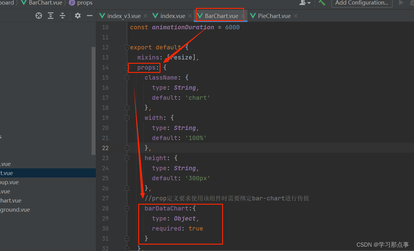
如下是根据若依框架改写后的BarChart.vue文件,该BarChart.vue可实现组件间的值传递。
<template>
  <div :class="className" :style="{height:height,width:width}" />
</template>

<script>
import * as echarts from 'echarts';
require('echarts/theme/macarons') // echarts theme
import resize from './mixins/resize'

const animationDuration = 6000

export default {
  mixins: [resize],
  props: {
    className: {
      type: String,
      default: 'chart'
    },
    width: {
      type: String,
      default: '100%'
    },
    height: {
      type: String,
      default: '300px'
    },
    //prop定义要求使用该组件时需要绑定bar-chart进行传值
    barDataChart:{
      type: Object,
      required: true
    }
  },
  data() {
    return {
      chart: null
    }
  },
  //监听barChart中值的变化
  watch:{
    barDataChart:{
      deep:true,
      handler(val){
        this.setOptions(val)
      }
    }
  },
  mounted() {
    this.$nextTick(() => {
      this.initChart()
    })
  },
  beforeDestroy() {
    if (!this.chart) {
      return
    }
    this.chart.dispose()
    this.chart = null
  },
  methods: {
    initChart() {
      this.chart = echarts.init(this.$el, 'macarons')
      this.setOptions(this.barDataChart)
    },
    setOptions({work_days, hj_main_count, hj_right_count, hj_left_count, hj_main, hj_right, hj_left}) {
      this.chart.setOption({
        tooltip: {
          trigger: 'axis',
          axisPointer: { // 坐标轴指示器,坐标轴触发有效
            type: 'shadow' // 默认为直线,可选为:'line' | 'shadow'
          }
        },
        grid: {
          top: 10,
          left: '2%',
          right: '2%',
          bottom: '3%',
          containLabel: true
        },
        xAxis: [{
          type: 'category',
          data: work_days,
          // name:'日期',
          nameLocation: 'middle', // 显示位置
          nameTextStyle: {
            fontWeight: 'bold' // 字体加粗
          },
          axisTick: {
            alignWithLabel: true
          }
        }],
        yAxis: [
          {
          type: 'value',
          axisTick: {
            show: false
          },
          // name: '预警次数', // 添加单位
          // nameLocation: 'end', // 显示位置
          // nameTextStyle: {
          //    fontWeight: 'bold' // 字体加粗
          //   }
          axisLabel: {
              formatter: '{value} 次'
            }
        }],
        series: [{
          name: hj_main,
          type: 'bar',
          stack: 'vistors',
          barWidth: '60%',
          data: hj_main_count,
          animationDuration
        }, {
          name: hj_right,
          type: 'bar',
          stack: 'vistors',
          barWidth: '60%',
          data: hj_right_count,
          animationDuration
        }, {
          name: hj_left,
          type: 'bar',
          stack: 'vistors',
          barWidth: '60%',
          data: hj_left_count,
          animationDuration
        }]
      })
    }
  }
}
</script>
其他页面使用BarChart
如下以在ruoyi-ui/index.vue下使用BarChart文件为例进行介绍。
1.导入BarChart组件
<script>
  import BarChart from './dashboard/BarChart'
<script>
2.注册组件
export default {
  name: 'Index',
  components: {
     BarChart
  }
}
3.在所需位置引入
 <div class="chart-wrapper">
    <bar-chart :bar-data-chart="barFalseChart"/>
  </div>
4.使用:bar-data-chart绑定需要展示的值,barFalseChart就是处理好等待渲染的对象
//柱状图数据
const barFalseChart = {
  work_days: ['周一', '周二', '周三', '周四', '周五', '周六', '周日'],
  hj_main_count: [9, 2, 0, 8, 0, 5, 1],
  hj_right_count: [8, 5, 3, 3, 9, 6, 4],
  hj_left_count: [3, 7, 1, 0, 3, 6, 4],
  hj_main: '圆棒浇铸区主摄像头预警次数',
  hj_left: '圆棒浇铸区左摄像头预警次数',
  hj_right: '圆棒浇铸区右摄像头预警次数'
}
其中barFalseChart为啥是对象,原因在这:
5.在data中也要绑定一下:
  data() {
    return {
      //柱状图数据
      barFalseChart:barFalseChart,
     }
}
6.最后一步,根据需求修改只要需要的值,文中需要修改和自定义的地方已经用注释标注出来了,各位看官按需进行修改。
(1)父组件中的定义:
//柱状图数据
const barFalseChart = {
  work_days: ['周一', '周二', '周三', '周四', '周五', '周六', '周日'],
  hj_main_count: [9, 2, 0, 8, 0, 5, 1],
  hj_right_count: [8, 5, 3, 3, 9, 6, 4],
  hj_left_count: [3, 7, 1, 0, 3, 6, 4],
  hj_main: '主摄像头预警次数',
  hj_left: '左摄像头预警次数',
  hj_right: '右摄像头预警次数'
}
(2)上手修改:
  methods: {
    initChart() {
      this.chart = echarts.init(this.$el, 'macarons')
      this.setOptions(this.barDataChart)
    },
//  按需修改传入值,按需在setOptions({work_days, hj_main_count, hj_right_count, hj_left_count, hj_main, hj_right, hj_left})中进行自定义(但这些值是来自于父组件定义的值)

    setOptions({work_days, hj_main_count, hj_right_count, hj_left_count, hj_main, hj_right, hj_left}) {
      this.chart.setOption({
        tooltip: {
          trigger: 'axis',
          axisPointer: {
            type: 'shadow'
          }
        },
        grid: {
          top: 10,
          left: '2%',
          right: '2%',
          bottom: '3%',
          containLabel: true
        },
        xAxis: [{
          type: 'category',
          data: work_days,   //这里修改x轴的值
          axisTick: {
            alignWithLabel: true
          }
        }],
        yAxis: [
          {
          type: 'value',
          axisTick: {
            show: false
          },
          axisLabel: {
              formatter: '{value} 次'   //给y轴加上单位
            }
        }],
        series: [{
          name: hj_main,    //修改序列1的名称
          type: 'bar',
          stack: 'vistors',
          barWidth: '60%',
          data: hj_main_count, //修改序列1绑定的值
          animationDuration
        }, {
          name: hj_right,     //修改序列2的名称
          type: 'bar',
          stack: 'vistors',
          barWidth: '60%',
          data: hj_right_count,  //修改序列2绑定的值
          animationDuration
        }, {
          name: hj_left,   //修改序列3的名称
          type: 'bar',
          stack: 'vistors',
          barWidth: '60%',
          data: hj_left_count,  //修改序列3绑定的值
          animationDuration
        }]
      })
    }
  }
}
</script>
文章来源:https://blog.csdn.net/weixin_52890053/article/details/135277787
本文来自互联网用户投稿,该文观点仅代表作者本人,不代表本站立场。本站仅提供信息存储空间服务,不拥有所有权,不承担相关法律责任。 如若内容造成侵权/违法违规/事实不符,请联系我的编程经验分享网邮箱:chenni525@qq.com进行投诉反馈,一经查实,立即删除!
本文来自互联网用户投稿,该文观点仅代表作者本人,不代表本站立场。本站仅提供信息存储空间服务,不拥有所有权,不承担相关法律责任。 如若内容造成侵权/违法违规/事实不符,请联系我的编程经验分享网邮箱:chenni525@qq.com进行投诉反馈,一经查实,立即删除!
最新文章
- Python教程
- 深入理解 MySQL 中的 HAVING 关键字和聚合函数
- Qt之QChar编码(1)
- MyBatis入门基础篇
- 用Python脚本实现FFmpeg批量转换
- Java商城 免 费 搭 建:鸿鹄云商实现多种商业模式,VR全景到SAAS,应有尽有
- hive多分隔符外表支持
- 关于“Python”的核心知识点整理大全51
- RK3568驱动指南|第十二篇 GPIO子系统-第130章 GPIO的调试方法
- VSCode Python开发环境配置
- labelme标注json文件检查标注标签(修改imageWidth,imagePath,imageHeight)
- Python之自然语言处理库snowNLP
- 鉴源实验室|自动驾驶仿真测试技术分析
- Linux文件与目录管理
- centos7服务器上的文件上传到谷歌云盘(google drive)