利用HTML和CSS实现的浮动布局
发布时间:2024年01月15日
代码如下
<!DOCTYPE html>
<html lang="en">
<head>
  <meta charset="UTF-8">
  <meta name="viewport" content="width=device-width, initial-scale=1.0">
  <title>Document</title>
  <style>
    *{
      margin: 0;
      padding: 0;
    }
    .all{
      width: 960px;
      height: 1000px;
      margin: 0 auto;
    }

    .body_url{
      height: 80px;
      display: inline-block;
      margin-bottom: 10px;
      /* 去除换行空格距离 */
      font-size: 0;
    }
    .body_com{
      display: inline-block;
      text-align: center;
      line-height: 80px;
      background-color: rgb(171, 149, 149);
      font-size: 16px;
    }
    .logo{
      width: 200px;
    }
    .banner1{
      width: 540px;
      margin: 0 10px;
    }
    .banner2{
      width: 200px;
    }
    .menu{
      height: 30px;
      background-color: rgb(171, 149, 149);
      text-align: center;
      line-height: 30px;
      margin-bottom: 10px;
    }
    .nav_left{
      width: 760px;
      float: left;
      font-size: 0;
    }
    .left_one{
      display: inline-block;
      width: 368px;
      height: 198px;
      text-align: center;
      line-height: 100px;
      border: 1px solid black;
      margin-right: 10px;
      margin-bottom: 10px;
      font-size: 16px;
    }

    .left_two{
      display: inline-block;
      width: 178px;
      height: 198px;
      text-align: center;
      line-height: 100px;
      border: 1px solid black;
      margin-right: 10px;
      font-size: 16px;
    }
    .nav_right{
      width: 200px;
      float: right;
      font-size: 0;
    }
    .left_three{
      display: inline-block;
      width: 198px;
      height: 128px;
      text-align: center;
      line-height: 100px;
      border: 1px solid black;
      margin-bottom: 10px;
      font-size: 16px;
    }
    .foot_url{
      /* 清除浮动 */
      clear: both;
      height: 60px;
      text-align: center;
      line-height: 60px;
      background-color: rgb(171, 149, 149);
    }
  </style>
</head>
<body>
  <div class="all">
    <!-- 头部 -->
    <div class="body_url">
      <div class="body_com logo">logo</div>
      <div class="body_com banner1">banner1</div>
      <div class="body_com banner2">banner2</div>
    </div>
    <!-- 菜单 -->
    <div class="menu">
      菜单
    </div>
    <!-- 栏目 -->
    <div class="nav_url">
      <!-- 左边栏目 -->
      <div class="nav_left">
        <!-- top -->
        <span class="left_one">栏目一</span>
        <span class="left_one">栏目二</span>
        <!-- bottom -->
        <span class="left_two">栏目三</span>
        <span class="left_two">栏目四</span>
        <span class="left_two">栏目五</span>
        <span class="left_two">栏目六</span>
      </div>
      <!-- 右边栏目 -->
      <div class="nav_right">
        <span class="left_three">栏目七</span>
        <span class="left_three">栏目八</span>
        <span class="left_three">栏目九</span>
      </div>
    </div>
    <!-- 页脚 -->
    <div class="foot_url">
      页脚
    </div>
  </div>
</body>
</html>
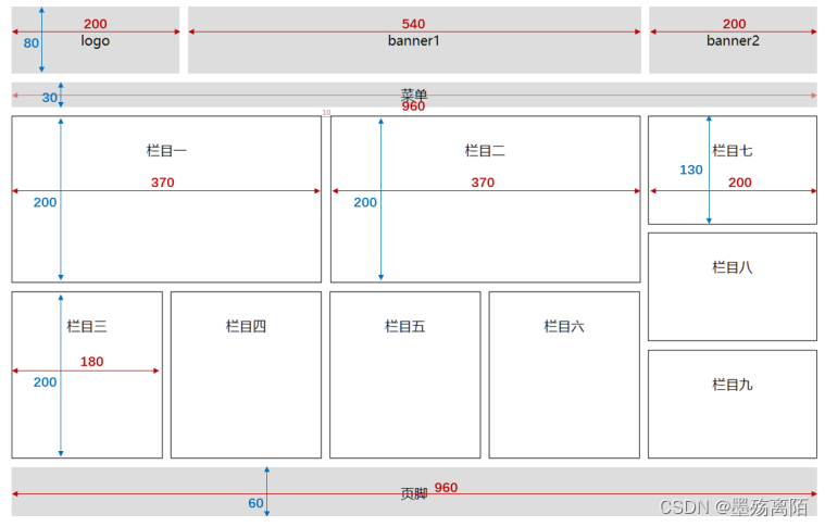
这是UI设计图
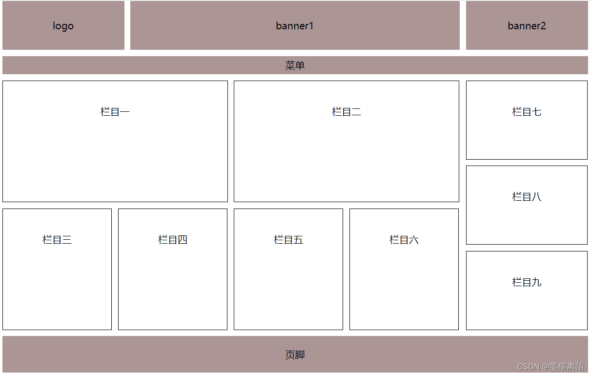
下面为实现的效果图
文章来源:https://blog.csdn.net/qq_36191374/article/details/135607694
本文来自互联网用户投稿,该文观点仅代表作者本人,不代表本站立场。本站仅提供信息存储空间服务,不拥有所有权,不承担相关法律责任。 如若内容造成侵权/违法违规/事实不符,请联系我的编程经验分享网邮箱:chenni525@qq.com进行投诉反馈,一经查实,立即删除!
本文来自互联网用户投稿,该文观点仅代表作者本人,不代表本站立场。本站仅提供信息存储空间服务,不拥有所有权,不承担相关法律责任。 如若内容造成侵权/违法违规/事实不符,请联系我的编程经验分享网邮箱:chenni525@qq.com进行投诉反馈,一经查实,立即删除!