vue3中,vue-echarts基本使用(柱状图、饼图、折线图)
发布时间:2024年01月12日
注意:vue-echarts在使用前要先安装echarts,不要只安装vue-echarts这一个
安装vue-echarts
npm i -S vue-echarts echarts

//cnpm 安装
cnpm i -S vue-echarts echarts注意:Vue 2?下使用?vue-echarts,必须还要安装?@vue/composition-api?:
npm i -D @vue/composition-api
//cnpm 安装
cnpm i -D @vue/composition-api
main.js中全局注册组件
import Echarts from "vue-echarts"
import * as echarts from "echarts"

app.component("v-chart", Echarts)

app.config.globalProperties.$echarts = echarts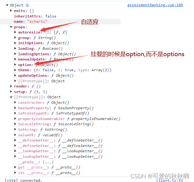
自适应屏幕
方式1:autoresize:true? 【推荐】
该方式自适应需满足两个条件:
- 加上autoresize属性。
- 图表外层需要指定vw单位的宽度,如width:100vw;
<template>
    <div style="width:100vw">
      <v-chart autoresize :option="option_column" style="height: 400px"></v-chart>
    </div>
</template>
基本使用??
- 柱状态
<template>
    <v-chart ref="mychart1" class="chart" :option="optionBar"></v-chart>
</template>

<script setup>
    import { onMounted, reactive, watch, ref, onBeforeUnmount, shallowRef } from 'vue'

    // 渲染数
    mychart1.value.setOption(renderLineOptions())

    // 定义属性
    const mychart1 = ref(null)
    const optionBar = ref(null)

    // 坐标轴及其属性定义
    const renderLineOptions = () => {
        return {
            grid: {
                left: '3%',
                right: '4%',
                bottom: '8%',
                containLabel: true
            },
            xAxis: {
                data: data.chartName, // x轴的标题(定义的变量),可以是直接的数组["衬衫", "羊毛衫", "雪纺衫", "裤子", "高跟鞋", "袜子"]
                axisLabel: {
                    show: true,
                    textStyle: {
                        fontSize: 15// 字体大小
                    }
                },
                axisLabel: {
                    show: true,
                rotate: 30    // 设置x轴标签旋转角度
                }
            },
            yAxis: {
                name: '工时/h',
                nameTextStyle: {
                    nameLocation: 'start'
                },
                axisLabel: {
                    show: true,
                    fontSize: 16
                },
                axisLine: {
                    show: true, // 是否显示Y轴线
                    lineStyle: {
                        width: 1, // 线的大小
                        type: 'solid' // Y轴线的类型
                    }
                }
            },
            series: [
                {
                    // 渲染的数据,可以使用 [5, 20, 36, 10, 10, 20],也可以是定义的变量(记得赋值)
                    data: data.chartRows,
                    type: 'bar',
                    barWidth: '20%',
                    itemStyle: {
                        // 通常情况下:
                        color: function (params) {
                            // 每根柱子的颜色
                            return data.colorList[params.dataIndex]
                        },
                        offset: 6 // 偏移量
                    },
                    label: {
                        show: true,
                        position: 'top',
                        fontSize: 14,
                        formatter: (params) => {
                            const reData = (params.data || 0).toString().replace(/(\d)(?=(?:\d{3}) + $)/g, '$1,')
                            return reData
                        }
                    }
                }
            ]
        }
    }

</script>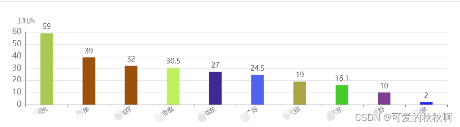
- 饼图?
<template>
    <v-chart ref="mychart1" class="chart" :option="optionPie "></v-chart>
</template>

<script setup>
    import { onMounted, reactive, watch, ref, onBeforeUnmount, shallowRef } from 'vue'

//饼图的数据格式对应的是key:value的形式
// data.pieNumber = [
//     { value:1, name: "开发" },
//     { value:2, name: "维护" },
//     { value:3, name: "测试" },
//     { value:4, name: "BUG修复" },
//     { value:5, name: "其他" }
// ]
    // 渲染数
    mychart1.value.setOption(renderPieOptions ())

    // 定义属性
    const mychart1 = ref(null)
    const optionPie = ref(null)

    const renderPieOptions = () => {
        return {
            tooltip: {
                trigger: "item",
                formatter: "{a} <br/>{b} : {c} 个,占比: ({d}%)"
            },
            legend: {
                orient: "vertical",
                position: 'right',
                right: '2%',
                top: '20%',
                data: data.pieTitle //这里的渲染的数据需要与series里面渲染的数据中的name保持一致
            },
            series: [
                {
                    name: "任务类型占比分析表",
                    type: "pie",
                    radius: "70%",
                    center: ["45%", "55%"],
                    data: data.pieNumber, //渲染的数据
                    emphasis: {
                        itemStyle: {
                            shadowBlur: 10,
                            shadowOffsetX: 0,
                            shadowColor: "rgba(0, 0, 0, 0.5)"
                        }
                    },
                    label: {
                        show: true, // 显示标签
                        formatter: '{b}个数占比:{d}%'
                    }
                }
            ]
        }
    }

</script>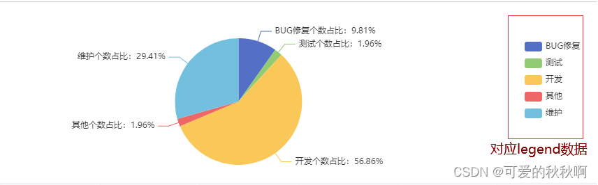
- ?折线图
    xAxis: {
          type: 'category',
          data: ['Mon', 'Tue', 'Wed', 'Thu', 'Fri', 'Sat', 'Sun']
        },
        yAxis: {
          type: 'value'
        },
        series: [{
          data: [820, 932, 901, 934, 1290, 1330, 1320],
          type: 'line'
    }]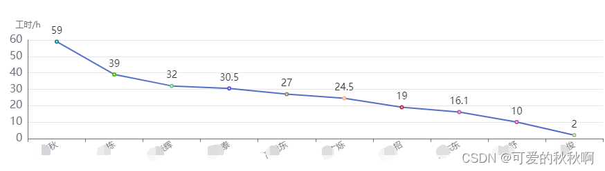
配置样式?
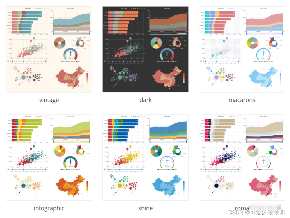
- 官网样式:主题下载 - Apache EChartsApache ECharts,一款基于JavaScript的数据可视化图表库,提供直观,生动,可交互,可个性化定制的数据可视化图表。
 https://echarts.apache.org/zh/download-theme.html
 - 如:macarons、dark? 、vintage、infographic、shine、roma
文章来源:https://blog.csdn.net/mq1314520_zhl/article/details/135554131
本文来自互联网用户投稿,该文观点仅代表作者本人,不代表本站立场。本站仅提供信息存储空间服务,不拥有所有权,不承担相关法律责任。 如若内容造成侵权/违法违规/事实不符,请联系我的编程经验分享网邮箱:chenni525@qq.com进行投诉反馈,一经查实,立即删除!
本文来自互联网用户投稿,该文观点仅代表作者本人,不代表本站立场。本站仅提供信息存储空间服务,不拥有所有权,不承担相关法律责任。 如若内容造成侵权/违法违规/事实不符,请联系我的编程经验分享网邮箱:chenni525@qq.com进行投诉反馈,一经查实,立即删除!