创建轮播(Swiper)
目录
????????Swiper组件提供滑动轮播显示的能力。Swiper本身是一个容器组件,当设置了多个子组件后,可以对这些子组件进行轮播显示。通常,在一些应用首页显示推荐的内容时,需要用到轮播显示的能力。
1、布局与约束
????????Swiper作为一个容器组件,在自身尺寸属性未被设置时,会自动根据子组件的大小设置自身的尺寸。如果开发者对Swiper组件设置了固定的尺寸,则在轮播显示过程中均以该尺寸生效;否则,在轮播过程中,会根据子组件的大小自动调整自身的尺寸。
2、循环播放
????????通过loop属性控制是否循环播放,该属性默认值为true。
????????当loop为true时,在显示第一页或最后一页时,可以继续往前切换到前一页或者往后切换到后一页。如果loop为false,则在第一页或最后一页时,无法继续向前或者向后切换页面。
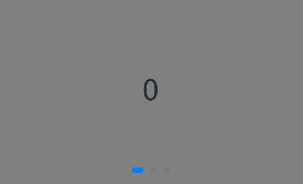
????????loop为true:
@Entry
@Component
struct SwiperPage1 {
  @State message: string = 'Hello World'

  private swiperController: SwiperController = new SwiperController()

  build() {
    Row() {
      Column() {
        Swiper(this.swiperController) {
          Text("0")
            .width('90%')
            .height('100%')
            .backgroundColor('#1067c8ff')
            .textAlign(TextAlign.Center)
            .fontSize(30)

          Text("1")
            .width('90%')
            .height('100%')
            .backgroundColor('#2067c8ff')
            .textAlign(TextAlign.Center)
            .fontSize(30)

          Text("2")
            .width('90%')
            .height('100%')
            .backgroundColor('#3067c8ff')
            .textAlign(TextAlign.Center)
            .fontSize(30)
        }
        .loop(true).autoPlay(true).interval(2000)
      }
      .width('100%').height('20%').alignSelf(ItemAlign.Start)
    }
    .height('100%')
  }
}
????????
????????loop为false:
@Entry
@Component
struct SwiperPage1 {
  @State message: string = 'Hello World'

  private swiperController: SwiperController = new SwiperController()

  build() {
    Row() {
      Column() {
        Swiper(this.swiperController) {
          Text("0")
            .width('90%')
            .height('100%')
            .backgroundColor('#1067c8ff')
            .textAlign(TextAlign.Center)
            .fontSize(30)

          Text("1")
            .width('90%')
            .height('100%')
            .backgroundColor('#2067c8ff')
            .textAlign(TextAlign.Center)
            .fontSize(30)

          Text("2")
            .width('90%')
            .height('100%')
            .backgroundColor('#3067c8ff')
            .textAlign(TextAlign.Center)
            .fontSize(30)
        }
        .loop(false).autoPlay(true).interval(2000)
      }
      .width('100%').height('20%').alignSelf(ItemAlign.Start)
    }
    .height('100%')
  }
}
?????????
3、自动轮播
????????Swiper通过设置autoPlay属性,控制是否自动轮播子组件。该属性默认值为false。
????????autoPlay为true时,会自动切换播放子组件,子组件与子组件之间的播放间隔通过interval属性设置。interval属性默认值为3000,单位毫秒。
????????autoPlay为true:
@Entry
@Component
struct SwiperPage1 {
  @State message: string = 'Hello World'

  private swiperController: SwiperController = new SwiperController()

  build() {
    Row() {
      Column() {
        Swiper(this.swiperController) {
          Text("0")
            .width('90%')
            .height('100%')
            .backgroundColor('#1067c8ff')
            .textAlign(TextAlign.Center)
            .fontSize(30)

          Text("1")
            .width('90%')
            .height('100%')
            .backgroundColor('#2067c8ff')
            .textAlign(TextAlign.Center)
            .fontSize(30)

          Text("2")
            .width('90%')
            .height('100%')
            .backgroundColor('#3067c8ff')
            .textAlign(TextAlign.Center)
            .fontSize(30)
        }
        .loop(true).autoPlay(true).interval(2000)
      }
      .width('100%').height('20%').alignSelf(ItemAlign.Start)
    }
    .height('100%')
  }
}
4、导航点样式
????????Swiper提供了默认的导航点样式,导航点默认显示在Swiper下方居中位置,开发者也可以通过indicatorStyle属性自定义导航点的位置和样式。
????????通过indicatorStyle属性,开发者可以设置导航点相对于Swiper组件上下左右四个方位的位置,同时也可以设置每个导航点的尺寸、颜色、蒙层和被选中导航点的颜色。
????????导航点使用默认样式:
Swiper(this.swiperController) {
  Text("0")
    .width('90%')
    .height('100%')
    .backgroundColor(Color.Gray)
    .textAlign(TextAlign.Center)
    .fontSize(30)

  Text("1")
    .width('90%')
    .height('100%')
    .backgroundColor(Color.Green)
    .textAlign(TextAlign.Center)
    .fontSize(30)

  Text("2")
    .width('90%')
    .height('100%')
    .backgroundColor(Color.Pink)
    .textAlign(TextAlign.Center)
    .fontSize(30)
}
?????????自定义导航点样式(示例:导航点直径设为30VP,左边距为0,导航点颜色设为红色):
@Entry
@Component
struct SwipeIndicatorPage {
  @State message: string = 'Hello World'

  private swiperController: SwiperController = new SwiperController()

  build() {
    Row() {
      Column() {
        Swiper(this.swiperController) {
          Text("0")
            .width('90%')
            .height('100%')
            .backgroundColor('#1067c8ff')
            .textAlign(TextAlign.Center)
            .fontSize(30)

          Text("1")
            .width('90%')
            .height('100%')
            .backgroundColor('#2067c8ff')
            .textAlign(TextAlign.Center)
            .fontSize(30)

          Text("2")
            .width('90%')
            .height('100%')
            .backgroundColor('#3067c8ff')
            .textAlign(TextAlign.Center)
            .fontSize(30)
        }
        .loop(true).autoPlay(true).interval(2000).indicatorStyle({
          size: 30,
          left: 0,
          color: Color.Red
        })
      }
      .width('100%').height('20%').alignSelf(ItemAlign.Start)
    }
    .height('100%')
  }
}
5、页面切换方式
????????Swiper支持三种页面切换方式:手指滑动、点击导航点和通过控制器。
通过控制器切换页面:
@Entry
@Component
struct SwiperDemo {
  private swiperController: SwiperController = new SwiperController();

  build() {
    Column({ space: 5 }) {
      Swiper(this.swiperController) {
        Text("0")
          .width(250)
          .height(250)
          .backgroundColor(Color.Gray)
          .textAlign(TextAlign.Center)
          .fontSize(30)
        Text("1")
          .width(250)
          .height(250)
          .backgroundColor(Color.Green)
          .textAlign(TextAlign.Center)
          .fontSize(30)
        Text("2")
          .width(250)
          .height(250)
          .backgroundColor(Color.Pink)
          .textAlign(TextAlign.Center)
          .fontSize(30)
      }
      .indicator(true)

      Row({ space: 12 }) {
        Button('showNext')
          .onClick(() => {
            this.swiperController.showNext(); // 通过controller切换到后一页
          })
        Button('showPrevious')
          .onClick(() => {
            this.swiperController.showPrevious(); // 通过controller切换到前一页
          })
      }.margin(5)
    }.width('100%')
    .margin({ top: 5 })
  }
}
6、轮播方向
????????Swiper支持水平和垂直方向上进行轮播,主要通过vertical属性控制。
????????当vertical为true时,表示在垂直方向上进行轮播;为false时,表示在水平方向上进行轮播。vertical默认值为false。
????????设置水平方向上轮播:
Swiper(this.swiperController) {
  ...
}
.indicator(true)
.vertical(false)
?????????

设置垂直方向轮播:
Swiper(this.swiperController) {
  ...
}
.indicator(true)
.vertical(true)
7、每页显示多个子页面
????????Swiper支持在一个页面内同时显示多个子组件,通过displayCount属性设置。
????????设置一个页面内显示两个子组件:
Swiper(this.swiperController) {
  Text("0")
    .width(250)
    .height(250)
    .backgroundColor(Color.Gray)
    .textAlign(TextAlign.Center)
    .fontSize(30)
  Text("1")
    .width(250)
    .height(250)
    .backgroundColor(Color.Green)
    .textAlign(TextAlign.Center)
    .fontSize(30)
  Text("2")
    .width(250)
    .height(250)
    .backgroundColor(Color.Pink)
    .textAlign(TextAlign.Center)
    .fontSize(30)
  Text("3")
    .width(250)
    .height(250)
    .backgroundColor(Color.Blue)
    .textAlign(TextAlign.Center)
    .fontSize(30)
}
.indicator(true)
.displayCount(2)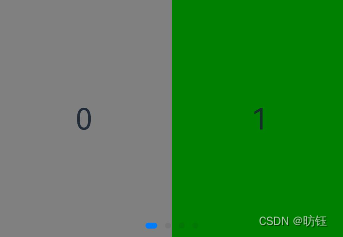
本文来自互联网用户投稿,该文观点仅代表作者本人,不代表本站立场。本站仅提供信息存储空间服务,不拥有所有权,不承担相关法律责任。 如若内容造成侵权/违法违规/事实不符,请联系我的编程经验分享网邮箱:chenni525@qq.com进行投诉反馈,一经查实,立即删除!
- Python教程
- 深入理解 MySQL 中的 HAVING 关键字和聚合函数
- Qt之QChar编码(1)
- MyBatis入门基础篇
- 用Python脚本实现FFmpeg批量转换
- QDockWidget学习
- 不同岗位角色下的销售数据分析如何做?
- MySQL数据库的缓存
- 一种针对相干源信号DOA估计的改进MUSIC算法
- 免费的WordPress插件大全
- Mybatis 42_Mybatis自动映射
- Matlab论文插图绘制模板第135期—隐函数曲面图(fimplicit3)
- 【Linux系统编程二十二】:(信号1)--信号的产生与发送
- JavaEE学习笔记 2024-1-17 --请求转发和重定向、MVC设计模式
- 【华为OD机试python】告警抑制【2023 B卷|100分】