flex 2----居中
发布时间:2023年12月26日
居中
方法1:父容器开启flex 布局,随后使用justify-content 和align-items 实现水平垂直居中
方法2:父容器开启flex 布局,随后子元素margin: auto
vs 使用不使用flex的方法
块元素
? ? ? ? 水平 :margin:0 auto ;
? ? ? ? 垂直:margin-top(父元素H-子元素H)/2)px
行内,行内块:
? ? ? ? 水平:text-align:center;
? ? ? ? 垂直:height = line-height,? vertical-align:middle;若想绝对居中的话,父元素font-size:0,再重置子元素的font-size
方法1:父容器开启flex 布局,随后使用justify-content 和align-items 实现水平垂直居中
 .outer1{
            width: 800px;
            height: 500px;
            background-color: antiquewhite;
            display: flex;
            align-items: center;
            justify-content: center;
        }
        .inner1{
            width: 300px;
            height: 150px;
            background-color: aqua;
        }

  <div class="outer1">
        <div class="inner1">
            haha
        </div>
    </div>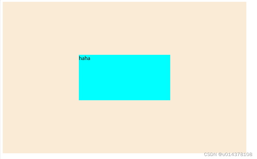
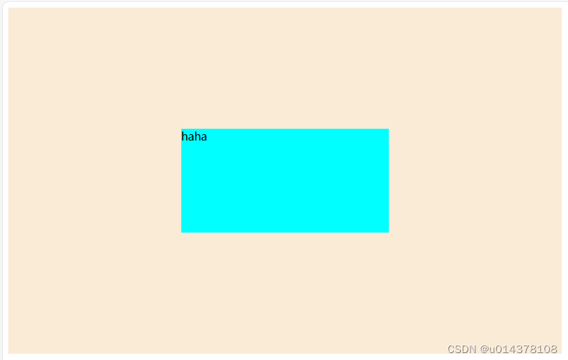
方法2:父容器开启flex 布局,随后子元素margin: auto
.outer1{
            width: 800px;
            height: 500px;
            background-color: antiquewhite;
            display: flex;
        }
        .inner1{
            width: 300px;
            height: 150px;
            background-color: aqua;
            margin:auto;
        }
文章来源:https://blog.csdn.net/u014378108/article/details/135213400
本文来自互联网用户投稿,该文观点仅代表作者本人,不代表本站立场。本站仅提供信息存储空间服务,不拥有所有权,不承担相关法律责任。 如若内容造成侵权/违法违规/事实不符,请联系我的编程经验分享网邮箱:chenni525@qq.com进行投诉反馈,一经查实,立即删除!
本文来自互联网用户投稿,该文观点仅代表作者本人,不代表本站立场。本站仅提供信息存储空间服务,不拥有所有权,不承担相关法律责任。 如若内容造成侵权/违法违规/事实不符,请联系我的编程经验分享网邮箱:chenni525@qq.com进行投诉反馈,一经查实,立即删除!
最新文章
- Python教程
- 深入理解 MySQL 中的 HAVING 关键字和聚合函数
- Qt之QChar编码(1)
- MyBatis入门基础篇
- 用Python脚本实现FFmpeg批量转换
- 网络安全威胁——缓冲区溢出攻击
- mysql学习打卡day8
- js中的document.querySelector()方法
- rpb/rpc文件说明与matlab读取
- 2023.12.18 关于 CentOS7 安装 Redis5
- 【Leetcode】2171. 拿出最少数目的魔法豆
- 使用 async-profiler 分析内存
- [GXYCTF2019]Ping Ping Ping
- MySQL主从复制与读写分离
- 单机开机无感全自动进入B\S架构系统