画图案例分享
发布时间:2024年01月18日
案例 1
from scipy.misc import derivative
from scipy.integrate import quad
import matplotlib.pyplot as plt
import numpy as np
import pandas as pd
from scipy.stats import norm
import warnings
plt.style.use('ggplot')
np.random.seed(37)
warnings.filterwarnings('ignore')
import matplotlib
plt.rcParams['font.sans-serif']=['Songti SC'] #用来正常显示中文标签
# 或者是下面这个,宋体和仿宋字体,都可以用。
#plt.rcParams['font.sans-serif']=['STFangsong'] #用来正常显示中文标签
plt.rcParams['axes.unicode_minus'] = False # 用来正常显示负号
x = np.arange(-2.5, 2.5, 0.1)
y_pdf = norm.pdf(x)
y_cdf = norm.cdf(x)
y_cdf = np.array([tup[0] for tup in [quad(norm.pdf, a, b) for a, b in [(a, b) for a, b in zip(x, x[1:len(x)])]]] + [0]).cumsum()
y_pdf = derivative(norm.cdf, x, dx=1e-6)
fig, ax = plt.subplots(1, 2, figsize=(20, 6),facecolor="white")
_ = ax[0].plot(x, y_pdf, color='black',linewidth=3.0)
#_ = ax[1].plot(x, y_cdf, color='b')
ax[0].set_facecolor('white') # 设置背景颜色
ax[0].axvline(x=0.0, color="black", linestyle="-", linewidth=3,ymin=0., ymax=0.66)
#ax[0].arrow(-4,0,8,0,color="black",linewidth=3)
ax[0].set_ylim(0,0.6)
################################################
for side in ['bottom','right','top','left']:
ax[0].spines[side].set_visible(False)
for side in ['bottom','right','top','left']:
ax[1].spines[side].set_visible(False)
################################################
xmin, xmax = ax[0].get_xlim()
ymin, ymax = ax[0].get_ylim()
dps = fig.dpi_scale_trans.inverted()
bbox = ax[0].get_window_extent().transformed(dps)
width, height = bbox.width, bbox.height
# manual arrowhead width and length
hw = 1./20.*(ymax-ymin)
hl = 1./20.*(xmax-xmin)
lw = 2.0 # axis line width
ohg = 0.3 # arrow overhang
# compute matching arrowhead length and width
yhw = hw/(ymax-ymin)*(xmax-xmin)* height/width
yhl = hl/(xmax-xmin)*(ymax-ymin)* width/height
# draw x and y axis
ax[0].arrow(xmin, 0, xmax-xmin+0.2, 0., fc='k', ec='k', lw = lw,
head_width=hw, head_length=hl, color="black",
length_includes_head= False, clip_on = False)
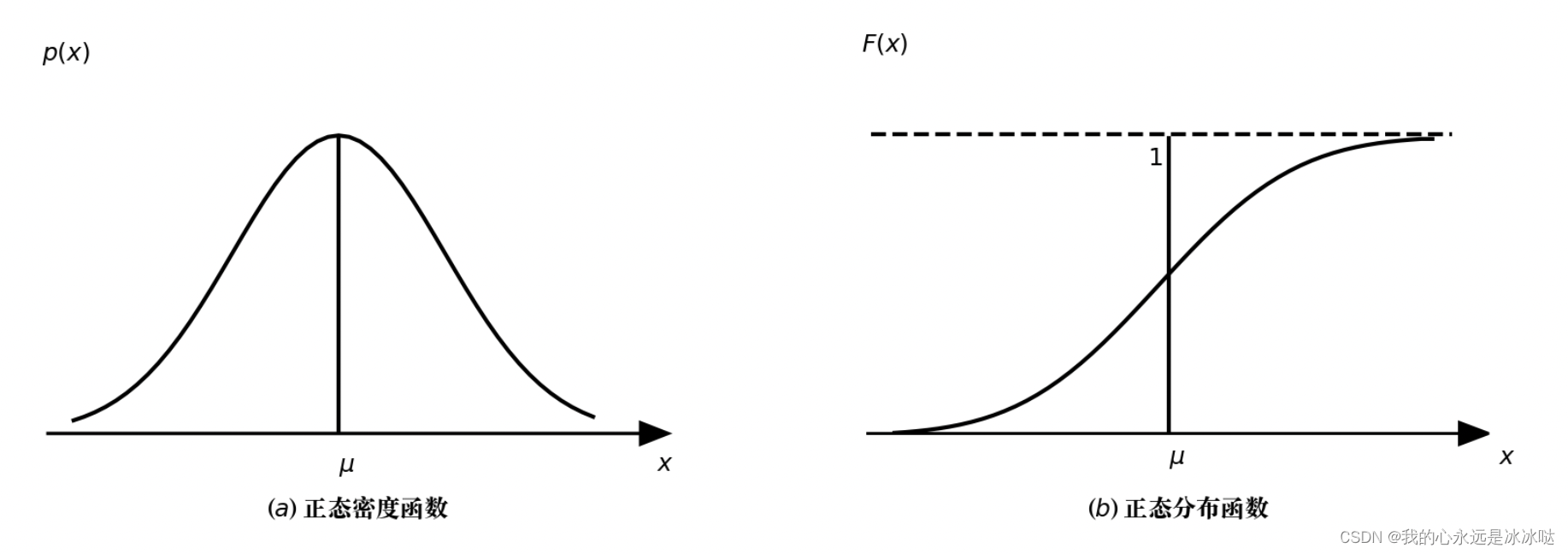
ax[0].text(0,-0.05,"$\mu$",size=18)
ax[0].text(-2.8,0.5,"$p(x)$",size=18)
ax[0].text(3,-0.05,"$x$",size=18)
ax[0].set_xticks([])
ax[0].set_yticks([])
_ = ax[0].set_title('($a$)'+' 正态密度函数',y=-0.2,fontsize=18) # 标题放下面
_ = ax[1].plot(x, y_cdf, color='black',linewidth=3.0)
ax[1].set_facecolor('white') # 设置背景颜色
ax[1].axvline(x=0.0, color="black", linestyle="-", linewidth=3,ymin=0., ymax=0.66)
ax[1].axhline(y=1.0, color="black", linestyle="-", linewidth=3,xmin=0.05,xmax=0.9,ls="--")
#ax[1].arrow(-4,0,8,0,color="black",linewidth=3)
ax[1].set_ylim(0,1.5)
# get width and height of axes object to compute
# matching arrowhead length and width
dps = fig.dpi_scale_trans.inverted()
bbox = ax[1].get_window_extent().transformed(dps)
width, height = bbox.width, bbox.height
xmin, xmax = ax[1].get_xlim()
ymin, ymax = ax[1].get_ylim()
# manual arrowhead width and length
hw = 1./20.*(ymax-ymin)
hl = 1./20.*(xmax-xmin)
lw = 2.0 # axis line width
ohg = 0.3 # arrow overhang
# compute matching arrowhead length and width
yhw = hw/(ymax-ymin)*(xmax-xmin)* height/width
yhl = hl/(xmax-xmin)*(ymax-ymin)* width/height
# draw x and y axis
ax[1].arrow(xmin, 0, xmax-xmin, 0., fc='k', ec='k', lw = lw,
head_width=hw, head_length=hl,
length_includes_head= False, clip_on = False)
ax[1].text(0,-0.1,"$\mu$",size=18)
ax[1].text(-2.8,1.28,"$F(x)$",size=18)
ax[1].text(3,-0.1,"$x$",size=18)
ax[1].text(-0.2,0.9,"$1$",size=18)
ax[1].set_xticks([])
ax[1].set_yticks([])
_ = ax[1].set_title('($b$)'+' 正态分布函数',y=-0.2,fontsize=18) # 标题放下面
plt.savefig("./重绘/13.png",dpi=500,bbox_inches='tight')
结果如下
注意点1
其中有一个易错的点需要注意
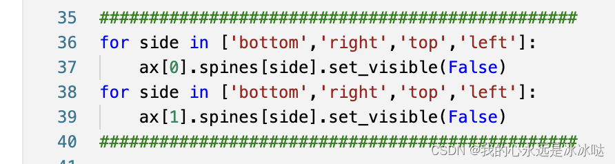
################################################
for side in ['bottom','right','top','left']:
    ax[0].spines[side].set_visible(False)
for side in ['bottom','right','top','left']:
    ax[1].spines[side].set_visible(False)
################################################
这部分代码是一定要加上的,否则这个图像就变成了下面的这个结果
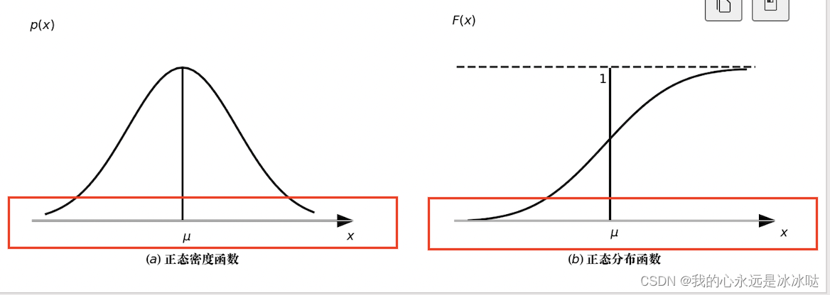 这个x轴就像长了一个奇怪的东西一样,需要注意
注意点2
保存图片时,一定要记得用bbox_inches的参数
plt.savefig("./重绘/13.png",dpi=500,bbox_inches='tight')
如果不用这个参数,图片下面的标题就没有了,意外的被丢掉了,需要注意
案例2
%matplotlib inline
from scipy.stats import norm
import numpy as np
import matplotlib.pyplot as plt
import warnings
plt.style.use('ggplot')
np.random.seed(37)
warnings.filterwarnings('ignore')

plt.rcParams['font.sans-serif']=['Songti SC'] #用来正常显示中文标签

plt.rcParams['axes.unicode_minus'] = False  # 用来正常显示负号

fig, ax = plt.subplots(1, 2, figsize=(20, 6),facecolor="white")
ax[0].set_facecolor('white') # 设置背景颜色

################################################
for side in ['bottom','right','top','left']:
    ax[0].spines[side].set_visible(False)
for side in ['bottom','right','top','left']:
    ax[1].spines[side].set_visible(False)
################################################

# draw x and y axis
ax[0].arrow(-4, 0, 12, 0., fc='k', ec='k', lw = 2.0,
         head_width=0.021931753100282243, head_length=0.66, color="black",
         length_includes_head= False, clip_on = False)
# draw x and y axis
# draw x and y axis
ax[0].arrow(0, 0, 0, 0.5, fc='k', ec='k', lw = 2.0,
        head_width=0.3,head_length=0.05,color="black",
         length_includes_head= False, clip_on = False)

means = [0.0, 3.0, 2.0]
cnt=0
for mean in means:
    if(cnt ==0):
        x = np.linspace(-3.3,3.3,100)
        ax[0].plot(x, norm.pdf(x,loc=mean),c="b",linewidth=3.0)
    if(cnt ==1):
        x = np.linspace(-1.5,7.5,100)
        ax[0].plot(x, norm.pdf(x,loc=mean),c="g",linewidth=3.0)
        ax[0].axvline(x=3.0, color="black", linestyle="-", linewidth=2,ymin=0.07, ymax=0.71)
    if(cnt ==2):
        x = np.linspace(-1.5,5.5,100)
        ax[0].plot(x, norm.pdf(x,loc=mean),c="r",linewidth=3.0)
        ax[0].axvline(x=2.0, color="black", linestyle="-", linewidth=2,ymin=0.07, ymax=0.71)
    cnt+=1
# ax[0].set_yticks([])
# ax[0].set_xticks([])
ax[0].text(0,-0.05,"$\mu_{2}$",size=18)
ax[0].text(2.0,-0.05,"$\mu_{1}$",size=18)
ax[0].text(3.0,-0.05,"$\mu_{3}$",size=18)
ax[0].text(0.35,0.5,"$\mathrm{p(x)}$",size=18)
ax[0].text(8.5,-0.05,"$x$",size=18)
ax[0].set_xticks([])
ax[0].set_yticks([])

ax[1].set_facecolor('white') # 设置背景颜色


# draw x and y axis
ax[1].arrow(-4, 0, 12, 0., fc='k', ec='k', lw = 2.0,
         head_width=0.021931753100282243, head_length=0.66, color="black",
         length_includes_head= False, clip_on = False)
# draw x and y axis
# draw x and y axis
ax[1].arrow(0, 0, 0, 0.55, fc='k', ec='k', lw = 2.0,
        head_width=0.3,head_length=0.05,color="black",
         length_includes_head= False, clip_on = False)

cnt=0

x = np.linspace(-3.3,7.3,100)
ax[1].plot(x, norm.pdf(x,loc=2,scale=1.0),c="r",linewidth=3.0)

x = np.linspace(-3.3,7.3,100)
ax[1].plot(x, norm.pdf(x,loc=2,scale=2.0),c="b",linewidth=3.0)

x = np.linspace(-3.3,8.0,100)
ax[1].plot(x, norm.pdf(x,loc=2,scale=0.7),c="g",linewidth=3.0)

ax[1].axvline(x=2.0, color="black", linestyle="-", linewidth=1,ymin=0.07, ymax=1.0)

ax[1].text(0,-0.05,"0",size=18)
ax[1].text(8.5,-0.05,"$x$",size=18)
ax[1].text(0,0.62,"$\mathrm{p(x)}$",size=18)
ax[1].text(2.1,0.63,"$x=\mu$",size=18)
ax[1].text(2.4,0.53,"$\sigma=0.7$",size=18,color="g")
ax[1].text(3.0,0.25,"$\sigma=1$",size=18,color="r")
ax[1].text(5.0,0.1,"$\sigma=2$",size=18,color="b")
ax[1].set_xticks([])
ax[1].set_yticks([])


plt.savefig("./重绘/14.png",dpi=500,bbox_inches='tight')
结果如下
除了这个坐标轴有点丑,其余的都还行的
文章来源:https://blog.csdn.net/qq_45759229/article/details/135668819
本文来自互联网用户投稿,该文观点仅代表作者本人,不代表本站立场。本站仅提供信息存储空间服务,不拥有所有权,不承担相关法律责任。 如若内容造成侵权/违法违规/事实不符,请联系我的编程经验分享网邮箱:chenni525@qq.com进行投诉反馈,一经查实,立即删除!
本文来自互联网用户投稿,该文观点仅代表作者本人,不代表本站立场。本站仅提供信息存储空间服务,不拥有所有权,不承担相关法律责任。 如若内容造成侵权/违法违规/事实不符,请联系我的编程经验分享网邮箱:chenni525@qq.com进行投诉反馈,一经查实,立即删除!
最新文章
- Python教程
- 深入理解 MySQL 中的 HAVING 关键字和聚合函数
- Qt之QChar编码(1)
- MyBatis入门基础篇
- 用Python脚本实现FFmpeg批量转换
- 2788.按分隔符拆分字符串
- Salesforce生成式AI聊天机器人「Einstein Copilot」,将于2月发布!
- Linuxwebserver项目
- 【Web开发】会话管理与无 Cookie 环境下的实现策略
- 禅道的安装及使用
- 黑客自学(笔记)- 网安入门
- 黑马苍穹外卖Day8学习
- Linux进程间通讯 -- 管道
- PowerBI Copilot 零售数据分析自动化报告实战
- 二进制插桩:静态插桩和动态intel pin插桩