利用Matplotlib画简单的线形图
实验题目:简单的线形图
实验目的:利用Matplotlib画简单的线形图
实验环境:海豚大数据和人工智能实验室,使用的Python库
| 名称 | 版本 | 简介 |
| numpy | 1.16.0 | 线性代数 |
| Pandas | 0.25.0 | 数据分析 |
| Matplotlib | 3.1.0 | 数据可视化 |
3实验适用的对象
- 已经学习了Python基础,具备机器学习基础
- 学习对象:本科学生、研究生、人工智能、算法相关研究者、开发者
- 大数据分析与人工智能
步骤1. 安装并引入必要的库
- 代码:
!pip install numpy==1.16.0
!pip install pandas==0.25.0!
pip install matplotlib==3.1.0
- 结果:
Looking in indexes: https://pypi.zjhu.dolphin-labs.com/simple/, Simple Index
Requirement already satisfied: numpy==1.16.0 in /opt/conda/lib/python3.6/site-packages (1.16.0)
WARNING: You are using pip version 20.1; however, version 21.3.1 is available.
You should consider upgrading via the '/resources/common/.virtualenv/python3.6/bin/python -m pip install --upgrade pip' command.
Looking in indexes: https://pypi.zjhu.dolphin-labs.com/simple/, Simple Index
Requirement already satisfied: pandas==0.25.0 in /opt/conda/lib/python3.6/site-packages (0.25.0)
Requirement already satisfied: pytz>=2017.2 in /opt/conda/lib/python3.6/site-packages (from pandas==0.25.0) (2021.3)
Requirement already satisfied: python-dateutil>=2.6.1 in /opt/conda/lib/python3.6/site-packages (from pandas==0.25.0) (2.8.1)
Requirement already satisfied: numpy>=1.13.3 in /opt/conda/lib/python3.6/site-packages (from pandas==0.25.0) (1.16.0)
Requirement already satisfied: six>=1.5 in /opt/conda/lib/python3.6/site-packages (from python-dateutil>=2.6.1->pandas==0.25.0) (1.14.0)
WARNING: You are using pip version 20.1; however, version 21.3.1 is available.
You should consider upgrading via the '/resources/common/.virtualenv/python3.6/bin/python -m pip install --upgrade pip' command.
Looking in indexes: https://pypi.zjhu.dolphin-labs.com/simple/, Simple Index
Requirement already satisfied: matplotlib==3.1.0 in /opt/conda/lib/python3.6/site-packages (3.1.0)
Requirement already satisfied: python-dateutil>=2.1 in /opt/conda/lib/python3.6/site-packages (from matplotlib==3.1.0) (2.8.1)
Requirement already satisfied: cycler>=0.10 in /opt/conda/lib/python3.6/site-packages (from matplotlib==3.1.0) (0.11.0)
Requirement already satisfied: numpy>=1.11 in /opt/conda/lib/python3.6/site-packages (from matplotlib==3.1.0) (1.16.0)
Requirement already satisfied: kiwisolver>=1.0.1 in /opt/conda/lib/python3.6/site-packages (from matplotlib==3.1.0) (1.3.1)
Requirement already satisfied: pyparsing!=2.0.4,!=2.1.2,!=2.1.6,>=2.0.1 in /opt/conda/lib/python3.6/site-packages (from matplotlib==3.1.0) (2.4.7)
Requirement already satisfied: six>=1.5 in /opt/conda/lib/python3.6/site-packages (from python-dateutil>=2.1->matplotlib==3.1.0) (1.14.0)
WARNING: You are using pip version 20.1; however, version 21.3.1 is available.
You should consider upgrading via the '/resources/common/.virtualenv/python3.6/bin/python -m pip install --upgrade pip' command.
- 代码:
%matplotlib inline
import matplotlib.pyplot as plt
plt.style.use('seaborn-whitegrid')
import numpy as np
可能最简单的图是一个函数y=f(x)的可视化。
在这里,我们将首先考虑创建这种类型的简单图。
对于所有的Matplotlib图,我们首先创建一个图形和一个坐标轴:
- 代码:
fig = plt.figure()
ax = plt.axes()
x = np.linspace(0, 10, 1000)
ax.plot(x, np.sin(x));
- 结果:

1.1 Figure对象
在Matplotlib中,图(类plt.Figure的一个实例)可以被认为是一个包含所有表示轴、图形、文本和标签的对象的容器。
figure?对象是最外层的绘图单位,默认是以?1开始编号(MATLAB风格,Figure 1, Figure 2, ...),可以用?plt.figure()?产生一幅图像,除了默认参数外,可以指定的参数有:
num?- 编号figsize?- 图像大小dpi?- 分辨率facecolor?- 背景色edgecolor?- 边界颜色frameon?- 边框
这些属性也可以通过?Figure?对象的?set_xxx?方法来改变。
1.2 Axes 轴域
我们在上面看到的ax是轴域(类plt.Axes的一个实例):一个带有刻度和标签的边界框, 可理解成一些轴(Axis,具体的坐标系)的集合,这个集合还有很多轴(Axis)属性、标注等,它最终将包含构成我们的可视化的plot元素。
一旦我们创建了一个坐标轴,我们就可以使用ax.plot函数来绘制一些数据。
- 代码:
fig = plt.figure()??
ax1 = fig.add_axes([0.1, 0.3, 0.7, 0.7])?????
ax2 = fig.add_axes([0.3, 0.5, 0.3, 0.3])????
plt.plot(np.arange(3))
plt.show()
- 结果:

或者,我们可以使用pylab接口,并在后台为我们创建图和轴。
- 代码:
plt.plot(x, np.sin(x));
- 结果:

如果我们想要创建一个多行的图形,我们可以简单地调用plot?函数多次:
- 代码:
plt.plot(x, np.sin(x))
plt.plot(x, np.cos(x));
- 结果:

这就是在Matplotlib中绘制简单函数的全部内容!
现在我们将深入了解如何控制轴和线的外观。
步骤2 调整图形:线条的颜色和风格
你首先想要调整的可能是控制一个图形的线条颜色和风格。?plt.plot()函数接受额外的参数,可以用来指定这些参数。
为了调整颜色,你可以使用color这个词,它接受一个代表几乎任何可以想象到的颜色的字符串参数。
颜色可以通过多种方式来指定:
- 代码:
plt.plot(x, np.sin(x - 0), color='blue')???????
plt.plot(x, np.sin(x - 1), color='g')??????????
plt.plot(x, np.sin(x - 2), color='0.75')???????
plt.plot(x, np.sin(x - 3), color='#FFDD44')????
plt.plot(x, np.sin(x - 4), color=(1.0,0.2,0.3))
plt.plot(x, np.sin(x - 5), color='chartreuse');
- 结果:

如果没有指定颜色,Matplotlib将自动循环通过一组默认颜色来进行多行。
同样的,线条风格也可以通过使用linestyle?关键字来调整:
- 代码:
plt.plot(x, x + 0, linestyle='solid')
plt.plot(x, x + 1, linestyle='dashed')
plt.plot(x, x + 2, linestyle='dashdot')
plt.plot(x, x + 3, linestyle='dotted');
plt.plot(x, x + 4, linestyle='-')?
plt.plot(x, x + 5, linestyle='--')
plt.plot(x, x + 6, linestyle='-.')
plt.plot(x, x + 7, linestyle=':');?
- 结果:

如果你想要非常简洁,这些?linestyle和color的代码可以组合成一个非关键字的plt.plot()功能:
- 代码:
plt.plot(x, x + 0, '-g')?
plt.plot(x, x + 1, '--c')
plt.plot(x, x + 2, '-.k')
?plt.plot(x, x + 3, ':r');?
- 结果:

表示颜色的字符参数有:
| 字符 | 颜色 |
|
| 蓝色,blue |
|
| 绿色,green |
|
| 红色,red |
|
| 青色,cyan |
|
| 品红,magenta |
|
| 黄色,yellow |
|
| 黑色,black |
|
| 白色,white |
|
| RGB某颜色 |
|
| 灰度值字符串 |
表示(风格)类型的字符参数有:
| 字符 | 类型 | 字符 | 类型 |
|
| 实线 |
| 虚线 |
|
| 虚点线 |
| 点线 |
|
| 点 |
| 像素点 |
|
| 圆点 |
| 下三角点 |
|
| 上三角点 |
| 左三角点 |
|
| 右三角点 |
| 下三叉点 |
|
| 上三叉点 |
| 左三叉点 |
|
| 右三叉点 |
| 正方点 |
|
| 五角点 |
| 星形点 |
|
| 六边形点1 |
| 六边形点2 |
|
| 加号点 |
| 乘号点 |
|
| 实心菱形点 |
| 瘦菱形点 |
|
| 横线点 |
步骤3. 设定坐标轴的范围
Matplotlib在为图形选择默认的坐标轴上做的很好,但是有时候我们有更改坐标轴的需要
- 代码:
x = np.linspace(-5* np.pi,5 * np.pi)
y, z = np.sin(x), np.cos(x)
plt.plot(x, y, linewidth=2.0, color='r')
plt.plot(x, z, linewidth=3.0, color='b', linestyle='--')
plt.show()
- 结果:

最基本的调整轴限的方法是使用plt.xlim()?和?plt.ylim()?的方法:
- 代码:
x = np.linspace(-5* np.pi,5 * np.pi, 200)
y, z = np.sin(x), np.cos(x)
plt.plot(x, y, linewidth=2.0, color='r')
plt.plot(x, z, linewidth=3.0, color='b', linestyle='--')
plt.xlim(-5, 5)
plt.show()
- 结果:

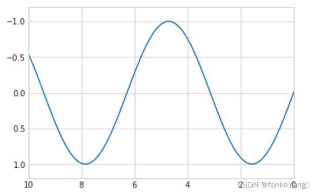
如果出于某种原因,您想要反向显示任意一个轴,您可以简单地颠倒参数的顺序:
- 代码:
plt.plot(x, np.sin(x))
plt.xlim(10, 0)
plt.ylim(1.2, -1.2);
- 结果:
一个有用的相关方法是?plt.axis(),允许您通过一个指定[xmin, xmax, ymin, ymax]的列表来设置x和y的极限:
- 代码:
plt.plot(x, np.sin(x))
plt.axis([-1, 11, -1.5, 1.5]);
- 结果:

plt.axis()方法甚至超出了这个范围,允许你做一些事情,比如自动收紧当前图形的边界:
- 代码:
plt.plot(x, np.sin(x))
plt.axis('tight');
- 结果:

它甚至允许更高级别的规范,比如保证一个相等的宽比,这样在屏幕上,x中的一个单位就等于y中的一个单位:
- 代码;
plt.plot(x, np.sin(x))
plt.axis('equal');
- 结果:

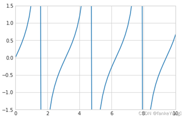
- 练习 1:绘制x的tan函数图像,将x轴设为(0,10),y轴设为(-1.5,1.5)
- 代码:
plt.plot(x, np.tan(x))
plt.axis([0,10,-1.5,1.5]);
- 结果:
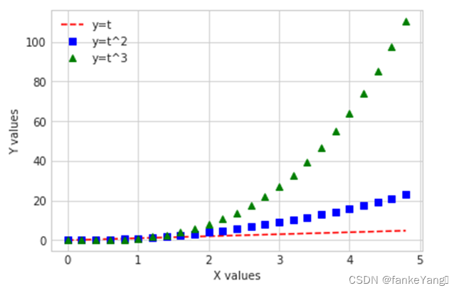
步骤4 图形的标签
作为本实验的最后一部分,我们将简要地看一下图形的标签:标题、轴标签和简单的说明。
标题和轴标签是最简单的标签,有一些方法可以用来快速设置它们:
- 代码:
import numpy as np
t =np.arange(0., 5., 0.2)???
plt.plot(t, t, 'r--', label='y=t')
plt.plot(t, t ** 2, 'bs',? label='y=t^2')
plt.plot(t, t ** 3, 'g^',? label='y=t^3')
plt.xlabel("X values")
plt.ylabel("Y values")
plt.legend()
plt.show()
- 结果:
这些标签的位置、大小和样式可以使用可选参数来调整。
当在单个轴中显示多个行时,创建一个标记每行类型的图形说明是很有用的。
同样,Matplotlib有一种快速创建这样一个说明的内置方法。
这是通过plt.legend()?的方法来完成的。
虽然有几种有效的使用方法,但我发现最容易的方法是使用label的plot函数关键字来指定每行的标签:
- 代码:
plt.plot(x, np.sin(x), '-g', label='sin(x)')
plt.plot(x, np.cos(x), ':b', label='cos(x)')
plt.axis('equal')
plt.legend();
- 结果:

正如您所看到的,plt.legend()函数可以跟踪线条样式和颜色,并与正确的标签匹配。
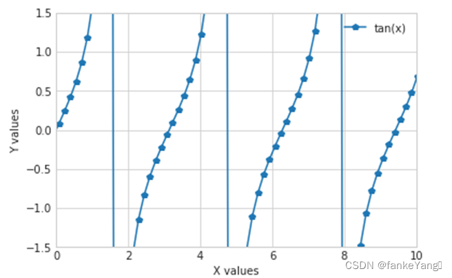
- 练习 2:对练习1创建的图形添加标签:x轴、y轴、以及图形说明
- 代码:
import numpy as np
t = np.arange(0., 5., 0.2)???
plt.plot(x, np.tan(x), '-p', label='tan(x)')
plt.axis([0,10,-1.5,1.5])
plt.xlabel("X values")
plt.ylabel("Y values")
plt.legend()
plt.show()
- 结果:
步骤5 Matplotlib陷阱
虽然大多数?plt函数可以直接转化为?ax的方法(如plt.plot()?→?ax.plot(),?plt.legend()?→?ax.legend()等),但不是对于所有的命令都是这样的。
特别地,设置坐标轴极限、标签和标题的函数被稍微修改了。
要在matlabstyle函数和面向对象的方法之间进行转换,请进行以下更改:
plt.xlabel()?→?ax.set_xlabel()plt.ylabel()?→?ax.set_ylabel()plt.xlim()?→?ax.set_xlim()plt.ylim()?→?ax.set_ylim()plt.title()?→?ax.set_title()
在面向对象的界面中绘图,而不是单独调用这些函数,使用ax.set()方法来设置所有这些属性通常更方便:
- 代码:
ax=plt.axes()
ax.plot(x, np.sin(x))
ax.set(xlim=(0, 10), ylim=(-2, 2),xlabel='x', ylabel='sin(x)',title='A Simple Plot');
- 练习 3:使用上文中介绍到的办法,对练习2的代码进行相应的修改。
ax = plt.axes()
ax.plot(x, np.tan(x))
ax.set(xlim=(0, 10), ylim=(-1.5, 1.5), xlabel='x', ylabel='tan(x)',title='A Simple Plot');
? 本文来自互联网用户投稿,该文观点仅代表作者本人,不代表本站立场。本站仅提供信息存储空间服务,不拥有所有权,不承担相关法律责任。 如若内容造成侵权/违法违规/事实不符,请联系我的编程经验分享网邮箱:chenni525@qq.com进行投诉反馈,一经查实,立即删除!
- Python教程
- 深入理解 MySQL 中的 HAVING 关键字和聚合函数
- Qt之QChar编码(1)
- MyBatis入门基础篇
- 用Python脚本实现FFmpeg批量转换
- k8s投射数据卷--超详细!!!
- 软件设计师——软件工程(四)
- 周例会-论主观能动性
- 测出Bug就完了?从4个方面教你Bug根因分析!
- 晚期食管癌肿瘤治疗线程分类
- cocos creator(2.4.7版本) videoplayer 可以在上层添加UI控件()
- 使用opencv实现图像中几何图形检测
- 不用再找了,这是机器学习算法最全面的总结(实战案例、面试总结)
- 【STM32F103】JDY-31蓝牙模块(USART)
- 【JS笔记】JavaScript语法 《基础+重点》 知识内容,快速上手(三)