matplotlib 虚战2
EDA? 探索性数据分析
纽约市出租车打车费用数据集
数据集下载地址:(需要登陆,没有账号可以注册一个)?
New York City Taxi Fare Prediction (kaggle.com)
把文件名改为NYC_taxi
import matplotlib
matplotlib.use("TkAgg")
import pandas as pd

df = pd.read_csv('NYC_taxi.csv', parse_dates=['pickup_datetime'], nrows=500000)

print(df.head())
调用df.head函数查看数据集的前5行
数据集有8列:
key 和 pickup_datatime 列是一样的,可以大胆删除key这一列
fare_amount: 行程结束后支付的费用,待预测的目标变量。
pickup_datatime:这一列包含了乘客上车的日期(年月日)和时间(时分秒)
pickup_longitude 和 pickup_latitude:乘客上车地点的经纬度
dropoff_longitude和dropoff_latitude: 乘客下车地点的经纬度
passenger_count:乘客数量
首先,只要纽约市内的数据点
# range of longitude for NYC
nyc_min_longitude = -74.05
nyc_max_longitude = -73.75

# range of latitude for NYC
nyc_min_latitude = 40.63
nyc_max_latitude = 40.85

df2 = df.copy(deep=True)
for long in ['pickup_longitude', 'dropoff_longitude']:
    df2 = df2[(df2[long] > nyc_min_longitude) & (df2[long] < nyc_max_longitude)]

for lat in ['pickup_latitude', 'dropoff_latitude']:
    df2 = df2[(df2[lat] > nyc_min_latitude) & (df2[lat] < nyc_max_latitude)]
?注意,将原始的DataFrame(变量df)复制到新的DataFrame (变量df2)中,避免元素数据被覆盖。
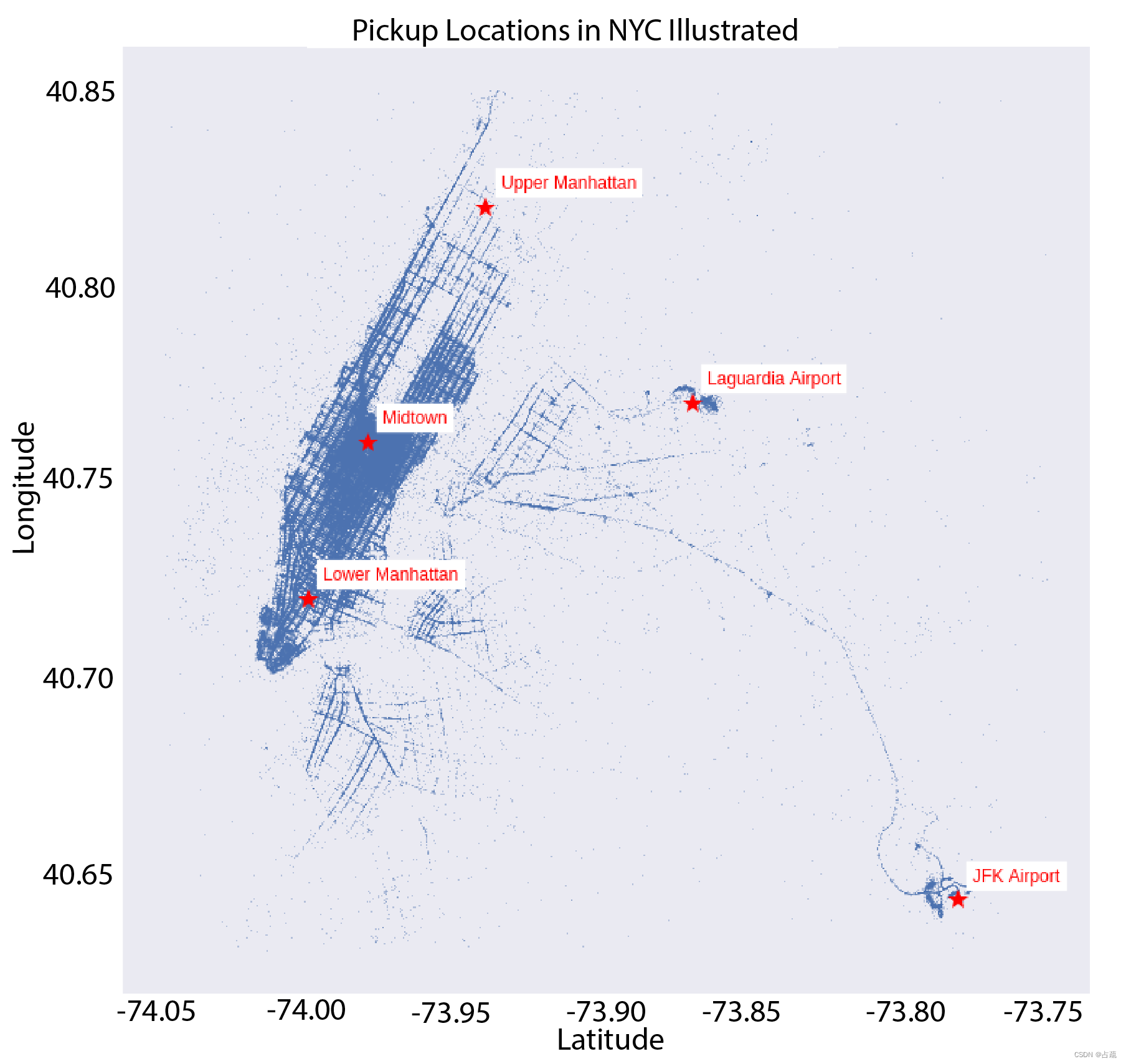
定义一个新的函数,它的输入是DataFrame, 在散点图上绘制乘客上车(或者下车)的地点的坐标。
同时绘制出纽约市的地标建筑。
显示上下车分布情况
import matplotlib
matplotlib.use("TkAgg")
import pandas as pd
import matplotlib.pyplot as plt
import numpy as np

df = pd.read_csv('NYC_taxi.csv', parse_dates=['pickup_datetime'], nrows=500000)  #导入数据时使用parse_datas参数,方便后面的处理

print(df.head())

## Visualizing Geolocation Data #############################################

# range of longitude for NYC
nyc_min_longitude = -74.05
nyc_max_longitude = -73.75

# range of latitude for NYC
nyc_min_latitude = 40.63
nyc_max_latitude = 40.85

df2 = df.copy(deep=True)
for long in ['pickup_longitude', 'dropoff_longitude']:
    df2 = df2[(df2[long] > nyc_min_longitude) & (df2[long] < nyc_max_longitude)]

for lat in ['pickup_latitude', 'dropoff_latitude']:
    df2 = df2[(df2[lat] > nyc_min_latitude) & (df2[lat] < nyc_max_latitude)]

landmarks = {'JFK Airport': (-73.78, 40.643),
             'Laguardia Airport': (-73.87, 40.77),
             'Midtown': (-73.98, 40.76),
             'Lower Manhattan': (-74.00, 40.72),
             'Upper Manhattan': (-73.94, 40.82),
             'Brooklyn': (-73.95, 40.66)}


def plot_lat_long(df, landmarks, points='Pickup'):
    plt.figure(figsize=(12, 12))  # set figure size
    if points == 'Pickup':
        plt.plot(list(df.pickup_longitude), list(df.pickup_latitude), '.', markersize=1)#在地图上绘制上车点
    else:
        plt.plot(list(df.dropoff_longitude), list(df.dropoff_latitude), '.', markersize=1)#在地图上绘制下车点

    for landmark in landmarks:
        plt.plot(landmarks[landmark][0], landmarks[landmark][1], '*', markersize=15, alpha=1,color='r')  # 在地图上绘制建筑地标位置
        plt.annotate(landmark, (landmarks[landmark][0] + 0.005, landmarks[landmark][1] + 0.005), color='r',backgroundcolor='w')  # 为美观起见,在地标名称上添加0.005偏移量

    plt.title("{} Locations in NYC Illustrated".format(points))
    plt.grid(None) #隐藏网格线
    plt.xlabel("Latitude")
    plt.ylabel("Longitude")
    plt.show()


plot_lat_long(df2, landmarks, points='Pickup')

plot_lat_long(df2, landmarks, points='Drop Off')
一些基础:
plt.figure(figsize=(12, 12))? ? #设置图像大小
plt.plot(x, y)? ? ? ?x为x轴数据, y为y轴数据
?x, y可传入(元组), [列表], np.array, pd.Series
?plt.plot(x, y, "格式控制字符串", 关键字=参数)
markersize=1? ?点尺寸1?
color="r"? ? ? ? 点颜色红色
annotate(s,xy,?args,* kwargs) 用文本s? 注释点xy。
| color / backgroundcolor | 字体/背景色 |
plt.grid(None) # 隐藏网格线
结果输出:
 ?
?
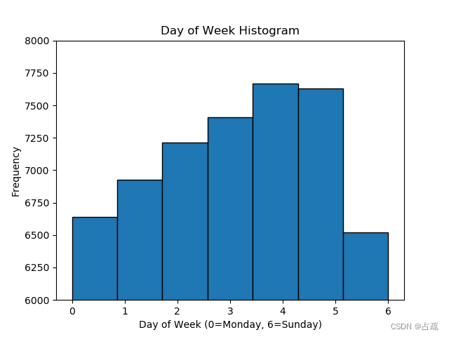
?全天及小时客流量
## Ridership by Day and Hour #############################################

df['year'] = df['pickup_datetime'].dt.year
df['month'] = df['pickup_datetime'].dt.month
df['day'] = df['pickup_datetime'].dt.day
df['day_of_week'] = df['pickup_datetime'].dt.dayofweek
df['hour'] = df['pickup_datetime'].dt.hour

df['day_of_week'].plot.hist(bins=7, ec='black', ylim=(6000, 8000))
plt.xlabel('Day of Week (0=Monday, 6=Sunday)')
plt.title('Day of Week Histogram')
plt.show()

df['hour'].plot.hist(bins=24, ec='black')
plt.title('Pickup Hour Histogram')
plt.xlabel('Hour')
plt.show()
输出结果:?
?
?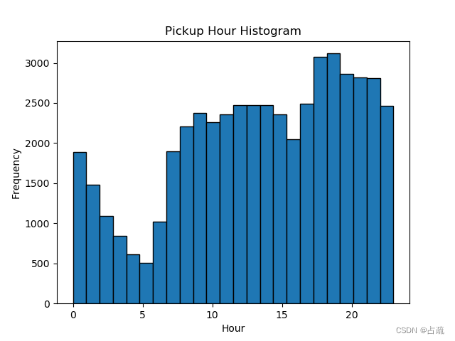
?基于上述分析,可以看到乘客打车数量和时间的关系.
全部代码:
import matplotlib

matplotlib.use("TkAgg")
import pandas as pd
import matplotlib.pyplot as plt
import numpy as np
from utils import preprocess

df = pd.read_csv('NYC_taxi.csv', parse_dates=['pickup_datetime'], nrows=500000)

print(df.head())

## Visualizing Geolocation Data #############################################

# range of longitude for NYC
nyc_min_longitude = -74.05
nyc_max_longitude = -73.75

# range of latitude for NYC
nyc_min_latitude = 40.63
nyc_max_latitude = 40.85

df2 = df.copy(deep=True)
for long in ['pickup_longitude', 'dropoff_longitude']:
    df2 = df2[(df2[long] > nyc_min_longitude) & (df2[long] < nyc_max_longitude)]

for lat in ['pickup_latitude', 'dropoff_latitude']:
    df2 = df2[(df2[lat] > nyc_min_latitude) & (df2[lat] < nyc_max_latitude)]

landmarks = {'JFK Airport': (-73.78, 40.643),
             'Laguardia Airport': (-73.87, 40.77),
             'Midtown': (-73.98, 40.76),
             'Lower Manhattan': (-74.00, 40.72),
             'Upper Manhattan': (-73.94, 40.82),
             'Brooklyn': (-73.95, 40.66)}


def plot_lat_long(df, landmarks, points='Pickup'):
    plt.figure(figsize=(12, 12))  # set figure size
    if points == 'Pickup':
        plt.plot(list(df.pickup_longitude), list(df.pickup_latitude), '.', markersize=1)
    else:
        plt.plot(list(df.dropoff_longitude), list(df.dropoff_latitude), '.', markersize=1)

    for landmark in landmarks:
        plt.plot(landmarks[landmark][0], landmarks[landmark][1], '*', markersize=15, alpha=1,
                 color='r')  # plot landmark location on map
        plt.annotate(landmark, (landmarks[landmark][0] + 0.005, landmarks[landmark][1] + 0.005), color='r',
                     backgroundcolor='w')  # add 0.005 offset on landmark name for aesthetics purposes

    plt.title("{} Locations in NYC Illustrated".format(points))
    plt.grid(None)
    plt.xlabel("Latitude")
    plt.ylabel("Longitude")
    plt.show()


plot_lat_long(df2, landmarks, points='Pickup')

plot_lat_long(df2, landmarks, points='Drop Off')

## Ridership by Day and Hour #############################################

df['year'] = df['pickup_datetime'].dt.year
df['month'] = df['pickup_datetime'].dt.month
df['day'] = df['pickup_datetime'].dt.day
df['day_of_week'] = df['pickup_datetime'].dt.dayofweek
df['hour'] = df['pickup_datetime'].dt.hour

df['day_of_week'].plot.hist(bins=7, ec='black', ylim=(6000, 8000))
plt.xlabel('Day of Week (0=Monday, 6=Sunday)')
plt.title('Day of Week Histogram')
plt.show()

df['hour'].plot.hist(bins=24, ec='black')
plt.title('Pickup Hour Histogram')
plt.xlabel('Hour')
plt.show()
参考:
plt.plot() 函数详解 - 知乎 (zhihu.com)
matplotlib:颜色、标记和线类型,刻度、标签和图例,注释与子图加工,将图片保存到文件,matplotlib 设置_matplotlib 色标注释-CSDN博客
python神经网路实战项目笔记
本文来自互联网用户投稿,该文观点仅代表作者本人,不代表本站立场。本站仅提供信息存储空间服务,不拥有所有权,不承担相关法律责任。 如若内容造成侵权/违法违规/事实不符,请联系我的编程经验分享网邮箱:chenni525@qq.com进行投诉反馈,一经查实,立即删除!