uView picker组件多选
发布时间:2024年01月16日
最近写项目遇到一个需求,手机端(uniapp H5)下拉选需要多选,用的是uView组件库,但是原有的picker组件并没有这个功能,索性自己上手了,简单封装一下。
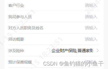
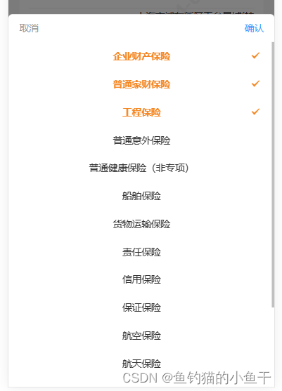
1. 效果图
2. 使用方法
<template>
	<view>
		// 这里我用到的值就是 name 的拼接字符串 value,如果需要 code 集合,则需要调用 confirm方法 获取
		<g-picker v-model="value" :columns="columns" :filter="filter" @confirm="confirm">
		</g-picker>
	</view>
</template>

<script>
	export default {
		data() {
			return {
				value: "",
				columns: [],
				filter: { label: 'dictLabel', value: 'dictValue' }
			}
		},
		methods: {
			confirm(data, code, name) {
				console.log(data, code, name)
			}
		}
	}
</script>
3. 使用说明
props:
- value:picker组件绑定值,默认 name 用,拼接
- columns: 数据源
- filter:数据显示格式化,label 为组件显示名称 name字段(默认为label),value 为数据相对应的 code 字段(默认为value)
- disabled:是否禁用
- activedColor:选中后的颜色
- inputAlign:文本对齐方式
- placeholder:默认提示
Events:
- confirm:点击确定按钮触发。(data, code, name) => {}
- data:选中的数据集合
- code:选中的数据 code 集合
- name:选中的数据 name 集合
4. 源码
- 直接在 components 里面创建相同的文件夹和文件名,这样可以省去注册步骤直接引用。
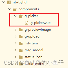
- g-picker.vue
<style lang="scss" scoped>
	.g-picker {

		.g-picker-value {
			display: flex;
		}

		.g-picker-con {
			color: #333;
			font-size: 28rpx;

			.g-picker-operate {
				display: flex;
				align-items: center;
				justify-content: space-between;
				height: 80rpx;
				padding: 0 32rpx;

				text {
					color: #999;

					&:last-child {
						color: #3c9cff;
					}
				}
			}

			.g-picker-list {
				min-height: 30vh;
				max-height: 60vh;
				overflow-y: scroll;

				.g-picker-item {
					position: relative;
					width: 100%;
					height: 80rpx;

					.g-picker-item_label {
						width: 66%;
						margin: 0 auto;
						text-align: center;
						line-height: 80rpx;
						white-space: nowrap;
						text-overflow: ellipsis;
						overflow: hidden;
					}

					.g-picker-item--actived {
						font-weight: 600;
					}

					.g-picker-item_icon {
						position: absolute;
						top: 50%;
						right: 40rpx;
						transform: translateY(-50%);
					}
				}
			}
		}
	}
</style>
<template>
	<view class="g-picker">
		<view class="g-picker-value" @click.native="showPicker">
			<u-input v-model="value" disabled disabledColor="#fff" :inputAlign="inputAlign" :placeholder="placeholder">
			</u-input>
			<u-icon v-if="!disabled" name="arrow-right" color="#c0c4cc"></u-icon>
		</view>
		<u-popup :show="show" :round="6" mode="bottom">
			<view class="g-picker-con">
				<view class="g-picker-operate">
					<text @click="show = false">取消</text>
					<text @click="confirm">确认</text>
				</view>
				<view class="g-picker-list">
					<view class="g-picker-item" v-for="(col, inx) in columnsList" :key="inx"
						@click="checkItem(col, inx)">
						<view :class="['g-picker-item_label', col._check ? 'g-picker-item--actived' : '']"
							:style="{color: col._check ? activedColor : '#333'}">{{ col[filter.label] }}</view>
						<u-icon class="g-picker-item_icon" v-show="col._check" name="checkbox-mark"
							:color="activedColor"></u-icon>
					</view>
				</view>
			</view>
		</u-popup>
	</view>
</template>

<script>
	export default {
		model: {
			prop: 'value',
			event: 'change'
		},
		props: {
			// picker组件绑定值,默认 name 用,拼接
			value: {
				type: String,
				default: ""
			},
			// 数据源
			columns: {
				type: Array,
				default: () => {
					return []
				}
			},
			// 数据显示格式化
			filter: {
				type: Object,
				default: () => {
					return {
						label: 'label',
						value: 'value'
					}
				}
			},
			// 是否禁用
			disabled: {
				type: Boolean,
				default: false
			},
			// 选中后颜色
			activedColor: {
				type: String,
				default: "#F58621"
			},
			// 文本对齐方式
			inputAlign: {
				type: String,
				default: "right"
			},
			// 默认提示
			placeholder: {
				type: String,
				default: "请选择"
			}
		},
		data() {
			return {
				show: false,
				columnsList: [],
				value_chx: []
			}
		},
		watch: {
			value: {
				handler(n) {
					if (n) this.reShow();
				},
				immediate: true
			},
			columns: {
				handler(n) {
					if (n.length) {
						this.columnsList = n
						for (let val of this.columnsList) {
							this.$set(val, '_check', false)
						}
					}
				},
				immediate: true
			}
		},
		methods: {
			showPicker() {
				if (this.disabled) return
				this.show = true
			},
			reShow() {
				let data = this.value.split(",")
				setTimeout(() => {
					for (let val of this.columnsList) {
						if (data.includes(val[this.filter.label])) val._check = true
					}
				}, 100)
			},
			checkItem(col, inx) {
				col._check = !col._check
			},
			// close() {
			// 	this.show = false
			// 	this.$emit("close")
			// },
			confirm() {
				let code = [],
					name = []
				this.value_chx = this.columns.filter(v => v._check)
				for (let val of this.value_chx) {
					code.push(val[this.filter.value_chx])
					name.push(val[this.filter.label])
				}
				this.show = false
				this.$emit('confirm', this.value_chx, code, name)
				this.$emit('change', name.join(","))
			}
		}
	}
</script>
封装的比较简单,够我目前使用,大家可以根据自己的需求修改。
文章来源:https://blog.csdn.net/weixin_62234646/article/details/135606438
本文来自互联网用户投稿,该文观点仅代表作者本人,不代表本站立场。本站仅提供信息存储空间服务,不拥有所有权,不承担相关法律责任。 如若内容造成侵权/违法违规/事实不符,请联系我的编程经验分享网邮箱:chenni525@qq.com进行投诉反馈,一经查实,立即删除!
本文来自互联网用户投稿,该文观点仅代表作者本人,不代表本站立场。本站仅提供信息存储空间服务,不拥有所有权,不承担相关法律责任。 如若内容造成侵权/违法违规/事实不符,请联系我的编程经验分享网邮箱:chenni525@qq.com进行投诉反馈,一经查实,立即删除!
最新文章
- Python教程
- 深入理解 MySQL 中的 HAVING 关键字和聚合函数
- Qt之QChar编码(1)
- MyBatis入门基础篇
- 用Python脚本实现FFmpeg批量转换
- 2023年摄影摄像行业市场分析(电商平台数据查询):微单销额增长68%,单反市场下滑20%
- 多商户入驻系统APP源码系统:功能强大+分销+秒杀+拼团+砍价+优惠券+完整的安装代码包以及搭建教程
- 统信UOS桌面操作系统教育版的安装方法
- Transform模型详解
- RTSP和RTMP协议有什么区别?RTSP为什么常用于安防监控摄像头行业,而视频直播却只使用RTMP推流?
- 实用类介绍
- CUDA编程
- Android MVI架构之UI状态的持有与保存
- 【React】常见疑问的整理
- 算法训练营Day48(动态规划9)