Matplotlib_布局格式定方圆
发布时间:2023年12月30日
一、子图
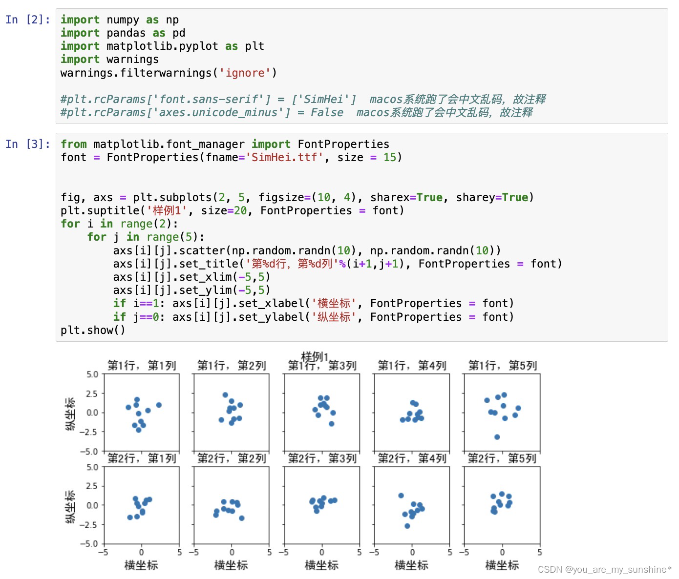
1.使用 plt.subplots 绘制均匀状态下的子图
返回元素分别是画布和子图构成的列表,第一个数字为行,第二个为列
figsize 参数可以指定整个画布的大小
sharex 和 sharey 分别表示是否共享横轴和纵轴刻度
tight_layout 函数可以调整子图的相对大小使字符不会重叠
import numpy as np
import pandas as pd
import matplotlib.pyplot as plt
import warnings
warnings.filterwarnings('ignore')

#plt.rcParams['font.sans-serif'] = ['SimHei']  macos系统跑了会中文乱码,故注释
#plt.rcParams['axes.unicode_minus'] = False  macos系统跑了会中文乱码,故注释


from matplotlib.font_manager import FontProperties
font = FontProperties(fname='SimHei.ttf', size = 15)


fig, axs = plt.subplots(2, 5, figsize=(10, 4), sharex=True, sharey=True)
plt.suptitle('样例1', size=20, FontProperties = font)
for i in range(2):
    for j in range(5):
        axs[i][j].scatter(np.random.randn(10), np.random.randn(10))
        axs[i][j].set_title('第%d行,第%d列'%(i+1,j+1), FontProperties = font)
        axs[i][j].set_xlim(-5,5)
        axs[i][j].set_ylim(-5,5)
        if i==1: axs[i][j].set_xlabel('横坐标', FontProperties = font)
        if j==0: axs[i][j].set_ylabel('纵坐标', FontProperties = font)
plt.show()
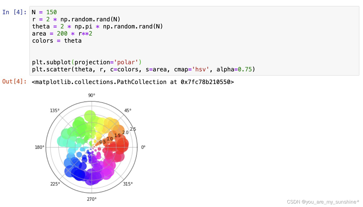
除了常规的直角坐标系,也可以通过projection方法创建极坐标系下的图表
N = 150
r = 2 * np.random.rand(N)
theta = 2 * np.pi * np.random.rand(N)
area = 200 * r**2
colors = theta


plt.subplot(projection='polar')
plt.scatter(theta, r, c=colors, s=area, cmap='hsv', alpha=0.75)
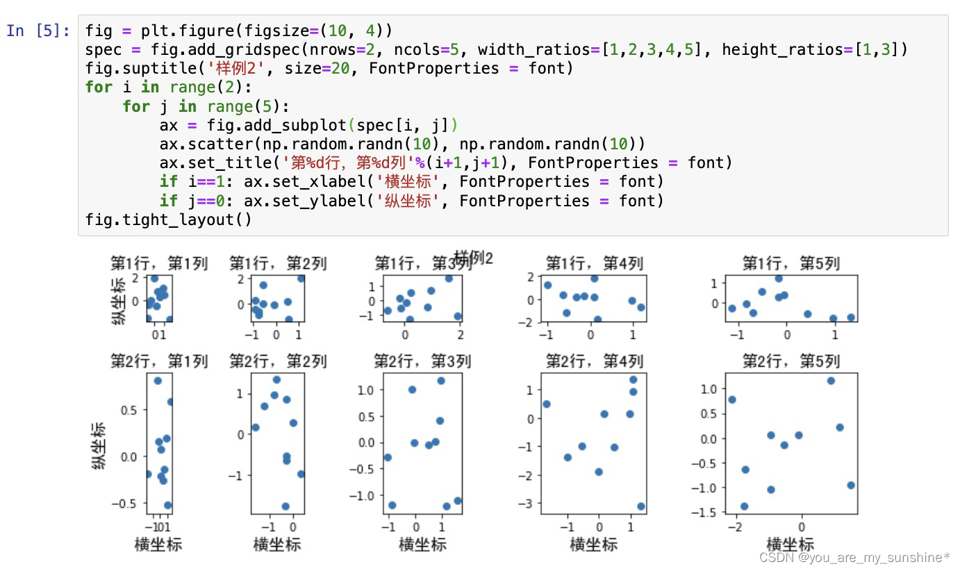
2.使用 GridSpec 绘制非均匀子图
所谓非均匀包含两层含义,第一是指图的比例大小不同但没有跨行或跨列,第二是指图为跨列或跨行状态
利用 add_gridspec 可以指定相对宽度比例 width_ratios 和相对高度比例参数 height_ratios
fig = plt.figure(figsize=(10, 4))
spec = fig.add_gridspec(nrows=2, ncols=5, width_ratios=[1,2,3,4,5], height_ratios=[1,3])
fig.suptitle('样例2', size=20, FontProperties = font)
for i in range(2):
    for j in range(5):
        ax = fig.add_subplot(spec[i, j])
        ax.scatter(np.random.randn(10), np.random.randn(10))
        ax.set_title('第%d行,第%d列'%(i+1,j+1), FontProperties = font)
        if i==1: ax.set_xlabel('横坐标', FontProperties = font)
        if j==0: ax.set_ylabel('纵坐标', FontProperties = font)
fig.tight_layout()
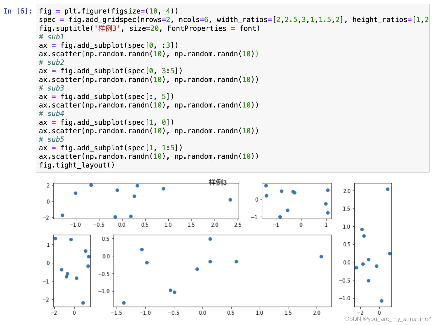
在上面的例子中出现了 spec[i, j] 的用法,事实上通过切片就可以实现子图的合并而达到跨图的共能
fig = plt.figure(figsize=(10, 4))
spec = fig.add_gridspec(nrows=2, ncols=6, width_ratios=[2,2.5,3,1,1.5,2], height_ratios=[1,2])
fig.suptitle('样例3', size=20, FontProperties = font)
# sub1
ax = fig.add_subplot(spec[0, :3])
ax.scatter(np.random.randn(10), np.random.randn(10))
# sub2
ax = fig.add_subplot(spec[0, 3:5])
ax.scatter(np.random.randn(10), np.random.randn(10))
# sub3
ax = fig.add_subplot(spec[:, 5])
ax.scatter(np.random.randn(10), np.random.randn(10))
# sub4
ax = fig.add_subplot(spec[1, 0])
ax.scatter(np.random.randn(10), np.random.randn(10))
# sub5
ax = fig.add_subplot(spec[1, 1:5])
ax.scatter(np.random.randn(10), np.random.randn(10))
fig.tight_layout()
二、子图上的方法
在 ax 对象上定义了和 plt 类似的图形绘制函数,常用的有: plot, hist, scatter, bar, barh, pie
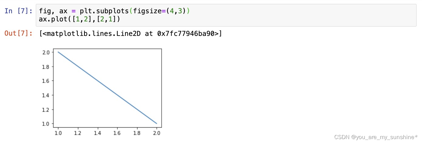
fig, ax = plt.subplots(figsize=(4,3))
ax.plot([1,2],[2,1])
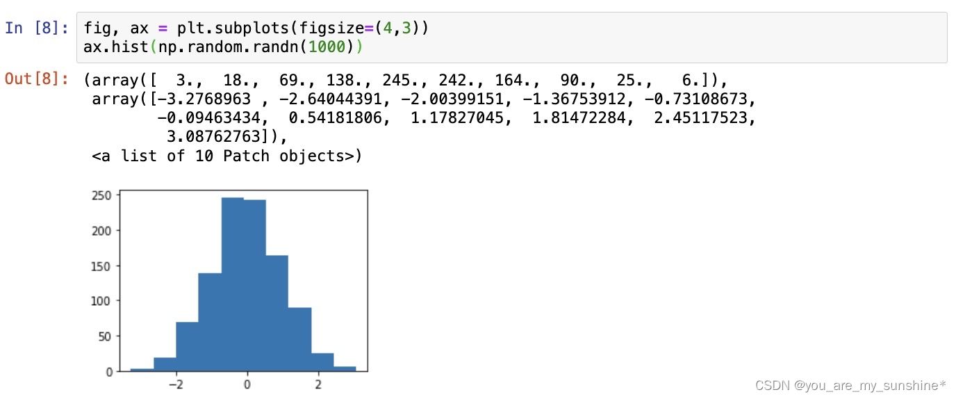
fig, ax = plt.subplots(figsize=(4,3))
ax.hist(np.random.randn(1000))
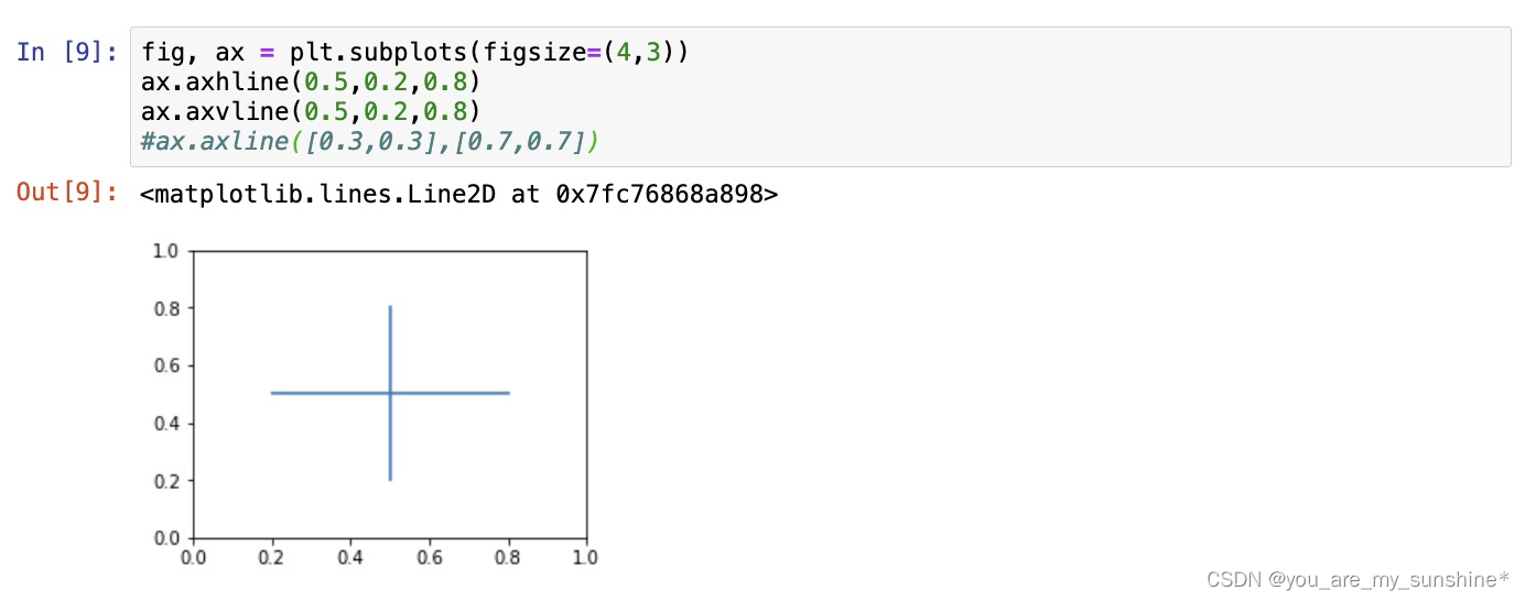
常用直线的画法为: axhline, axvline, axline (水平、垂直、任意方向)
fig, ax = plt.subplots(figsize=(4,3))
ax.axhline(0.5,0.2,0.8)
ax.axvline(0.5,0.2,0.8)
#ax.axline([0.3,0.3],[0.7,0.7])#显示无axline,大概率是当前Matplotlib版本运行不了,故注释
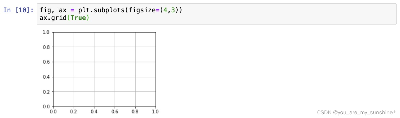
使用 grid 可以加灰色网格
fig, ax = plt.subplots(figsize=(4,3))
ax.grid(True)
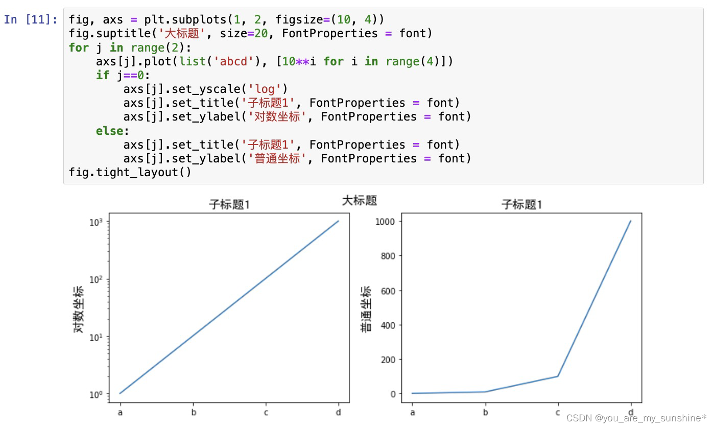
使用 set_xscale, set_title, set_xlabel 分别可以设置坐标轴的规度(指对数坐标等)、标题、轴名
fig, axs = plt.subplots(1, 2, figsize=(10, 4))
fig.suptitle('大标题', size=20, FontProperties = font)
for j in range(2):
    axs[j].plot(list('abcd'), [10**i for i in range(4)])
    if j==0:
        axs[j].set_yscale('log')
        axs[j].set_title('子标题1', FontProperties = font)
        axs[j].set_ylabel('对数坐标', FontProperties = font)
    else:
        axs[j].set_title('子标题1', FontProperties = font)
        axs[j].set_ylabel('普通坐标', FontProperties = font)
fig.tight_layout()
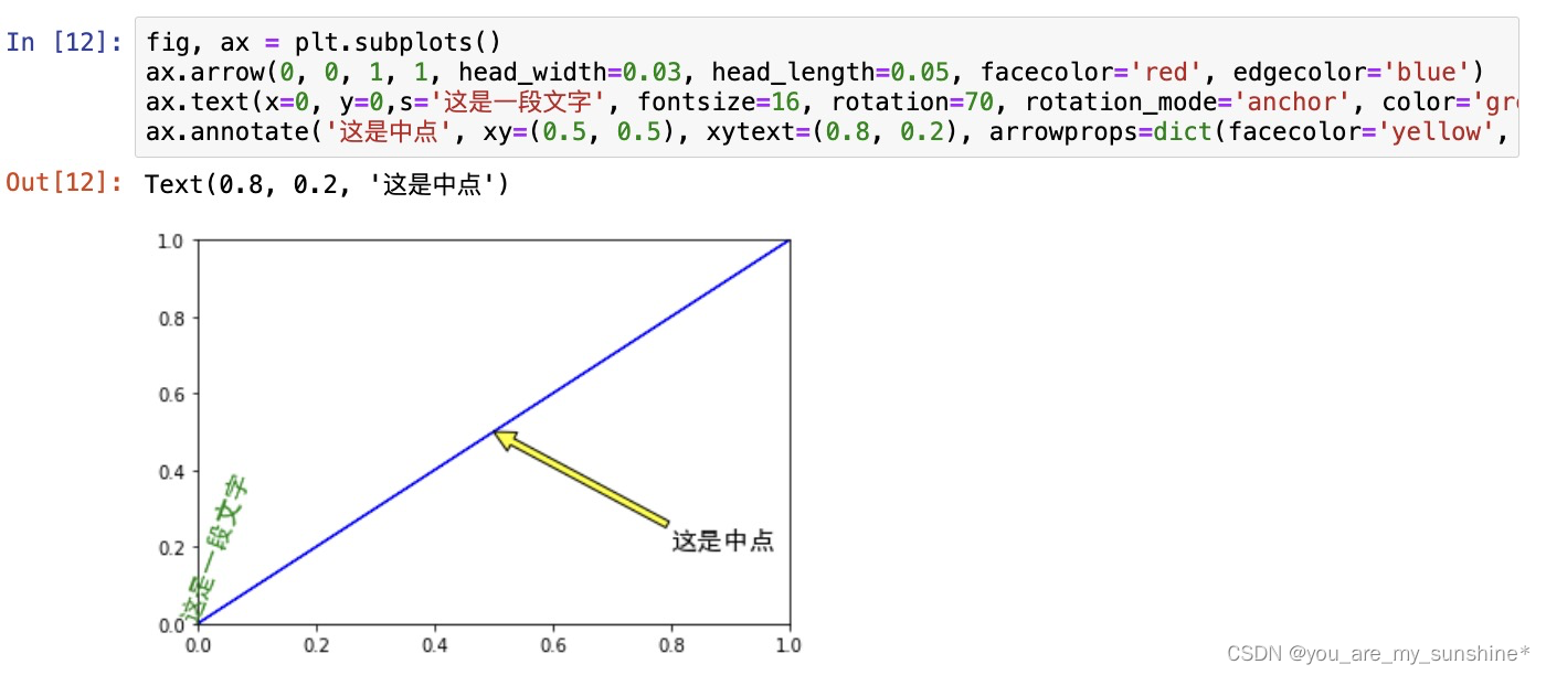
与一般的 plt 方法类似, legend, annotate, arrow, text 对象也可以进行相应的绘制
fig, ax = plt.subplots()
ax.arrow(0, 0, 1, 1, head_width=0.03, head_length=0.05, facecolor='red', edgecolor='blue')
ax.text(x=0, y=0,s='这是一段文字', fontsize=16, rotation=70, rotation_mode='anchor', color='green', FontProperties = font)
ax.annotate('这是中点', xy=(0.5, 0.5), xytext=(0.8, 0.2), arrowprops=dict(facecolor='yellow', edgecolor='black'), fontsize=16, FontProperties = font)
fig, ax = plt.subplots()
ax.plot([1,2],[2,1],label="line1")
ax.plot([1,1],[1,2],label="line1")
ax.legend(loc=1)
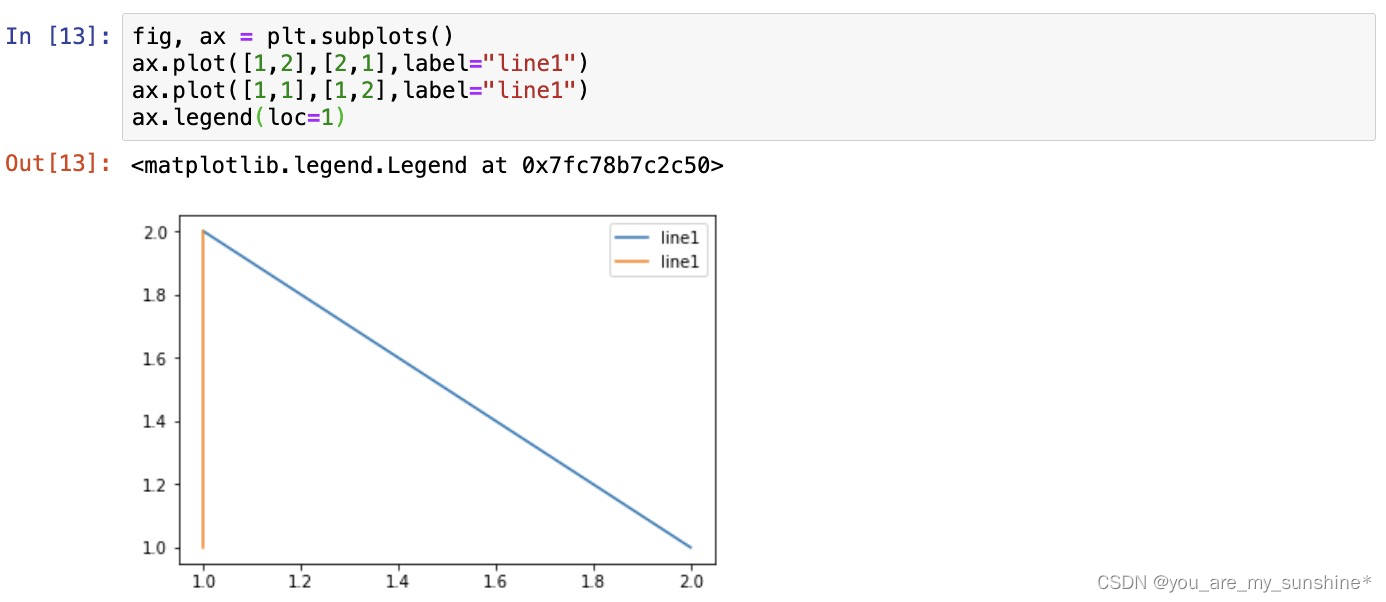
其中,图例的 loc 参数如下:
string code
best 0
upper right 1
upper left 2
lower left 3
lower right 4
right 5
center left 6
center right 7
lower center 8
upper center 9
center 10
文章来源:https://blog.csdn.net/weixin_42504788/article/details/135207087
本文来自互联网用户投稿,该文观点仅代表作者本人,不代表本站立场。本站仅提供信息存储空间服务,不拥有所有权,不承担相关法律责任。 如若内容造成侵权/违法违规/事实不符,请联系我的编程经验分享网邮箱:chenni525@qq.com进行投诉反馈,一经查实,立即删除!
本文来自互联网用户投稿,该文观点仅代表作者本人,不代表本站立场。本站仅提供信息存储空间服务,不拥有所有权,不承担相关法律责任。 如若内容造成侵权/违法违规/事实不符,请联系我的编程经验分享网邮箱:chenni525@qq.com进行投诉反馈,一经查实,立即删除!
最新文章
- Python教程
- 深入理解 MySQL 中的 HAVING 关键字和聚合函数
- Qt之QChar编码(1)
- MyBatis入门基础篇
- 用Python脚本实现FFmpeg批量转换
- Openwrt修改Dropbear ssh root密码
- 2024.1.9每日一题
- 揭露欧拉骗局4.“Σ1/n2=π2/6”里的猫腻
- 003-90-09【RDD-Actions】法华寺山门前梅林深处许姓人家女儿小白用GPT学习Spark的reduce && reduceByKey
- 认识YAML和Propertis
- 论文感悟~
- Qt基础-QWidget背景图片设计时显示正常运行无法显示
- 【Simulink教程案例60】基于强化学习的自适应PID控制器simulink建模与仿真
- 手麻、腿麻、麻痛…背后竟隐藏7大疾病!多一个人知道,少一个悲剧!
- kubeadm