基础绘图篇 | 核密度估计图绘制(R+Python)
发布时间:2024年01月21日
前面介绍了基础直方图的绘制教程,接下来,同样分享一篇关于数据分布的基础图表绘制-核密度估计图。具体含义我们这里就不作多解释,大家可以自行百度啊,这里我们主要讲解R-python绘制该图的方法。本期知识点主要如下:
-
R-ggplot2.geom_density()绘制方法
-
Python-seaborn.kdeplot()绘制方法
-
各自方法的图片元素添加
R-ggplot2.geom_density()绘制方法
我们还是使用前几期绘制的数据,关注公众号DataCharm,后台回复柱形图 ,即可获取练习数据啦。这里给出部分数据的预览,如下:
这里直接给出绘图代码:
library(ggtext)
library(hrbrthemes)
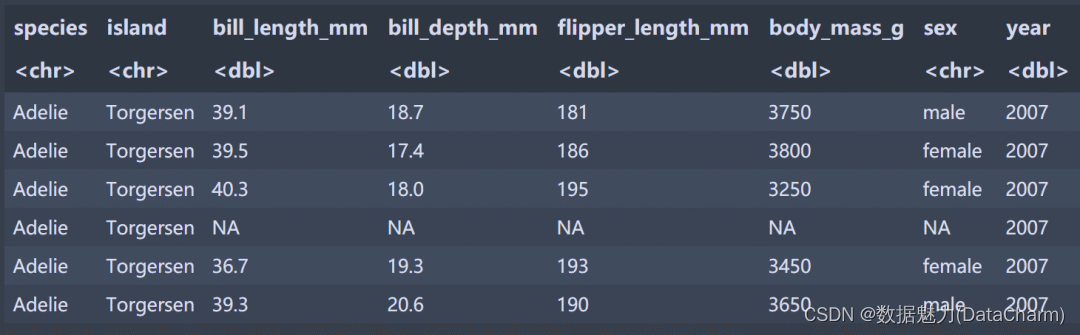
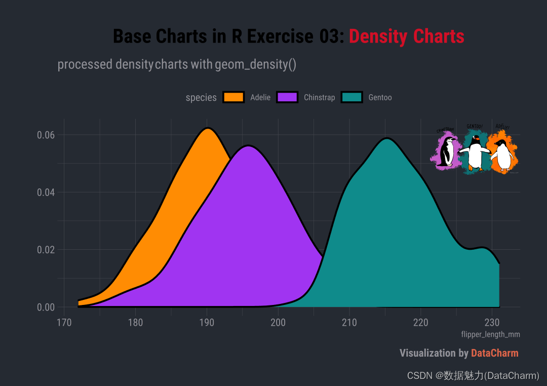
flipper_density?<-?ggplot(data?=?data,aes(x?=?flipper_length_mm))?+
??geom_density(aes(fill=species),colour="black",size=1)+
??scale_fill_manual(values?=?c('#FF8C03',"#A034F1","#0F8B8B"))?+
??guides(fill?=?guide_legend(nrow?=?1))?+?
??labs(y="",
???????title?=?"Base?Charts?in?R?Exercise?03:?<span style='color:#D20F26'>Density?Charts</span>",
???????subtitle?=?"processed?density?charts?with?geom_density()",
???????caption?=?"Visualization?by?<span style='color:#DD6449'>DataCharm</span>")?+
??theme_ipsum(base_family?=?"Roboto?Condensed")?+
??theme(
????????plot.title?=?element_markdown(hjust?=?0.5,vjust?=?.5,color?=?"black",
?????????????????????????????size?=?22,?margin?=?margin(t?=?1,?b?=?12)),
????????plot.subtitle?=?element_markdown(hjust?=?0,vjust?=?.5,size=15),
????????plot.caption?=?element_markdown(face?=?'bold',size?=?12),
????????#legend.position?=?c(.1,?.1),?
????????legend.position?=?"top",
????????legend.direction?=?"horizontal",?
????????#legend.justification?=?"right",
????????legend.key.width?=?unit(1.8,?"lines"),?
????????legend.key.height?=?unit(1,?"lines"),
??)
可视化结果如下:
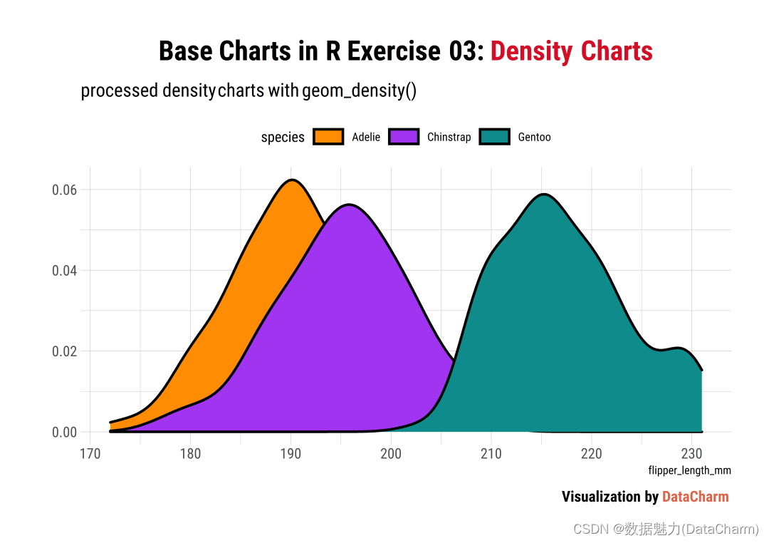
更换主题
通过如下代码,更换成“暗黑主题”:
theme_ft_rc()?+
注意:
theme_ft_rc() 和* theme_ipsum()* 都来自功能强大的 hrbrthemes 绘图主题包哦,大家可以重点掌握哦。 结果如下:
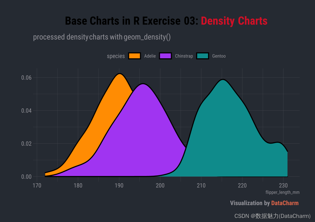
添加图片美化
该方法前几篇推文呢都有介绍,这里不再累赘,直接给出代码:
#读取图片
library(png)
library(grid)
img_file?<-?"lter_penguins.png"
img?<-?png::readPNG(img_file)
i1?<-?grid::rasterGrob(img,?interpolate?=?T)

flipper_density_img?<-?flipper_density?+
????annotation_custom(i1,?ymin?=?.045,?ymax?=?.065,?xmin?=?220,?xmax?=?235)
效果如下:
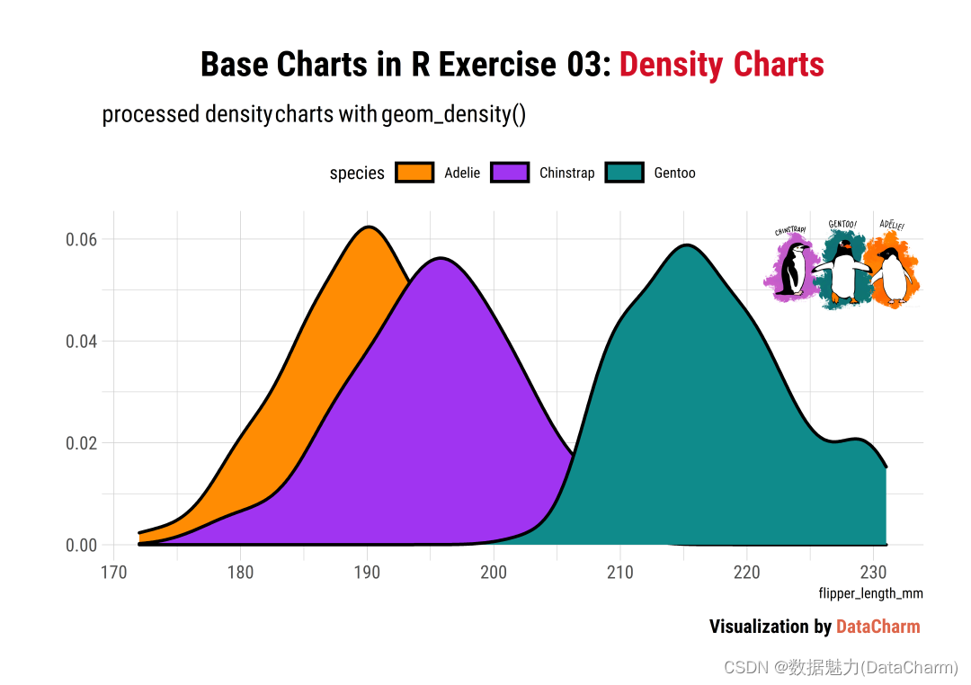
暗黑主题的图片添加,效果如下:
Python-seaborn 绘制
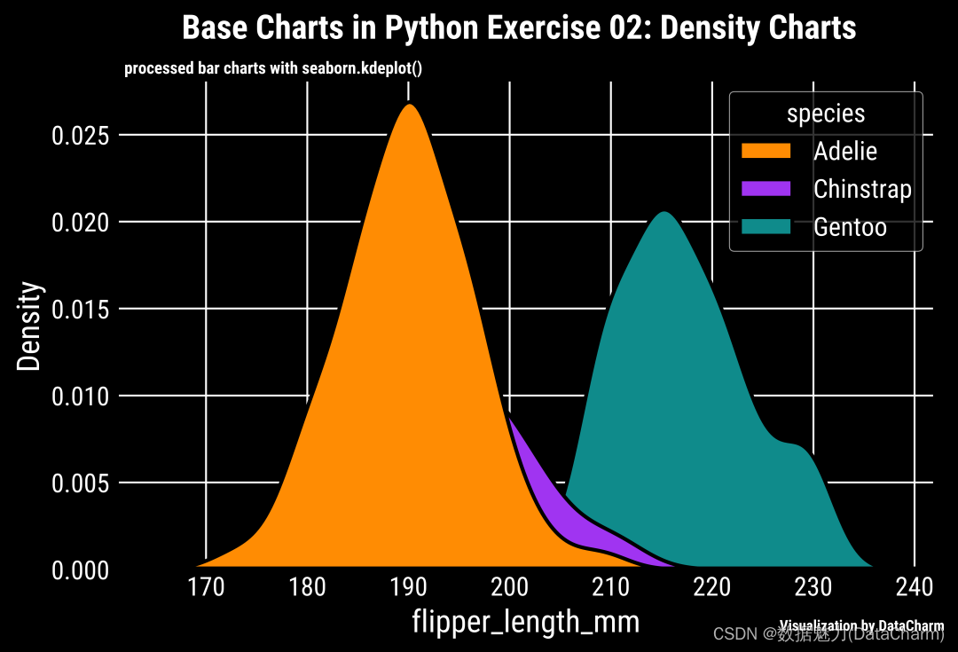
还是使用集成功能强大的seaborn绘图包,我们直接给出代码:
import?pandas?as?pd
import?numpy?as?np
import?matplotlib.pyplot?as?plt
import?seaborn?as?sns

fig,ax?=?plt.subplots(figsize=(7,4.5),dpi=200)

palette?=?['#FF8C03',"#A034F1","#0F8B8B"]
sns.kdeplot(data=data,x="flipper_length_mm",hue="species",palette=palette,alpha=1,
????????????hue_order=["Adelie","Chinstrap","Gentoo"],fill=True,edgecolor="black",
????????????linewidth=2,ax=ax)

#title
ax.text(.08,1.1,"Base?Charts?in?Python?Exercise?02:?Density?Charts",
???????transform?=?ax.transAxes,color='k',ha='left',va='center',size=18,fontweight='extra?bold')
#subtitle
ax.text(.01,1.02,"processed?bar?charts?with?seaborn.kdeplot()",
???????transform?=?ax.transAxes,color='k',ha='left',va='center',size=9,fontweight='bold')
#caption
ax.text(.91,-.1,'\nVisualization?by?DataCharm',transform?=?ax.transAxes,
????????ha='center',?va='center',fontsize?=?8,color='black',fontweight='bold')
结果如下:

更换主题
通过添加如下代码完成:
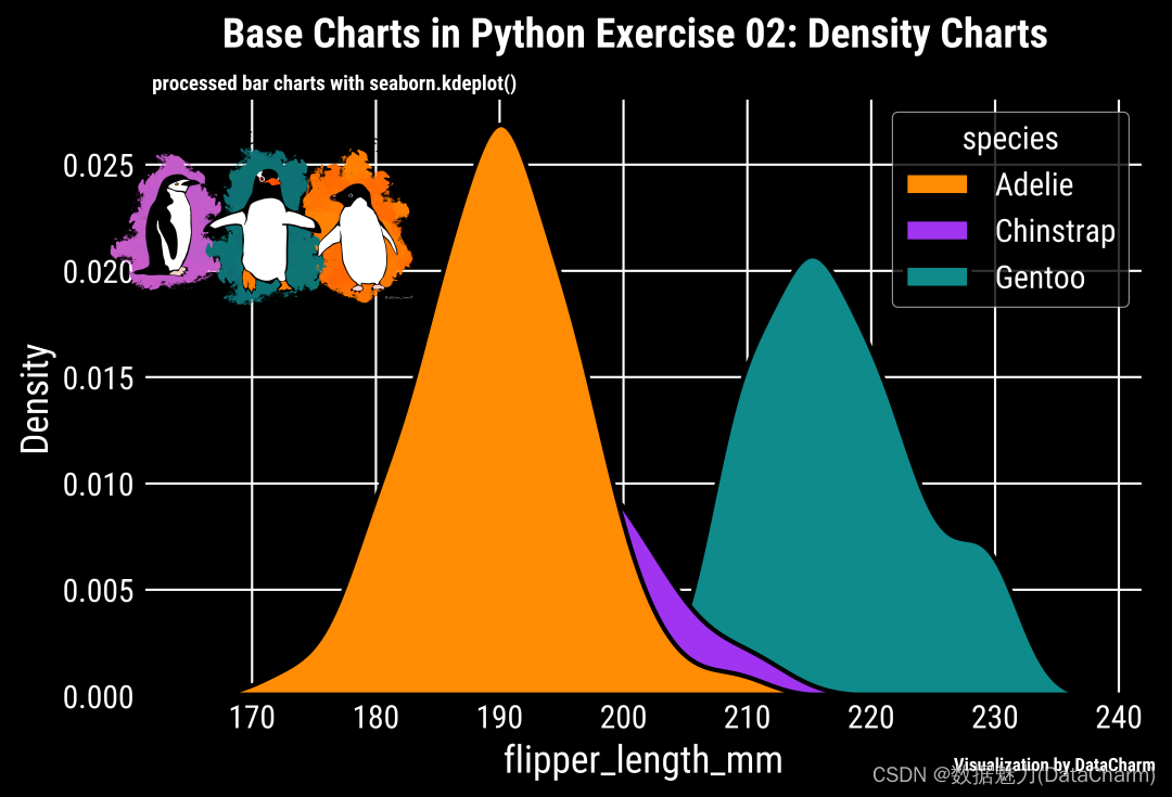
plt.style.use('dark_background')
可视化效果如下:
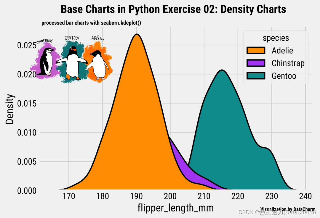
添加图片美化
这部分是对绘图结果进行美化操作,大家可以尝试以下。直接给出添加图片的代码:
from?mpl_toolkits.axes_grid1.inset_locator?import?inset_axes

#添加图片
aximins?=?inset_axes(ax,width=2,height=2,
??????????????????????bbox_to_anchor=(.1,?.55,?.2,?.6),?#[left,?bottom,?width,?height],
??????????????????????bbox_transform=ax.transAxes)
im?=?aximins.imshow(image,zorder=0)
aximins.axis('off')
将以上代码加入之前的代码即可。最终的效果如下:
暗黑风格的图片添加效果如下:
总结
本期将R-ggplot2绘图和Python-seaborn 进行了汇总整理,一方面因为内容较为基础,另一方面,大家也可以对比下R-ggplot2系列 和Python-matplotlib系列绘图。大家可以根据自己喜好选择适合自己的绘图工具。
文章来源:https://blog.csdn.net/qq_40483688/article/details/135599669
本文来自互联网用户投稿,该文观点仅代表作者本人,不代表本站立场。本站仅提供信息存储空间服务,不拥有所有权,不承担相关法律责任。 如若内容造成侵权/违法违规/事实不符,请联系我的编程经验分享网邮箱:chenni525@qq.com进行投诉反馈,一经查实,立即删除!
本文来自互联网用户投稿,该文观点仅代表作者本人,不代表本站立场。本站仅提供信息存储空间服务,不拥有所有权,不承担相关法律责任。 如若内容造成侵权/违法违规/事实不符,请联系我的编程经验分享网邮箱:chenni525@qq.com进行投诉反馈,一经查实,立即删除!
最新文章
- Python教程
- 深入理解 MySQL 中的 HAVING 关键字和聚合函数
- Qt之QChar编码(1)
- MyBatis入门基础篇
- 用Python脚本实现FFmpeg批量转换
- mysql基础演练
- 如何才能拥有比特币 - 01 ?
- 已解决 ValueError: Data cardinality is ambiguous 问题
- 基于微信小程序的毕业设计——学生选课系统(附源码+论文)
- 【小沐学Python】Python实现通信协议(grpc)
- APP启动流程
- yum配置文件及NFS共享
- Postgresql中PL/pgSQL代码块的语法与使用-声明与赋值、IF语句、CASE语句、循环语句
- 【排序算法总结】
- 一文带你掌握Flutter dio网络请求库的封装