有趣的css
发布时间:2023年12月31日
1.旋转小动画(loading)
<script  lang="ts" setup></script>
<template>
    <div id="background-wrapper">
        <div class="annot"></div>
    </div>
</template>
<style lang="scss" scoped>
#background-wrapper {
    display: flex;
    justify-content: center;
    align-items: center;

    .annot {
        position: relative;
        width: 150px;
        height: 150px;
        margin-top: 60px;
        animation: skin 2s linear infinite;
        border: 3px solid transparent;
        border-radius: 50%;
        border-top-color: #ccc;
        z-index: 2;

        &::before {
            content: "";
            position: absolute;
            top: 5px;
            left: 5px;
            right: 5px;
            bottom: 5px;
            border-radius: 50%;
            border: 3px solid transparent;
            animation: skin-reverse  .6s linear infinite;
            border-top-color: #c02020;
        }

        &::after {
            content: "";
            position: absolute;
            top: 15px;
            left: 15px;
            right: 15px;
            bottom: 15px;
            border-radius: 50%;
            border: 3px solid transparent;
            animation: skin 1s linear infinite;
            border-top-color: #38dd43;
        }

    }


    @keyframes skin {
        0% {
            transform: rotate(0deg);
        }

        100% {
            transform: rotate(360deg);
        }
    }

    @keyframes skin-reverse {
        0% {
            transform: rotate(0deg);
        }

        100% {
            transform: rotate(-360deg);
        }
    }
}
</style>
2.菱形?
.wrapper {
 width: 200px;
height:  200px;
transform: rotate(45deg);
background:#fff;
overflow: hidden;
 }

.wrapper > img{
transform: rotate(-45deg) scale(2);
width: 100%;
height: auto;
}
?3.切角效果
#缺角

background: #58a;
background:linear-gradient(-45deg, transparent 30px, #58a 0);

#双拼色

background: #58a;
background:
linear-gradient(-45deg, transparent 15px, #58a 0) right,
linear-gradient(45deg, transparent 15px, #655 0) left;
background-size: 50% 100%;
background-repeat: no-repeat;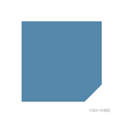

弧形切角?
background:
radial-gradient(circle at top left,transparent 15px, #58a 0) top left,
radial-gradient(circle at top right,
transparent 15px, #58a 0) top right,
radial-gradient(circle at bottom right,
transparent 15px, #58a 0) bottom right,
 radial-gradient(circle at bottom left,
 transparent 15px, #58a 0) bottom left;
background-size: 50% 50%;
background-repeat: no-repeat;
4.染色效果
网页灰度:默哀效果
| grayscale(%) | 将图像转换为灰度图像。值定义转换的比例。值为100%则完全转为灰度图像,值为0%图像无变化。值在0%到100%之间,则是效果的线性乘子。若未设置,值默认是0; |
filter: grayscale(90%);5.毛玻璃效果
background-color: rgba(225, 225, 225, 0.2);
backdrop-filter: blur(8px);
box-shadow:0 0 6px rgba(255, 255, 255, 0.2);
5.文字换行连接符?
hyphens: none|manual|auto|initial|inherit;
| none | 单词不用连字符(不换行)。 |
| manual | 默认。单词只在 ‐ 或 ­ 处有连字符(如果需要)。 |
| auto | 在算法确定的位置插入单词连字符(如果需要)。 |
| initial | 将此属性设置为其默认值。参阅?initial。 |
| inherit | 从其父元素继承此属性。参阅?inherit。 |
6.打字机效果
<div class="container">
<div class="typed-out">应该记住我们的事业,需要的是手而不是嘴。 </div>
</div>

只要添加一个一定步长,正的输出一遍,反着输出一遍,然后无限循环

 .typed-out{

    animation: typing 5s steps(20, end) alternate infinite;
}
@keyframes typing {
from {
width: 0;
}
to {
width: 100%;
}
}
?
文章来源:https://blog.csdn.net/2301_82255230/article/details/135267073
本文来自互联网用户投稿,该文观点仅代表作者本人,不代表本站立场。本站仅提供信息存储空间服务,不拥有所有权,不承担相关法律责任。 如若内容造成侵权/违法违规/事实不符,请联系我的编程经验分享网邮箱:chenni525@qq.com进行投诉反馈,一经查实,立即删除!
本文来自互联网用户投稿,该文观点仅代表作者本人,不代表本站立场。本站仅提供信息存储空间服务,不拥有所有权,不承担相关法律责任。 如若内容造成侵权/违法违规/事实不符,请联系我的编程经验分享网邮箱:chenni525@qq.com进行投诉反馈,一经查实,立即删除!
最新文章
- Python教程
- 深入理解 MySQL 中的 HAVING 关键字和聚合函数
- Qt之QChar编码(1)
- MyBatis入门基础篇
- 用Python脚本实现FFmpeg批量转换
- 【JAVA】泛型和Object的区别
- centos7 arm服务器编译安装PaddlePaddle
- 用katalon解决接口/自动化测试拦路虎--参数化
- yolov8模型转换
- linux 应用开发笔记---【线程】
- 【elfboard linux开发板】8. watchdog 和 mpu
- Linux嵌入式入门(一)--虚拟机下安装Ubuntu
- 【研究】聚焦型光场相机等效多相机模型及其运动恢复结构应用
- 高性能、低功耗4口全速 USB1.1 HUB控制器DPU54 替代AU9254
- 轻量应用服务器Lighthouse_香港轻量服务器_海外轻量服务器-腾讯云