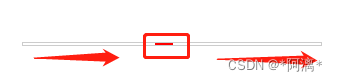
CSS进度条动画
发布时间:2023年12月26日
CSS进度条移动
<!DOCTYPE html>
<html lang="en">
<head>
    <meta charset="UTF-8">
    <meta http-equiv="X-UA-Compatible" content="IE=edge">
    <meta name="viewport" content="width=device-width, initial-scale=1.0">
    <title>animation</title>
    <style>
        .rec {
            box-sizing: border-box;
            position: relative;
            overflow: hidden;
            margin: 300px auto;
            width: 300px;
            height: 4px;
            border: 1px solid #ccc;
        }
        .rec::before {
            position: absolute;
            left: -100%;
            top: 0;
            content: '';
            height: 2px;
            width:  18px;
            background-color: red;
            /* 依次对应:动画名、时长、匀速、无限循环 */
            animation: move 5s linear infinite;
        }

        @keyframes move {
            from {
                left: -18px;
            }
            to {
                left: 100%;
            }
        }
    </style>
</head>
<body>
    <div class="rec"></div>
</body>
</html>
CSS动画实现进度条从左到右滚动 https://zhuanlan.zhihu.com/p/441023495?utm_id=0
边框跑马灯

<!DOCTYPE html>
<html lang="en">

<head>
	<meta charset="UTF-8">
	<meta http-equiv="X-UA-Compatible" content="IE=edge">
	<meta name="viewport" content="width=device-width, initial-scale=1.0">
	<title>Document</title>
</head>
<style>
	body {
		background-color: #000;
	}

	.main {
		position: absolute;
		width: 400px;
		height: 150px;
		top: 50%;
		left: 50%;
		transform: translate(-50%, -50%);
		overflow: hidden;
		text-align: center;
		background-color: transparent;
		line-height: 150px;
		color: aquamarine;
		font-size: 30px;
		font-family: '宋体';
	}

	.main div {
		position: absolute;
	}

	.main :nth-child(1) {
		top: 0;
		left: 0;
		width: 100%;
		height: 2px;
		animation: run1 1s linear infinite;
		/* animation-delay: 0s;  */
		background: linear-gradient(to right, #fff, #acd, cyan);
	}

	.main :nth-child(2) {
		top: 0;
		right: 0;
		height: 100%;
		width: 2px;
		animation: run2 1s linear infinite;
		/* animation-delay: 1s; 设置动画延迟加载时间*/
		background: linear-gradient(to bottom, #fff, #acd, cyan);
	}

	.main :nth-child(3) {
		bottom: 0;
		left: 0;
		height: 2px;
		width: 100%;
		animation: run3 1s linear infinite;
		/* animation-delay: 2s; 设置动画延迟加载时间*/
		background: linear-gradient(to right, #fff, #acd, cyan);
	}

	.main :nth-child(4) {
		top: 0;
		left: 0;
		height: 100%;
		width: 2px;
		animation: run4 1s linear infinite;
		/* animation-delay: 3s; 设置动画延迟加载时间 */
		background: linear-gradient(to top, #fff, #acd, cyan);
	}

	@keyframes run1 {
		from {
			transform: translateX(-100%)
		}

		to {
			transform: translateX(100%)
		}
	}

	@keyframes run2 {
		from {
			transform: translateY(-100%)
		}

		to {
			transform: translateY(100%)
		}
	}

	@keyframes run3 {
		from {
			transform: translateX(100%)
		}

		to {
			transform: translateX(-100%)
		}
	}

	@keyframes run4 {
		from {
			transform: translateY(100%)
		}

		to {
			transform: translateY(-100%)
		}
	}
</style>

<body>
	<div class="main">
		海绵宝宝
		<div></div>
		<div></div>
		<div></div>
		<div></div>
	</div>
</body>

</html>动态圆环


<!DOCTYPE html>
<html>
	<head>
		<meta charset="utf-8">
		<title></title>
		<style>
		</style>
	</head>
	<body>
		<canvas id="myCanvas1" width="400" height="400"></canvas>
	</body>
</html>
<script>
    let canvas = document.querySelector("#myCanvas1");
    var ctx = canvas.getContext('2d');

    var centerX = canvas.width / 2;
    var centerY = canvas.height / 2;
    var R = 100;

    var angle = 0; // 初始角度
    var speed = 0.05; // 运动速度

    function animate() {
        requestAnimationFrame(animate);


        // 计算圆心坐标
        var x = centerX + Math.cos(angle) * R;
        var y = centerY + Math.sin(angle) * R;

        // 绘制圆
        ctx.beginPath();
        ctx.arc(x, y, 10, 0, 2*Math.PI);
        ctx.fillStyle = "red";
        ctx.fill();

        // 更新角度
        angle += speed;
    }
    // 清除画布
    ctx.clearRect(0, 0, canvas.width, canvas.height);

    animate();


</script>Canvas实现动态绘制圆周效果|实现奥运五环https://blog.csdn.net/wodegeCSDN/article/details/130284110
光点跑动

<!DOCTYPE html>
<html lang="en">

<head>
    <meta charset="UTF-8">
    <meta http-equiv="X-UA-Compatible" content="IE=edge">
    <meta name="viewport" content="width=device-width, initial-scale=1.0">
    <title>Document</title>
    <style>
        .box {
            height: 500px;
            width: 400px;
            box-shadow: 0 0 2px orange;
            text-align: center;
            line-height: 260px;
        }

        .run {
            background-image: linear-gradient(90deg, rgba(196, 233, 64, 0) 0%, rgb(62, 224, 84) 100%), linear-gradient(0deg, rgb(62, 224, 84) 0%, rgba(196, 233, 64, 0) 100%), linear-gradient(-90deg, rgba(196, 233, 64, 0) 0%, rgb(62, 224, 84) 100%), linear-gradient(0deg, rgba(196, 233, 64, 0) 0%, rgb(62, 224, 84) 100%);
            background-repeat: no-repeat, no-repeat, no-repeat, no-repeat;
            background-size: 100px 4px, 4px 100px, 100px 4px, 4px 100px;
            background-position: -100px 1px, calc(100% - 1px) -100px, calc(100% + 100px) calc(100% - 1px), 1px 0px;
            animation: moveLine 8s infinite linear;
            height: calc(100% - 2px);
            padding: 1px;
            background-clip: content-box;
        }

        @keyframes moveLine {
            0% {
                background-position: -100px 1px, calc(100% - 1px) -100px, calc(100% + 100px) calc(100% - 1px), 1px 0px;
            }

            5% {
                background-position: 0px 1px, calc(100% - 1px) -100px, calc(100% + 100px) calc(100% - 1px), 1px -100px;
            }

            30% {
                background-position: 100% 1px, calc(100% - 1px) -100px, calc(100% + 100px) calc(100% - 1px), 1px -100px;
            }

            35% {
                background-position: calc(100% + 100px) 1px, calc(100% - 1px) 0px, calc(100% + 100px) calc(100% - 1px), 1px -100px;
            }

            50% {
                background-position: calc(100% + 100px) 1px, calc(100% - 1px) 100%, calc(100% + 100px) calc(100% - 1px), -100px -100px;
            }

            55% {
                background-position: calc(100% + 100px) 1px, calc(100% - 1px) calc(100% + 100px), 100% calc(100% - 1px), -100px calc(100% + 100px);
            }

            80% {
                background-position: calc(100% + 100px) 1px, calc(100% - 1px) calc(100% + 100px), 0px calc(100% - 1px), 1px calc(100% + 100px);
            }

            85% {
                background-position: calc(100% + 100px) 1px, calc(100% - 1px) calc(100% + 100px), -100px calc(100% - 1px), 1px 100%;
            }

            100% {
                background-position: calc(100% + 100px) 1px, calc(100% - 1px) calc(100% + 100px), -100px calc(100% - 1px), 1px 0px;
            }
        }
    </style>
</head>

<body>
    <div class="box run">光点跑动</div>
</body>

</html>css3如何实现光点随着指定位置跑https://ipkd.cn/webs_3506.html
文章来源:https://blog.csdn.net/weixin_44481113/article/details/135219352
本文来自互联网用户投稿,该文观点仅代表作者本人,不代表本站立场。本站仅提供信息存储空间服务,不拥有所有权,不承担相关法律责任。 如若内容造成侵权/违法违规/事实不符,请联系我的编程经验分享网邮箱:chenni525@qq.com进行投诉反馈,一经查实,立即删除!
本文来自互联网用户投稿,该文观点仅代表作者本人,不代表本站立场。本站仅提供信息存储空间服务,不拥有所有权,不承担相关法律责任。 如若内容造成侵权/违法违规/事实不符,请联系我的编程经验分享网邮箱:chenni525@qq.com进行投诉反馈,一经查实,立即删除!
最新文章
- Python教程
- 深入理解 MySQL 中的 HAVING 关键字和聚合函数
- Qt之QChar编码(1)
- MyBatis入门基础篇
- 用Python脚本实现FFmpeg批量转换
- V8提升对象属性访问速度---快属性和慢属性
- 无法解析的外部符号ShellExecuteExW
- Java读取静态文本文件的两个方式
- uniapp中组件库丰富的Switch 开关选择器使用方法
- 【备忘】fastadmin穿透传参and默认选中下拉框的值
- TS类型体操-简单-02-实现Readonly
- s26.Rocky Linux、CentOS和Ubuntu系统初始化脚本v7版
- 了解不同方式导入导出的速度之快
- 米贸搜|Facebook广告费烧得快?超出预算的钱花在哪了?怎么合理分配广告预算?
- 快速幂 算法