【Vue.js 中使用 ECharts 打造交互式数据可视化】
发布时间:2024年01月05日
摘要:
Vue.js和ECharts的结合为开发者提供了强大而灵活的数据可视化解决方案。本文将介绍如何在Vue.js项目中集成ECharts,并通过简单的示例展示如何创建交互式的数据可视化图表。
正文:
1. 引入 ECharts 库:
首先,在你的Vue.js项目中安装ECharts库。
npm install echarts --save
2. 创建一个简单的 Vue 组件:
<template>
  <div>
    <div ref="chart" style="width: 100%; height: 400px;"></div>
  </div>
</template>

<script>
import echarts from 'echarts';

export default {
  data() {
    return {
      // 示例数据
      chartData: {
        categories: ['类别1', '类别2', '类别3', '类别4', '类别5'],
        data: [120, 200, 150, 80, 70],
      },
    };
  },
  mounted() {
    // 在组件挂载后初始化图表
    this.initChart();
  },
  methods: {
    initChart() {
      // 使用 ECharts 初始化图表
      const chart = echarts.init(this.$refs.chart);

      // 配置项
      const option = {
        title: {
          text: '示例图表',
          left: 'center',
        },
        tooltip: {
          trigger: 'axis',
          axisPointer: {
            type: 'shadow',
          },
        },
        xAxis: {
          type: 'category',
          data: this.chartData.categories,
        },
        yAxis: {
          type: 'value',
        },
        series: [{
          data: this.chartData.data,
          type: 'bar',
        }],
      };

      // 将配置项设置给图表
      chart.setOption(option);
    },
  },
};
</script>

<style scoped>
/* 样式可以根据实际需要进行调整 */
</style>
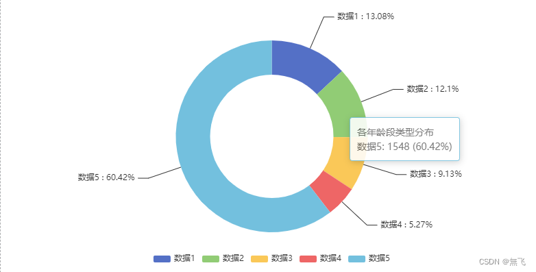
我的示例-饼图
  <div id="ageCharts" style="height: 400px;width:100%;"></div>


drawAgeStructureCharts() {
            let option = {
                    tooltip: {
                        trigger: 'item',
                        formatter: '{a} <br/>{b}: {c} ({d}%)'
                    },
                    legend: {
                        orient: 'horizontal',
                        bottom: 10,
                        itemHeight: 10,
                        data: ['数据1', '数据2', '数据3', '数据4', '数据5']
                    },
                    series: [{
                            name: '各年龄段类型分布',
                            type: 'pie',
                            radius: ['45%', '70%'],
                            avoidLabelOverlap: false,
                            label: {
                                show: true,
                                formatter: "{b} : {d}%" // b代表名称,c代表对应值,d代表百分比
                            },
                            emphasis: {
                                label: {
                                    show: true,
                                    fontSize: '20',
                                    fontWeight: 'bold'
                                }
                            },
                            labelLine: {
                                length: 50, // 改变标示线的长度
                                lineStyle: {
                                    color: '#333' // 改变标示线的颜色
                                }
                            },
                            data: [
                                {value: 335, name: '数据1'},
                                {value: 310, name: '数据2'},
                                {value: 234, name: '数据3'},
                                {value: 135, name: '数据4'},
                                {value: 1548, name: '数据5'}
                            ]
                        }]
                };
            let myChart = this.$echarts.init(document.getElementById('ageCharts'));
            // 绘制图表
            myChart.setOption(option);
        },
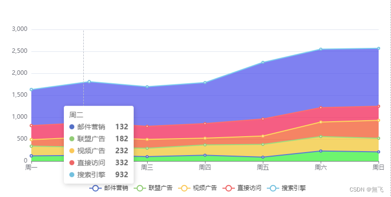
我的示例-趋势图
 <div id="crowdCharts" style="height: 400px;width:100%;"></div>


 drawCrowStructureCharts(data) {
            let option = {
                tooltip: {
                    trigger: "axis",
                },
                legend: {
                    bottom: 10,
                    data: ["邮件营销", "联盟广告", "视频广告", "直接访问", "搜索引擎"],
                },
                grid: {
                    left: "3%",
                    right: "4%",
                    bottom: "14%",
                    containLabel: true,
                },
                xAxis: {
                    type: "category",
                    boundaryGap: false,
                    data: ["周一", "周二", "周三", "周四", "周五", "周六", "周日"],
                },
                yAxis: {
                    type: "value",
                },
                series: [
                    {
                        name: "邮件营销",
                        type: "line",
                        stack: "总量",
                        data: [120, 132, 101, 134, 90, 230, 210],
                        areaStyle: {
                            color: 'rgb(44, 222, 44)'
                        }
                    },
                    {
                        name: "联盟广告",
                        type: "line",
                        stack: "总量",
                        data: [220, 182, 191, 234, 290, 330, 310],
                        areaStyle: {
                            color: 'rgb(222,180,38)'
                        }
                    },
                    {
                        name: "视频广告",
                        type: "line",
                        stack: "总量",
                        data: [150, 232, 201, 154, 190, 330, 410],
                        areaStyle: {
                            color: 'rgb(222,74,31)'
                        }
                    },
                    {
                        name: "直接访问",
                        type: "line",
                        stack: "总量",
                        data: [320, 332, 301, 334, 390, 330, 320],
                        areaStyle: {
                            color:'rgb(222,24,72)'
                        }
                    },
                    {
                        name: "搜索引擎",
                        type: "line",
                        stack: "总量",
                        data: [820, 932, 901, 934, 1290, 1330, 1320],
                        areaStyle: {//区域填充渐变颜色

                            color: 'rgb(69,71,222)'
                            // 下面替换背景渐变色
                            //     {
                            //     type: 'linear',
                            //     x: 0,
                            //     y: 0,
                            //     x2: 0,
                            //     y2: 1,
                            //     colorStops: [{
                            //         offset: 0, color: 'rgb(69,71,222)' // 0% 处的颜色
                            //     }, {
                            //         offset: 1, color: 'rgba(234,174,10, 0)' // 100% 处的颜色
                            //     }],
                            //     global: false // 缺省为 false
                            // }
                        }
                    },
                ],

            };
            let myChart = this.$echarts.init(document.getElementById('crowdCharts'));
            // 绘制图表
            myChart.setOption(option);
        },
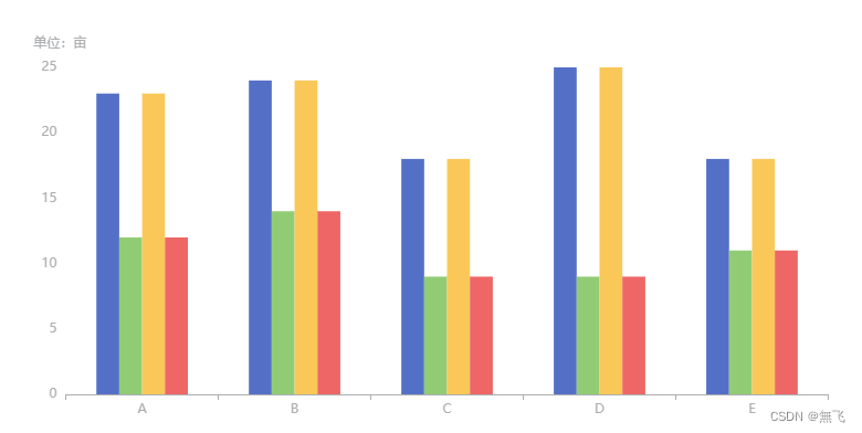
我的示例-柱状图
 <div id="registerCharts" style="height: 400px;width:100%;"></div>

 drawRegisterStructureCharts(data){
            let option = {
                grid: {
                    top: '16%',
                    left: '5%',
                    right: '5%',
                    bottom: '5%',
                    containLabel: true
                },
                legend: {
                    textStyle: {
                        color: '#FFFFFF'
                    }
                },
                tooltip: {
                    trigger: 'axis',
                    axisPointer: {
                        type: 'shadow'
                    }
                },
                xAxis: {
                    type: 'category',
                    data: ["A", "B", "C", "D", "E"],
                    axisLine: {
                        lineStyle: {
                            color: '#acaeb0'
                        }
                    },
                },
                yAxis: {
                    type: 'value',
                    name: '单位:亩   ',
                    axisLine: {
                        lineStyle: {
                            color: '#acaeb0'
                        }
                    },
                    splitLine: {  // 设置网格线样式
                        lineStyle: {
                            color: 'rgba(255,255,255,0.1)' // 修改网格线颜色为红色
                        }
                    }
                },
                series: [
                    {
                        type: "bar",
                        data: [23, 24, 18, 25, 18],
                        barGap: "0%", // 两个柱子之间的距离相对于柱条宽度的百分比;
                        barCategoryGap: "40%" // 每侧空余的距离相对于柱条宽度的百分比
                    },
                    {
                        type: "bar",
                        data: [12, 14, 9, 9, 11]
                    },
                    {
                        type: "bar",
                        data: [23, 24, 18, 25, 18],
                        barGap: "0%", // 两个柱子之间的距离相对于柱条宽度的百分比;
                        barCategoryGap: "40%" // 每侧空余的距离相对于柱条宽度的百分比
                    },
                    {
                        type: "bar",
                        data: [12, 14, 9, 9, 11]
                    }
                ]
            }

            let myChart = this.$echarts.init(document.getElementById('registerCharts'));
            // 绘制图表
            myChart.setOption(option);
        },
3. 在 Vue 组件中使用 ECharts:
在上述代码中,我们通过 import echarts from ‘echarts’; 导入了 ECharts 库。在 mounted 钩子函数中,调用 initChart 方法初始化了一个简单的柱状图。chartData 中存储了示例数据,你可以根据实际需求替换为你的数据。
4. 集成更多图表类型:
ECharts支持多种图表类型,例如线图、饼图等。你可以在 series 中切换图表类型,调整 xAxis 和 yAxis 配置,以适应不同的数据可视化需求。
5. 添加交互性和响应式:
ECharts提供了丰富的配置选项,使得图表具有交互性。你可以配置鼠标悬浮提示、数据筛选、缩放等功能。此外,结合Vue.js的响应式机制,你可以实现动态更新图表的数据和配置。
6. 异步加载数据:
在实际应用中,数据通常是异步获取的。你可以在 mounted 钩子函数中调用异步函数获取数据,并在数据返回后调用 initChart 方法更新图表。
结论:
通过这篇文章,你学会了如何在Vue.js项目中使用ECharts库创建交互式的数据可视化图表。这是一个简单的入门示例,你可以根据项目需求和ECharts文档深入学习和定制。在实际应用中,数据可视化不仅能够使数据更具可读性,还能够提升用户体验,帮助用户更好地理解和分析数据。
文章来源:https://blog.csdn.net/weixin_43830033/article/details/135378318
本文来自互联网用户投稿,该文观点仅代表作者本人,不代表本站立场。本站仅提供信息存储空间服务,不拥有所有权,不承担相关法律责任。 如若内容造成侵权/违法违规/事实不符,请联系我的编程经验分享网邮箱:chenni525@qq.com进行投诉反馈,一经查实,立即删除!
本文来自互联网用户投稿,该文观点仅代表作者本人,不代表本站立场。本站仅提供信息存储空间服务,不拥有所有权,不承担相关法律责任。 如若内容造成侵权/违法违规/事实不符,请联系我的编程经验分享网邮箱:chenni525@qq.com进行投诉反馈,一经查实,立即删除!
最新文章
- Python教程
- 深入理解 MySQL 中的 HAVING 关键字和聚合函数
- Qt之QChar编码(1)
- MyBatis入门基础篇
- 用Python脚本实现FFmpeg批量转换
- kali-Linux安装ARL灯塔教程以及timeout of 20000ms exceeded 的解决方法
- 2024年PMP考试新考纲-PMBOK第七版-价值交付系统真题解析
- log4j:WARN Please initialize the log4j system properly的解决办法
- 基于Spring Cloud + Spring Boot的企业电子招标采购系统源码
- LINUX自启动线程学习笔记
- 【代码随想录算法训练营-第八天】【字符串】344,541,卡码网:54,151,卡码网:55
- 2023年第6届传智杯省赛第二场复赛 解题报告 | 珂学家
- LeetCode、162. 寻找峰值【中等,最大值、二分】
- ESP系列入门教程(二)——之简单驱动温湿度传感器DHT11【附 ESP32 / ESP8266 通用代码】
- 探索深度学习在自然语言处理中的应用