bokeh:HoverTool入门,悬停工具,ColumnDatasource的使用
发布时间:2024年01月12日
Bokeh是一个用于生成交互式可视化图形的Python库。它提供了丰富的绘图工具和高级图形功能,使用户能够轻松地创建各种类型的图表,包括折线图、散点图、柱状图、饼图、热图和地理图等。
Bokeh的主要特点是它能够生成交互式图形,这意味着用户可以通过鼠标交互来探索和操作图表。它支持响应式布局和小部件,使用户能够动态地更改图表的属性和参数,并实时观察结果的变化。
Bokeh还提供了一套丰富的工具和接口,用于将图表嵌入到网页中或与其他Python库和框架集成,如Flask、Django和Jupyter Notebook等。
总之,Bokeh是一个功能强大且易于使用的数据可视化工具,适用于数据科学家、研究人员和开发人员等各种领域的用户,可以帮助他们将数据转化为具有交互性和吸引力的图形。
from bokeh.plotting import figure
from bokeh.io import show
from bokeh.models import Range1d
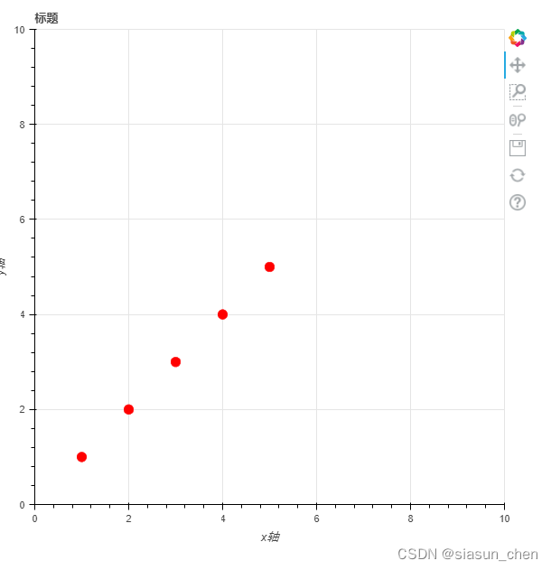
#轴数据
x_axis = [1, 2, 3, 4, 5]
y_axis = [1, 2, 3, 4, 5]
#创建一个图片对象
p1 = figure(title='标题', x_axis_label='x轴', y_axis_label='y轴', x_range=Range1d(start=0, end=10),
y_range=Range1d(start=0, end=10), )
#添加散点
p1.circle(x=x_axis, y=y_axis, fill_color="red", line_color="red", size=10, )
#显示
show(p1)
?
from bokeh.plotting import figure
from bokeh.io import show
from bokeh.models import Range1d
from bokeh.models.tools import HoverTool
x_axis = [1, 2, 3, 4, 5]
y_axis = [1, 2, 3, 4, 5]
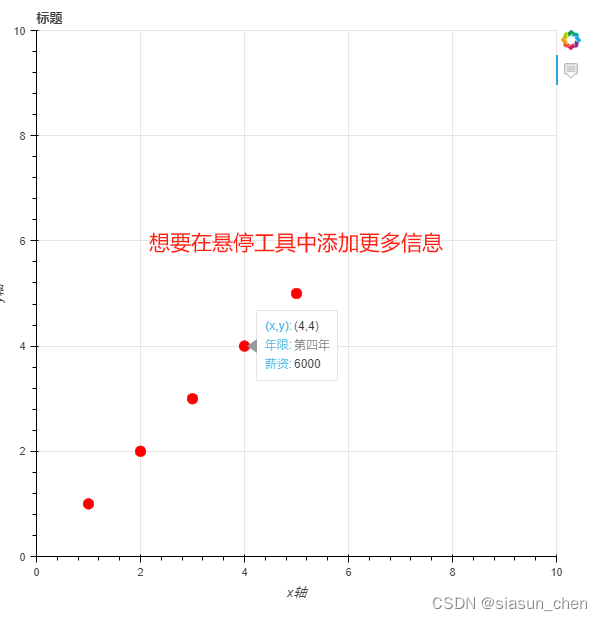
#添加悬停工具
#$x表示x轴数据
#$y表示y轴数据
#{int}整数限定
hover = HoverTool(tooltips=[
("(x,y)", "($x{int},$y{int})"),
])
p1 = figure(title='标题', x_axis_label='x轴', y_axis_label='y轴', x_range=Range1d(start=0, end=10),
y_range=Range1d(start=0, end=10), tools=[hover], )
p1.circle(x=x_axis, y=y_axis, fill_color="red", line_color="red", size=10, )
show(p1)
?
# 作者:CC
from bokeh.plotting import figure
from bokeh.io import show
from bokeh.models import Range1d
from bokeh.models.tools import HoverTool
from bokeh.models import ColumnDataSource
# x_axis = [1, 2, 3, 4, 5]
# y_axis = [1, 2, 3, 4, 5]

# 创建数据源
data = {'x_axis': [1, 2, 3, 4, 5],
        'y_axis':  [1, 2, 3, 4, 5],
        'year': ['第一年','第二年', '第三年','第四年','第五年'],
        'salary':[3000,4000,5000,6000,7000]
        }
source = ColumnDataSource(data)
#@引用的名称就是data中的键
hover = HoverTool(tooltips=[
    ("(x,y)", "($x{int},$y{int})"),
    ("年限","@year"),
    ("薪资","@salary"),

])


p1 = figure(title='标题', x_axis_label='x轴', y_axis_label='y轴', x_range=Range1d(start=0, end=10),
            y_range=Range1d(start=0, end=10), tools=[hover], )
#引入source数据,x轴数据,y轴数据
p1.circle(x='x_axis', y='y_axis',source=source, fill_color="red", line_color="red", size=10, )
#引入source数据,x轴数据,年限数据
p1.circle(x='x_axis', y='year',source=source, fill_color="red", line_color="red", size=10, )
#引入source数据,x轴数据,薪资数据
p1.circle(x='x_axis', y='salary',source=source, fill_color="red", line_color="red", size=10, )
#因为使用 ColumnDataSource构建了数据结构,data中的数据按列对应
show(p1)
?
文章来源:https://blog.csdn.net/siasun_chen/article/details/135498301
本文来自互联网用户投稿,该文观点仅代表作者本人,不代表本站立场。本站仅提供信息存储空间服务,不拥有所有权,不承担相关法律责任。 如若内容造成侵权/违法违规/事实不符,请联系我的编程经验分享网邮箱:chenni525@qq.com进行投诉反馈,一经查实,立即删除!
本文来自互联网用户投稿,该文观点仅代表作者本人,不代表本站立场。本站仅提供信息存储空间服务,不拥有所有权,不承担相关法律责任。 如若内容造成侵权/违法违规/事实不符,请联系我的编程经验分享网邮箱:chenni525@qq.com进行投诉反馈,一经查实,立即删除!
最新文章