Qlik Sense 之什么是Dimensions维度和Measures度量
Dimensions
Dimensions determine how the data in a visualization is grouped. For example: total sales per country or number of products per supplier. You typically find a dimension as the slices in a pie chart or on the x-axis of a bar chart with vertical bars.
Dimensions are created from fields in the data model tables.
Example:??
Product Type?is a field in the?Product?table that is loaded into the app. The values of this field are the different types that products are grouped into.
You can, for example, create a bar chart to visualize the cost of each type, by adding the?Product Type?dimension to the chart. To complete the visualization, you must add a measure (in this case?Cost), which is grouped by the?Product Type?dimension.
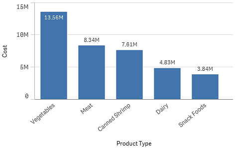
Bar chart with the dimension Product Type and measure Cost.
Field groups as dimensions
One main difference between?Qlik Sense?and many other database viewers and online analytical processing tools (OLAP?systems), is that in?Qlik Sense, you do not need to predefine any hierarchies in the input data. The unique internal logic of?Qlik Sense?gives you the complete freedom to access any field as a full dimension in any order you like.
For most purposes, the built-in functionality is fully satisfactory, but in some situations, a predefined hierarchy can help you to display data more efficiently. In?Qlik Sense, you can achieve this by defining hierarchic groups of fields as drill-down dimensions.
Any fields or calculated dimensions can be grouped together.
Calculated dimensions
You can use expressions to create calculated dimensions. A calculated dimension consists of an expression involving one or more fields. All standard functions may be used.
Information noteFor performance reasons, it is recommended to perform all calculations in the data load editor. When dimensions are calculated in the chart,?Qlik Sense?first calculates the dimension values, and then aggregates the measures for these calculated values, which affects the performance more than calculations in the load script.
There are cases when calculated dimensions are powerful in data analysis, for example, if you want to generate the dimensions values during analysis, when dimension values are dependent on the selections.
Calculated dimensions are also useful if you want to modify a field.
Once you have created a calculated dimension, you can use it as any other dimension.
Example:??
You have a field called?Calendar Month?that includes each of the months of the year. In your app, you want include a table that shows the sales for each of the first 6 months of the year. For the rest of the months, you want to see a total. You can use an expression to create this calculated dimension.
Syntax:??
If ([Calendar Month] <7, [Calendar Month], 'Rest')
?
维度
维度确定数据在可视化中的分组方式。例如:每个国家的总销售额或每个供应商的产品数量。 通常,在饼图或具有垂直条的条形图 X 轴上可找到切片形式的维度。
维度是根据数据模型表格中的字段创建的。
示例:??
Product Type?是加载到应用程序中的?Product?表格中的字段。此字段的值是将产品划分到的不同类型。
例如,您可以创建条形图来显示每个类型的成本,只需将?Product Type?维度添加到图表即可。要完成可视化内容,必须添加度量(在此例中是?Cost),它按?Product Type?维度分组。
带维度 Product Type 和度量 Cost 的条形图。

以字段组为维度
Qlik Sense?与其他许多数据库查看器和在线分析处理工具(OLAP?系统)之间的一个主要区别在于,在?Qlik Sense?中,不需要在输入数据中预定义任何层次结构。此独特的?Qlik Sense?内部逻辑可让您以全维度形式按喜欢的任何顺序完全自由地访问任何字段。
对于大多数用途,此内置功能完全可以让人满意,但在某些情况下,预定义的层次结构可帮助您更有效地显示数据。在?Qlik Sense?中,为此可将字段的层次结构组定义为向下钻取维度。
任何字段或计算维度都可以分组到一起。
计算维度
您可以使用表达式创建计算维度。计算维度由包含一个或多个字段的表达式构成。所有标准函数均可使用。
信息注释出于性能原因,建议在数据加载编辑器中执行全部计算。在图表中计算维度时,Qlik Sense?会先计算维度值,然后聚合这些计算值的度量,与在加载脚本中计算相比,此方式更影响性能。
在某些情况下,计算维度在数据分析中很有效,例如,如果您想要在分析期间生成维度值,此时维度值取决于选择项。
如果您想要修改字段,计算维度也同样非常有用。
在创建计算维度后,可以使用它作为任何其他维度。
示例:??
您有一个称为?Calendar Month?的字段,其中包含一年的每个月。在应用程序中,您想要包含一个显示一年前 6 个月中每月销售额的表格。对于其余的月份,您想要查看合计。您可以使用表达式创建此计算维度。
语法:??
If ([Calendar Month] <7, [Calendar Month], 'Rest')
Measures
Measures are calculations used in visualizations, typically represented on the y-axis of a bar chart or a column in a table. Measures are created from an expression composed of aggregation functions, such as?Sum?or?Max, combined with one or several fields.
A measure must have a name, and may also be supplied with descriptive data such as description and tags.
Example:??
You can, for example, create a bar chart to visualize the cost of each type, by adding the?Product Type?dimension to the chart, and the measure?Cost, which is made from the expression?Sum(Cost), that is the result of the calculation of the aggregation function?Sum?over the field?Cost. The results are grouped by the?Product Type?dimension.
Bar chart with the dimension Product Type and the measure Cost.
度量
度量是在可视化中使用的计算,通常呈现在条形图的 Y 轴上或表格的列中。 度量通过由聚合函数(例如?Sum?或?Max)组成的与一个或多个字段组合的表达式创建。
度量必须有名称,您还可以为其提供描述数据,例如说明和标记。
示例:??
例如,您可以创建条形图来显示每个类型的成本,只需将?Product Type?维度添加到图表即可,并且通过表达式?Sum(Cost)?获得的度量?Cost?是在字段?Cost?上计算聚合函数?Sum?的结果。这些结果按?Product Type?维度分组。
带维度 Product Type 和度量 Cost 的条形图。
修饰符
度量是基于字段的计算,例如?Sum(Cost)。可以使用修改器更改如何在可用尺寸上计算度量。
例如,可以使度量的值在一个或两个维度上累积,也可以计算特定步数上度量的平均值。
哪些可视化具有修饰符
| 可视化 | 累计 | 差分 | 移动平均数 | 相对数字 |
|---|---|---|---|---|
| 条形图 | 是 | 是 | 是 | 是 |
| 组合图 | 是 | 是 | 是 | 是 |
| 折线图 | 是 | 是 | 是 | 是 |
| 表格 | 是 | 是 | 是 | 是 |
累计
累计修改器允许您在一个或两个维度上累计度量值。通过累计值,可以很容易地可视化度量的效果如何在维度上加强。
在下面的组合图中,条形图和折线图随着时间推移累计。
一个组合图,其中线显示累计利润率,条形显示累计销售数字。
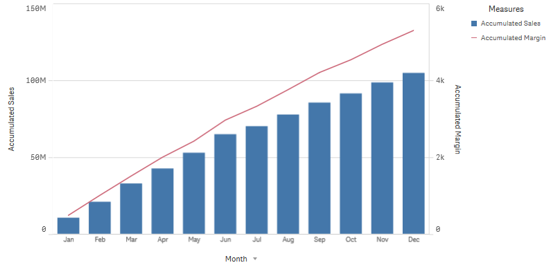
语法:??
RangeSum(Above {$M,0,Steps})
差分
差分修饰符可让您可视化一个或两个维度上度量的相邻值之间的差分。如果要可视化分组数据方向上的更改,则差分修饰非常有用。
在下面的条形图中,10 年期间的年利润下降都显示为负条形。
显示一年与下一年利润差异的条形图。
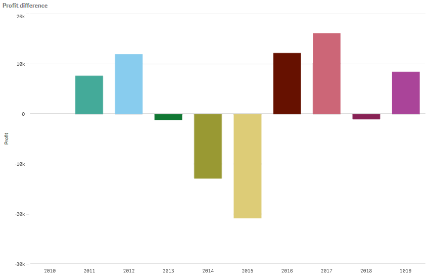
语法:??
$M - Above($M)
移动平均数
移动平均值修饰符允许您查看特定时段内度量的平均值。您可以用它来过滤掉短期价值波动的影响。根据希望修饰符跟踪数据变化的程度,可以更改求平均值操作的执行步数。移动平均值通常与时间序列数据一起使用,以突显长期趋势或周期。
在下面的折线图中,显示了具有两个差分范围的移动平均值,一个是 20 步范围,另一个是全范围。
示出产品在五个月期间内价格的折线图。
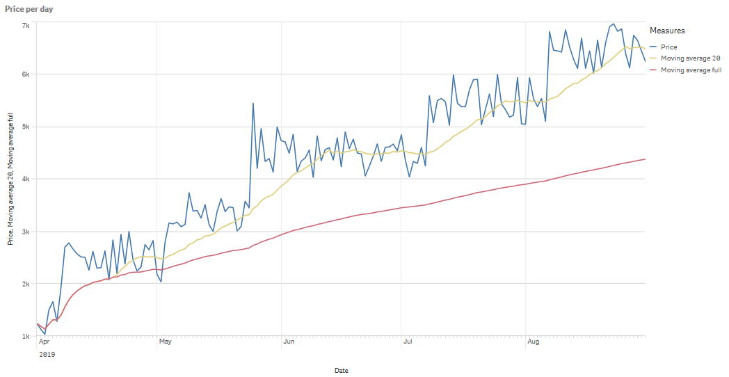
语法:??
RangeAvg(Above ($M,0,Steps))
相对数字
相对数字修饰符可让您查看相对百分比。您可用它看到特定选择项相对于选择项、总计或其他字段的影响。您可更改计算相对数字所依据的基础。
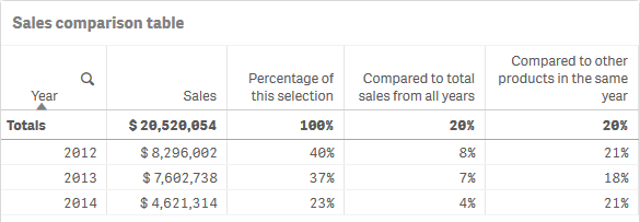
在下表中,示出了具有特定选择项的每个年份的销售额的一列,以及具有相对数字的三列,一列相对于当前选择项,一列相对于所有年份的总销售额,还有一列相对于每个年份的销售额。
表格示出相对于当前选择项、总销售额和每个年份销售额的不同销售额百分比。
以下是相对于总计选择项的修饰符的语法的示例。
语法:??
$M / Sum( total Aggr( $M, dim ) )
本文来自互联网用户投稿,该文观点仅代表作者本人,不代表本站立场。本站仅提供信息存储空间服务,不拥有所有权,不承担相关法律责任。 如若内容造成侵权/违法违规/事实不符,请联系我的编程经验分享网邮箱:chenni525@qq.com进行投诉反馈,一经查实,立即删除!
- Python教程
- 深入理解 MySQL 中的 HAVING 关键字和聚合函数
- Qt之QChar编码(1)
- MyBatis入门基础篇
- 用Python脚本实现FFmpeg批量转换
- android studio导入module
- 基于粒子群算法的三维航线规划
- 2024年供应商绩效管理战略指南
- 模集 - 240105 - 模集期末速成
- 基于若依框架实现前后端分离代码自动生成
- Android 常用的几个有用的方法
- Magnific AI:彻底改变 AI 生成图像的升级
- 从零实现一套低代码(保姆级教程) --- 【1】初始化项目,实现左侧组件列表
- 谷粒商城项目|es的应用场景及常见问题
- Matlab/F#/R进行数据分析和建模算法的经验,vb.net输给他了