从零实现一套低代码(保姆级教程) --- 【10】实现样式面板并支持Button组件的样式配置
摘要
经过前面九篇文章的讲解和实现,目前我们的低代码已经初具雏形了。
如果你是第一次看到这一篇文章, 建议先看一下第一节内容:
从零实现一套低代码(保姆级教程) — 【1】初始化项目,实现左侧组件列表
那我们可以回忆一下之前我们是怎么实现属性面板的。
本质上就是在画布区选中节点后,在redux保存。在通过右侧属性面板,修改节点的属性,从而引起组件的重新渲染。
那如果我们想实现一个样式面板,整体思路不就和属性面板一模一样嘛。
甚至,InputComponent这个组件我们都可以复用!!!!!
OK,现在我们在项目中实现一下样式面板。

1. 实现样式的配置Map
之前我们有一个attributeMap用来保存所有组件的属性配置,现在我们在它的同级目录新增一个styleMap用来保存所有组件分样式配置。
之前我们有一个comAttribute用来保存各个组件的属性列表,现在新建一个comStyle用来保存各个组件的样式列表。
这里我们先给Button组件的配置好:
XinBuilder2\src\pages\builder\rightPart\staticUtils\styleMap.ts
import { buttonStyle } from "./comStyle/buttonStyle"

interface StyleMap {
  [key: string]: Style[]
}

export interface Style {
  label: string,
  value: string,
  type: string,
  options?: Array<any>,
  defaultValue?: string,
  modalType?: string
}

const styleMap: StyleMap = {
  Button: buttonStyle
}

export {
  styleMap
}
XinBuilder2\src\pages\builder\rightPart\staticUtils\comStyle\buttonStyle.ts
给按钮配置两个样式属性,高度和宽度.
import { Style } from "../styleMap"
const buttonStyle: Style[] = [
  {
    label: '设置宽度',
    value: 'width',
    type: 'number'
  },
  {
    label: '设置高度',
    value: 'height',
    type: 'number'
  }
]

export {
  buttonStyle
}
OK,现在我们的基础配置就完事了。
2.实现样式面板的渲染
对于样式面板,我们只需要照着属性面板进行修改即可,来到rightPart下的index.tsx中。
  const items: TabsProps['items'] = [
    {
      key: 'attributePanel',
      label: <div style={{fontSize:'18px',width:'100px',textAlign:'center'}}>属性</div>,
      children: getAttributePanel(),
    },
    {
      key: 'stylePanel',
      label: <div style={{fontSize:'18px',width:'100px',textAlign:'center'}}>样式</div>,
      children: getStylePanel(),
    }
  ];
OK,现在我们实现getStylePanel方法:
  const getStylePanel = () => {
    const comType = selectNode?.comType || '';
    const styleList = styleMap[comType] || []
    return <div>
      {
        styleList.map((item,index) => {
          return <div key={index} className='attributeItem'>
          <label className='attributeLabel'>{item.label}</label>
          <div className='attributeItemValue'>
            <InputComponent selectNode={selectNode} {...item} onChange={changeComAttribute(item.value)}/>
          </div>
        </div>
        })
      }
    </div>
  }
getStylePanel 方法和 getAttributePanel方法区别点,只在于遍历的List不同,一个是属性的列表,一个是样式的列表。
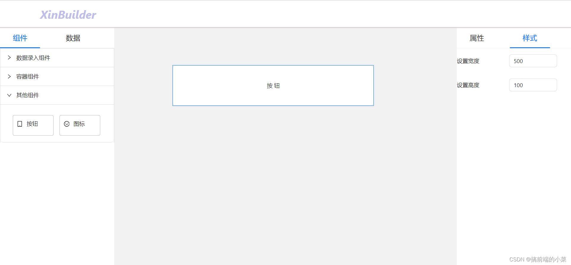
OK,现在我们的右侧样式面板就可以看到我们刚才设置的高度和宽度了。

但是有一个问题是什么,如果我给width设置了200,这对组件是无效的。只有200px才会对组件生效。所以这里,我们就再写一个change的方法。不用changeComAttribute了!
  const getStylePanel = () => {
	// 其他代码
 <InputComponent onChange{changeComStyle( item.value)}/>
  }
  const changeComStyle = (value: string) => {
    return (e: any) => {
      let attribute = e;
      if(typeof e === 'object') {
         attribute = e.target.value;
      }
      if(['width', 'height'].includes(value)) {
        attribute += 'px'
      }
      if(selectNode) {
        if(!selectNode.comStyle) {
          selectNode.comStyle = {}
        }
        selectNode.comStyle[value] = attribute;
      }
      Store.dispatch({type: 'changeComList', value:comList})
    }
  }
对于宽度和高度,我们给最后组件的样式值加上px。这样就能对组件生效了。
但是右侧属性面板的回显可能就会有问题了(因为number组件接收的是一个字符串了),现在我们再修改一下。
  const getComponent = () => {
    switch (type) {
      // 对于number组件,将组件的字符串值转换为number类型
      case 'number': {
        return <Input type="number" value={selectNode[value] || parseInt(selectNode?.comStyle?.[value] || '') || '0'} style={{width:'120px'}} defaultValue={defaultValue} onChange = {onChange}/>
      }
    }
  }
3.实现组件的渲染
现在我们来到组件里,只需要将组件的width和height渲染到组件上即可。
import { Button as AntButton } from 'antd'

export default function Button(props: any) {
  const { caption, danger, disabled, ghost, shape, size, type, comStyle } = props
  const IconComponent = require('@ant-design/icons')[type]
  return (
    <div>
      <AntButton
        style={{...comStyle}}
        danger={danger}
        disabled={disabled}
        ghost={ghost}
        shape={shape}
        size={size}
        icon={type ?  <IconComponent /> : null}
        >
          {caption || '按钮'}
      </AntButton>
    </div>
  )
}
现在我们就可以给Button组件设置宽高了:
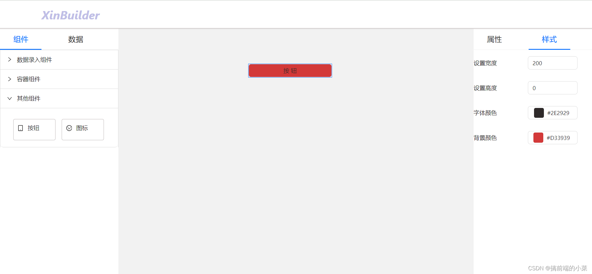
4.实现色板组件
现在我们思考一个问题,不管是组件的背景颜色还是字体颜色,都离不开配置颜色。
所以我们需要一个新的属性类型,就是color类型:
const buttonStyle: Style[] = [
  {
    label: '设置宽度',
    value: 'width',
    type: 'number'
  },
  {
    label: '设置高度',
    value: 'height',
    type: 'number'
  },
  // 新增两种颜色属性
  {
    label: '字体颜色',
    value: 'color',
    type: 'color'
  },
  {
    label: '背景颜色',
    value: 'backgroundColor',
    type: 'color'
  }
]
之前我们新增过弹窗类型,现在我们新增一个色板的类型。
  const getComponent = () => {
    switch (type) {
      case 'color': {
      case 'color': {
        return <ColorPicker disabledAlpha showText value={selectNode?.comStyle?.[value] || ''} style={{width:'120px'}} defaultValue={defaultValue} onChangeComplete = {onChange}/>
      }
    }
  }
然后我们再修改一下changeComStyle方法:
  const changeComStyle = (value: string) => {
    return (e: any) => {
      let attribute = e;
      if(typeof e === 'object') {
        if(['color', 'backgroundColor'].includes(value)) {
          attribute = e.toHexString()
        }else{
          attribute = e.target.value;
        }
      }
      if(['width', 'height'].includes(value)) {
        attribute += 'px'
      }
      if(selectNode) {
        if(!selectNode.comStyle) {
          selectNode.comStyle = {}
        }
        selectNode.comStyle[value] = attribute;
      }
      Store.dispatch({type: 'changeComList', value:comList})
    }
  }
OK,现在我们就可以通过色板去调整Button组件的字体颜色和背景颜色了。
OK, 现在我们给Button组件再补充一些常见的样式属性。
import { Style } from "../styleMap"
const buttonStyle: Style[] = [
  {
    label: '设置宽度',
    value: 'width',
    type: 'number'
  },
  {
    label: '设置高度',
    value: 'height',
    type: 'number'
  },
  {
    label: '字体颜色',
    value: 'color',
    type: 'color'
  },
  {
    label: '背景颜色',
    value: 'backgroundColor',
    type: 'color'
  },
  {
    label: '边框宽度',
    value: 'borderWidth',
    type: 'number'
  },
  {
    label: '边框颜色',
    value: 'borderColor',
    type: 'color'
  },
  {
    label: '边框样式',
    value: 'borderStyle',
    type: 'select',
    options: [
      {
        value: 'solid',
        label: '实线'
      },
      {
        value: 'dotted',
        label: '点线'
      },
      {
        value: 'dashed',
        label: '虚线'
      }
    ],
    defaultValue: 'solid'
  }
]

export {
  buttonStyle
}
OK,Button组件的样式面板我们就已经完成了。

相关的代码提交在github上:
https://github.com/TeacherXin/XinBuilder2
commit: 第十节: 实现样式面板并支持Button组件的样式配置
博主补充
如果你已经对Button组件的样式面板比较了解,希望你能把其他组件的样式配置也写出来,这一部分的内容,不会用文章来叙述了。
只会出现在以下的github提交记录上:
https://github.com/TeacherXin/XinBuilder2
commit: 第十节: 支持Form组件的样式配置
https://github.com/TeacherXin/XinBuilder2
commit: 第十节: 支持Icon组件的样式配置
https://github.com/TeacherXin/XinBuilder2
commit: 第十节: 支持Input组件的样式配置
本文来自互联网用户投稿,该文观点仅代表作者本人,不代表本站立场。本站仅提供信息存储空间服务,不拥有所有权,不承担相关法律责任。 如若内容造成侵权/违法违规/事实不符,请联系我的编程经验分享网邮箱:chenni525@qq.com进行投诉反馈,一经查实,立即删除!
- Python教程
- 深入理解 MySQL 中的 HAVING 关键字和聚合函数
- Qt之QChar编码(1)
- MyBatis入门基础篇
- 用Python脚本实现FFmpeg批量转换
- Java 开发中,常用的注解整理
- Java equals 和 == 有什么区别?
- linux 系统重启 Redis 服务
- 反编译会遇到哪些难题
- 应届毕业生如何一步步成为产品经理?
- 鸿鹄电子招投标系统:源码级别解析电子招投标的精髓
- Python算法例19 创建最大数
- Jenkins----基于 CentOS 或 Docker 安装部署Jenkins并完成基础配置
- FP独立站账户老被封?AB站跳转轮询帮你搞定!
- 性能监控工具nmon使用