浮动、定位
发布时间:2024年01月06日
浮动
浮动(float):元素脱离标准流,移动到指定位置
浮动的分类:
- 左浮动:
left - 右浮动:
right
浮动的初衷:文字环绕的效果 span特性:会环绕图片,文字不会在图片下面
浮动的特点:
- 添加浮动后的元素会漂浮在其他元素上面
- 添加浮动后的元素不占位置
- 同时添加浮动后的多个元素会在一行显示
- 添加浮动后的子元素永远不会超出父元素的范围
- 添加浮动后的子元素永远不会覆盖父元素的边框和内边距
- 添加浮动后的元素拥有了行内元素的特性(eg:可以设置宽高 可以在同一行显示)
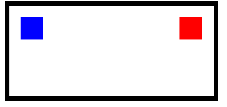
<style>
          footer {
        margin: 0 auto;
        width: 800px;
        height: 300px;
        border: 20px solid black;
        padding: 50px;
      }
      .child1,
      .child2 {
        width: 100px;
        height: 100px;
      }
      .child1 {
        background-color: red;
        float: left;
        float: right;
      }
      .child2 {
        background-color: blue;
        float: right;
        float: left;
      }
    </style>
<body>
	<footer>
		<div class="child1"></div>
		<div class="child2"></div>
    </footer>
</body>
- 运行效果图
- 不会覆盖内边距和边框
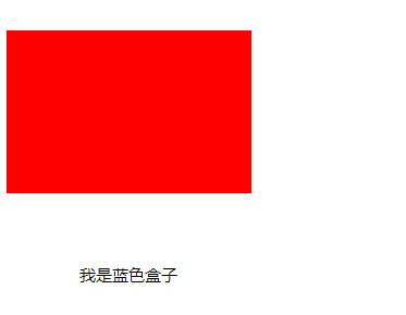
<style>
      .boxRed,
      .boxBlue {
        width: 300px;
        height: 200px;
      }
      .boxRed {
        background-color: red;
        /*红色盒子左浮动  红色盒子在蓝色上面*/
        float: left;
      }
      .boxBlue {
        background-color: blue;
        font-size: 20px;
        text-align: center;
        line-height: 200px;
      }
</style>
<body>
    <section>
      <div class="boxRed"></div>
      <div class="boxBlue">我是蓝色盒子</div>
    </section>
</body>
- 运行效果图
- 盒子浮动 文字不动
浮动的影响:
- 添加浮动后的子元素无法撑开父元素的高度,浮动不占位置
清除浮动(闭合浮动):
overflow:hidden;- 清除浮动并不是清除浮动,而是清除浮动所带来的影响
清除浮动的方式(三种):
- 额外标签法:
- 添加额外的元素
clear:left:清除左浮动clear:right:清除右浮动- 弊端:添加了无意义的结构标签,会使结构混乱语义化结构比较差
- 伪元素:
- 给父元素添加
::after content:""display:blocklclear:both- 弊端:IE7以下不支持伪元素
- 给父元素添加
- 父元素添加
overflow:hidden;- 弊端:溢出的部分隐藏掉
overflow:hidden;的作用
-
溢出的部分隐藏掉
-
解决嵌套元素外边距
-
清除浮动
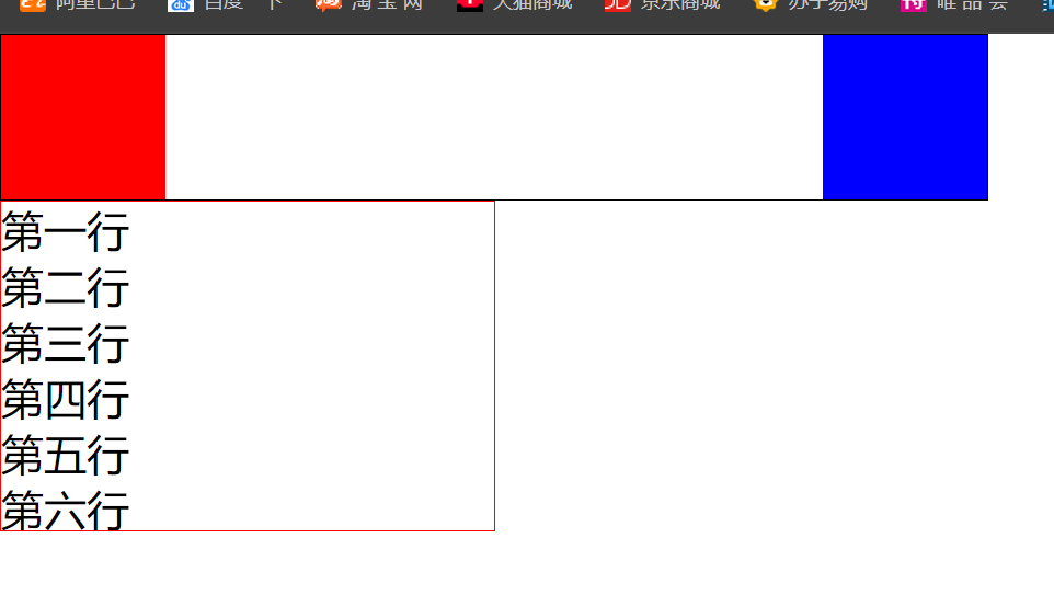
<style>
	* {
        margin: 0;
        padding: 0;
      }
      header {
        width: 600px;
        /* height: 100px; */
        border: 1px solid black;
        overflow: hidden;
      }
      .child1 {
        width: 100px;
        height: 100px;
        background-color: red;
        float: left;
      }
      .child2 {
        width: 100px;
        height: 100px;
        background-color: blue;
        float: right;
      }
      /*第二种:给父元素添加*/
      /* .clearfix::after {
        content: '';
        display: block;
        clear: both;
      } */
      ul {
        width: 300px;
        height: 200px;
        border: 1px solid red;
        font-size: 26px;
        /*第三种:添加溢出隐藏*/
        overflow: hidden;
      }
</style>
  <body>
    <header class="clearfix">
      <div class="child1"></div>
      <div class="child2"></div>
      <!-- 第一种:添加额外的元素 -->
      <!-- <div style="clear: both"></div> -->
    </header>
    <ul>
      <li>第一行</li>
      <li>第二行</li>
      <li>第三行</li>
      <li>第四行</li>
      <li>第五行</li>
      <li>第六行</li>
      <li>第七行</li>
    </ul>
</body>
- 效果图:
- 文字部分第七行超出隐藏了
定位
定位:将元素固定到一个位置上
定位属性:position
定位分类:
- 相对定位:
relative、绝对定位:absolute、固定定位:fixed、静态定位static(相当于标准流)
边偏移量:left/right/top/bottom
学习定位的四个特点:
- 1、相对于谁定位 2、是否脱离标准流 3、是否占位置 4、是 否能超出父元素的范围
相对定位的特点:
-
相对于元素本身的位置
-
没有脱标
-
占位置
-
可以超出父元素的范围,只跟原来的位置相关
- 相对定位案例:
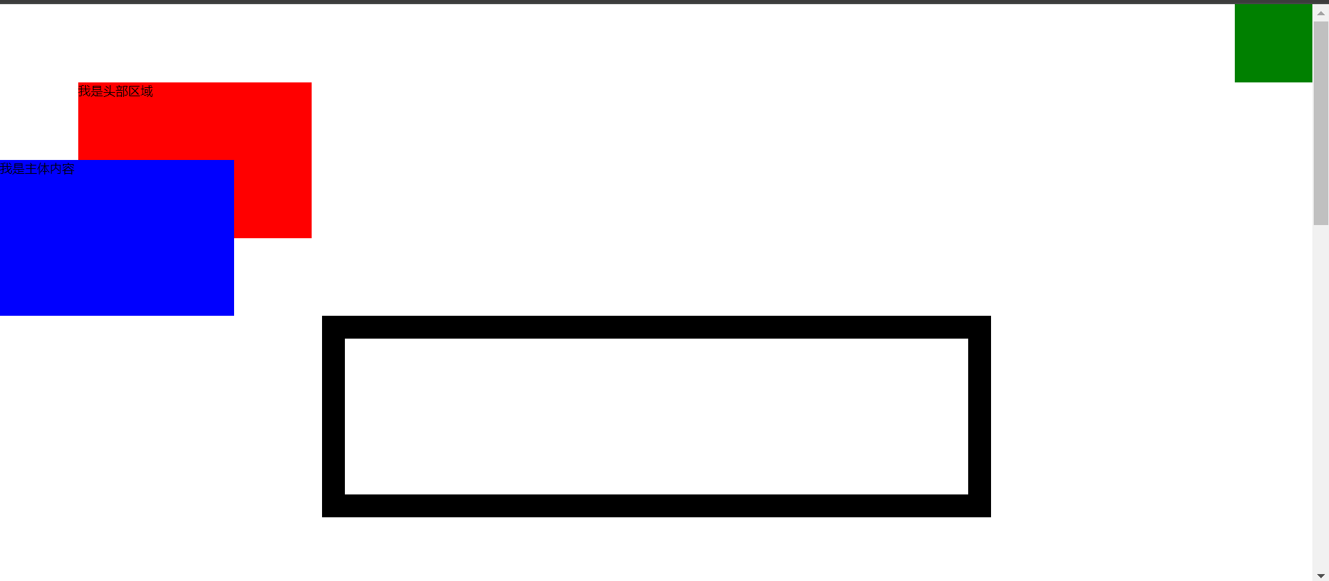
<style>
* {
margin: 0;
padding: 0;
}
header {
width: 300px;
height: 200px;
background-color: red;
position: relative;
top:20px;
left:10px;
}
section {
width: 300px;
height: 200px;
background-color: blue;
}
.parent {
margin: 0 auto;
width: 800px;
height: 200px;
border: 30px solid black;
}
.child {
width: 100px;
height: 100px;
background-color: green;
position: relative;
left: 1000px;
top: 300px;
}
</style>
</head>
<body>
<header>我是头部区域</header>
<section>我是主体内容</section>
<div class="parent">
<div class="child"></div>
</div>
</body>
- 相对定位效果图:
绝对定位的特点(子绝父相):
- 如果父元素没有定位,相对于浏览器的视口定位
如果父元素有相对定位,相对于父元素定位(子绝父相) - 脱标
- 不占位置
- 可以超出父元素的范围
固定定位的特点
-
相对于浏览器定位
-
脱标
-
不占位置
-
超出父元素的范围
-
固定定位案例:
<style>
      * {
        margin: 0;
        padding: 0;
      }
      header {
        width: 300px;
        height: 200px;
        background-color: red;
        position: fixed;
        left: 100px;
        top: 100px;
        bottom: 0px;
        position: relative;
        left: 100px;
        top: 100px;
        z-index: 2;
      }
      section {
        position: relative;
        width: 300px;
        height: 200px;
        background-color: blue;
        /* 层叠顺序属性 一定要搭配定位同时使用*/
        z-index: 3000;
      }
      .parent {
        margin: 0 auto;
        width: 800px;
        height: 200px;
        border: 30px solid black;
        /* position: relative; */
      }
      .child {
        width: 100px;
        height: 100px;
        background-color: green;
         /* 固定定位 */
        position: fixed;
        top: 0;
        right: 0;
      }
</style>
<body style="height: 2000px">
    <header>我是头部区域</header>
    <section>我是主体内容</section>
    <div class="parent">
      <div class="child"></div>
    </div>
</body>
-
固定定位效果图:
-
综合案例:
<style>
    *{
        margin: 0;
        padding: 0;
    }
    .box{
        /* 距上50px,左右居中 */
        margin:50px auto;
        width: 310px;
        height: 190px;
        border: 1px solid #333;
        /* padding影响盒子大小 */
        padding: 12px;
        position: relative;
    }
    .img1,
    .img2{
        position: absolute;
    }
    .img1{
        left: 0;
        top: 0;
    }
    .img2{
        right: 0;
        bottom: 0;
    }
</style>
<body>
    <div class="box">
        <img src="./adv.jpg" alt="">
        <img src="./top_tu.gif" alt="" class="img1">
        <img src="./br.gif" alt="" class="img2">
    </div>
</body>
-
综合案例效果图:
定位的层叠顺序:
z-index: 数字;- 层叠顺序属性 一定要搭配定位同时使用
总结:浮动与定位的区别:
- 不同点:浮动不会超出父元素的范围,定位都能超出父元素的范围
- 相同点:浮动与绝对定位、固定定位都是脱标的、都不占位置、都具有行 内块元素的特征
布局:由外到内,由大到小
- 布局案例
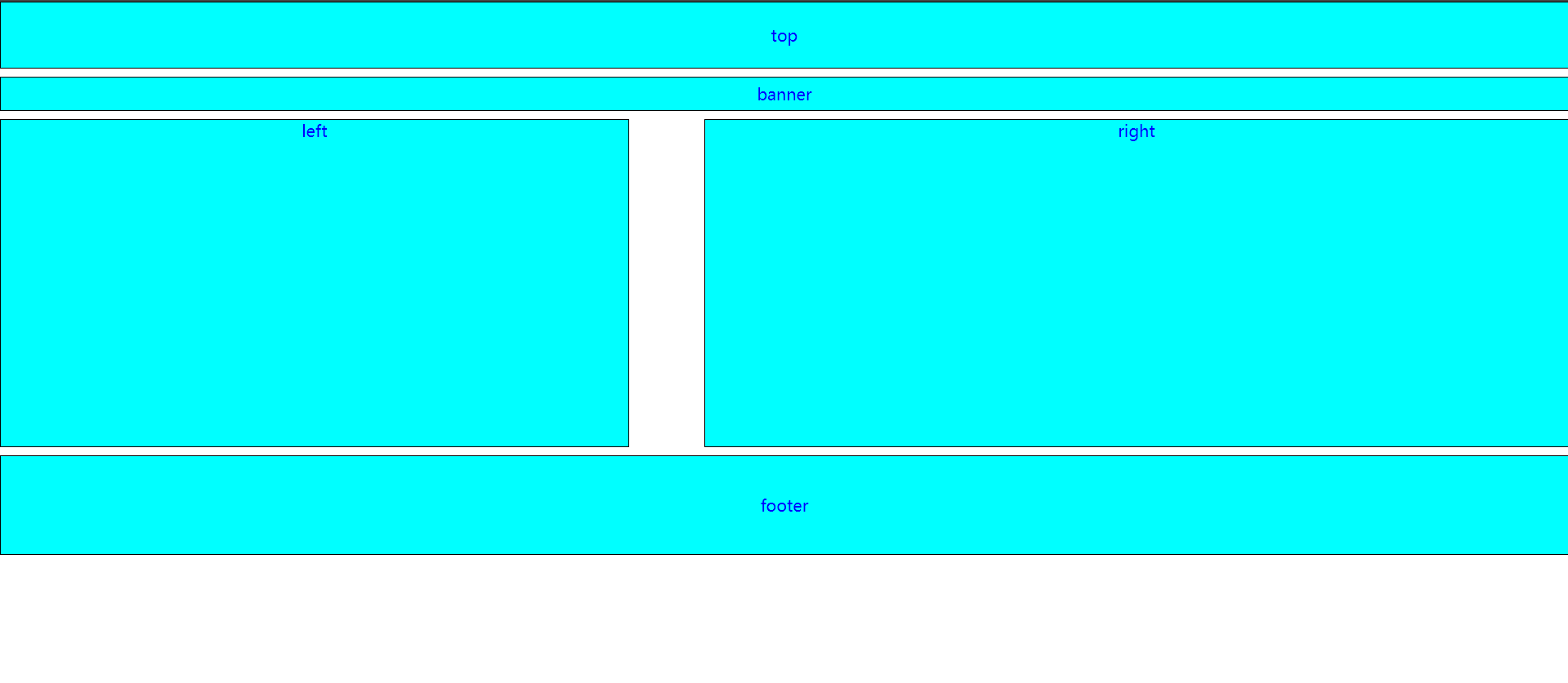
<style>
      * {
        margin: 0;
        padding: 0;
      }
      header {
        height: 80px;
        margin-top: 0 !important;
        line-height: 80px;
      }
      .banner {
        height: 40px;
        line-height: 40px;
      }
      .main {
        overflow: hidden;
      }
      footer {
        height: 120px;
        line-height: 120px;
      }
      header,
      .banner,
      footer,
      .leftBox,
      .rightBox {
        border: 1px solid black;
        background-color: aqua;
        text-align: center;
        font-size: 20px;
        color: blue;
        margin-top: 10px;
      }
      .leftBox,
      .rightBox {
        height: 400px;
      }
      .leftBox {
        width: 40%;
        float: left;
      }
      .rightBox {
        width: 55%;
        float: right;
      }
</style>
<body>
    <!-- 由外到内,由大到小 -->
    <header>top</header>
    <section class="banner">banner</section>
    <section class="main">
      <div class="leftBox">left</div>
      <div class="rightBox">right</div>
    </section>
    <footer>footer</footer>
</body>
-
布局效果图:
文章来源:https://blog.csdn.net/m0_58779986/article/details/135418365
本文来自互联网用户投稿,该文观点仅代表作者本人,不代表本站立场。本站仅提供信息存储空间服务,不拥有所有权,不承担相关法律责任。 如若内容造成侵权/违法违规/事实不符,请联系我的编程经验分享网邮箱:chenni525@qq.com进行投诉反馈,一经查实,立即删除!
本文来自互联网用户投稿,该文观点仅代表作者本人,不代表本站立场。本站仅提供信息存储空间服务,不拥有所有权,不承担相关法律责任。 如若内容造成侵权/违法违规/事实不符,请联系我的编程经验分享网邮箱:chenni525@qq.com进行投诉反馈,一经查实,立即删除!