CSS样式斜切边
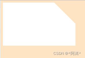
html部分
?<div class="rectangle"></div>
样式一:

? ? ? ? .rectangle {
? ? ? ? ? ? width: 251px;
? ? ? ? ? ? height: 75px;
? ? ? ? ? ? background:
? ? ? ? ? ? ? ? linear-gradient(-135deg, transparent 52px, #ffffff 0) top right;
? ? ? ? ? ? background-size: 100% 100%;
? ? ? ? ? ? background-repeat: no-repeat;
? ? ? ? ? ? background-color: bisque;
? ? ? ? }
样式二:
? ? ? ? .rectangle {
? ? ? ? ? ? width: 251px;
? ? ? ? ? ? height: 150px;
? ? ? ? ? ? background:
? ? ? ? ? ? ? ? linear-gradient(-135deg, transparent 52px, #ffffff 0) top right;
? ? ? ? ? ? background-size: 100% 100%;
? ? ? ? ? ? background-repeat: no-repeat;
? ? ? ? ? ? background-color: bisque;
? ? ? ? }
样式三:

? ? ? ? .rectangle {
? ? ? ? ? ? width: 305px;
? ? ? ? ? ? height: 75px;
? ? ? ? ? ? background:
? ? ? ? ? ? ? ? linear-gradient(-45deg, transparent 52px, #ffffff 0) bottom right,
? ? ? ? ? ? ? ? linear-gradient(-135deg, transparent 52px, #ffffff 0) top right;
? ? ? ? ? ? background-size: 100% 100%;
? ? ? ? ? ? background-repeat: no-repeat;
? ? ? ? }
样式四:
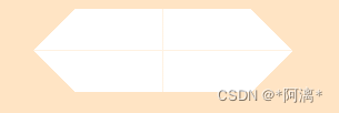
? ? ? ? .rectangle {
? ? ? ? ? ? width: 305px;
? ? ? ? ? ? height: 75px;
? ? ? ? ? ? background:
? ? ? ? ? ? ? ? linear-gradient(135deg, transparent 52px, #ffffff 0) top left,
? ? ? ? ? ? ? ? linear-gradient(45deg, transparent 52px, #ffffff 0) bottom left,
? ? ? ? ? ? ? ? linear-gradient(-45deg, transparent 52px, #ffffff 0) bottom right,
? ? ? ? ? ? ? ? linear-gradient(-135deg, transparent 52px, #ffffff 0) top right;
? ? ? ? ? ? background-size: 50% 50%;
? ? ? ? ? ? background-repeat: no-repeat;
? ? ? ? }
样式五:
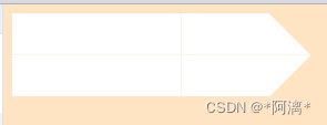
? ? ? ? .rectangle {
? ? ? ? ? ? width: 305px;
? ? ? ? ? ? height: 75px;
? ? ? ? ? ? background:
? ? ? ? ? ? ? ? linear-gradient(135deg, transparent 0px, #ffffff 0) top left,
? ? ? ? ? ? ? ? linear-gradient(45deg, transparent 0px, #ffffff 0) bottom left,
? ? ? ? ? ? ? ? linear-gradient(-45deg, transparent 52px, #ffffff 0) bottom right,
? ? ? ? ? ? ? ? linear-gradient(-135deg, transparent 52px, #ffffff 0) top right;
? ? ? ? ? ? background-size: 50% 50%;
? ? ? ? ? ? background-repeat: no-repeat;
? ? ? ? }
样式六:
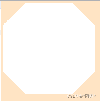
? ? ? ? .rectangle {
? ? ? ? ? ? width: 305px;
? ? ? ? ? ? height: 305px;
? ? ? ? ? ? background:
? ? ? ? ? ? ? ? linear-gradient(135deg, transparent 52px, #ffffff 0) top left,
? ? ? ? ? ? ? ? linear-gradient(45deg, transparent 52px, #ffffff 0) bottom left,
? ? ? ? ? ? ? ? linear-gradient(-45deg, transparent 52px, #ffffff 0) bottom right,
? ? ? ? ? ? ? ? linear-gradient(-135deg, transparent 52px, #ffffff 0) top right;
? ? ? ? ? ? background-size: 50% 50%;
? ? ? ? ? ? background-repeat: no-repeat;
? ? ? ? }
样式六:

?.rectangle {
? ? ? ? ? ? width: 305px;
? ? ? ? ? ? height: 305px;
? ? ? ? ? ? background:
? ? ? ? ? ? ? ? linear-gradient(135deg, transparent 52px, #e93030 150px) top left,
? ? ? ? ? ? ? ? linear-gradient(45deg, transparent 52px, #e93030 150px) bottom left,
? ? ? ? ? ? ? ? linear-gradient(-45deg, transparent 52px, #e93030 150px) bottom right,
? ? ? ? ? ? ? ? linear-gradient(-135deg, transparent 52px, #e93030 150px) top right;
? ? ? ? ? ? background-size: 50% 50%;
? ? ? ? ? ? background-repeat: no-repeat;
? ? ? ? }
样式七:

? ? ? ? .rectangle {
? ? ? ? ? ? width: 305px;
? ? ? ? ? ? height: 305px;
? ? ? ? ? ? background:
? ? ? ? ? ? ? ? linear-gradient(135deg, #e93030 150px, transparent 52px) top left,
? ? ? ? ? ? ? ? linear-gradient(45deg, ?#e93030 150px, transparent 52px) bottom left,
? ? ? ? ? ? ? ? linear-gradient(-45deg, ?#e93030 150px, transparent 52px) bottom right,
? ? ? ? ? ? ? ? linear-gradient(-135deg, ?#e93030 150px, transparent 52px) top right;
? ? ? ? ? ? background-size: 50% 50%;
? ? ? ? ? ? background-repeat: no-repeat;
? ? ? ? }
样式七 :

? ? ? ? .rectangle {
? ? ? ? ? ? width: 305px;
? ? ? ? ? ? height: 305px;
? ? ? ? ? ? background:
? ? ? ? ? ? ? ? linear-gradient(135deg, transparent 52px, #ffffff 0,transparent 81px,#ffffff 0,transparent 107px,#ffffff 0) top left,
? ? ? ? ? ? ? ? linear-gradient(45deg, transparent 52px, #ffffff 0,transparent 81px,#ffffff 0,transparent 107px,#ffffff 0) bottom left,
? ? ? ? ? ? ? ? linear-gradient(-45deg, transparent 52px, #ffffff 0,transparent 81px,#ffffff 0,transparent 107px,#ffffff 0) bottom right,
? ? ? ? ? ? ? ? linear-gradient(-135deg, transparent 52px, #ffffff 0,transparent 81px,#ffffff 0,transparent 107px,#ffffff 0) top right;
? ? ? ? ? ? background-size: 50% 50%;
? ? ? ? ? ? background-repeat: no-repeat;
? ? ? ? }
本文来自互联网用户投稿,该文观点仅代表作者本人,不代表本站立场。本站仅提供信息存储空间服务,不拥有所有权,不承担相关法律责任。 如若内容造成侵权/违法违规/事实不符,请联系我的编程经验分享网邮箱:chenni525@qq.com进行投诉反馈,一经查实,立即删除!
- Python教程
- 深入理解 MySQL 中的 HAVING 关键字和聚合函数
- Qt之QChar编码(1)
- MyBatis入门基础篇
- 用Python脚本实现FFmpeg批量转换
- 荷兰公司注册优势 注册荷兰公司所需条件 荷兰公司年审
- 1 Cesium介绍
- docker打包介绍
- php 调用python解密 AES-128-GCM
- 深入理解通用的HTTP POST请求发送方法
- Excel_VBA实现:弹出对话框进行打开另存(附FileDialog 属性)
- 矿泉水除硝酸盐的关键技术
- echarts 折线图加阴影
- 基于web“云课堂”智慧教学平台的设计与实现(源码+开题)
- cesium鼠标打点设置高度之后经纬度丢失问题