HTML+CSS-03
transform
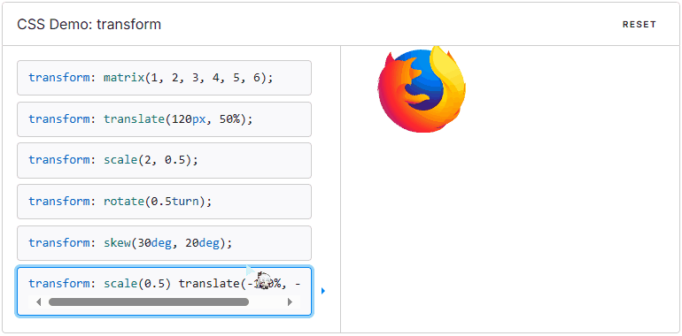
CSS transform 属性允许你旋转,缩放,倾斜或平移给定元素。这是通过修改 CSS 视觉格式化模型的坐标空间来实现的。
示例
警告: 只能转换由盒模型定位的元素。根据经验,如果元素具有
display: block,则由盒模型定位元素。
语法
/* 无变换 */
transform: none;

/* 2D 矩阵变换 */
transform: matrix(1, 2, 3, 4, 5, 6);

/* 沿 X 轴平移 12 像素,沿 Y 轴平移 50% */
transform: translate(12px, 50%);

/* 沿 X 轴平移 2em */
transform: translateX(2em);

/* 沿 Y 轴平移 3in */
transform: translateY(3in);

/* 横向缩放 2 倍,纵向缩放 0.5 倍 */
transform: scale(2, 0.5);

/* 横向缩放 2 倍 */
transform: scaleX(2);

/* 纵向缩放 0.5 倍 */
transform: scaleY(0.5);

/* 旋转 0.5 圈(90度) */
transform: rotate(0.5turn);

/* 横向斜切 30 度,纵向斜切 20 度 */
transform: skew(30deg, 20deg);

/* 横向斜切 30 度 */
transform: skewX(30deg);

/* 纵向斜切 1.07 弧度 */
transform: skewY(1.07rad);

/* 3D 矩阵变换 */
transform: matrix3d(1, 2, 3, 4, 5, 6, 7, 8, 9, 10, 11, 12, 13, 14, 15, 16);
/* 2D 平移 */
transform: translate(12px, 50%); /* 在X轴上平移12px,在Y轴上平移到50%的位置 */
transform: translate(12px); /* 在X轴上平移12px */
transform: translateY(50%); /* 在Y轴上平移到50%的位置 */
transform: translateZ(2px); /* 在Z轴上平移2px */

/* 3D 平移 */
transform: translate3d(12px, 50%, 3em); /* 在X轴上平移12px,在Y轴上平移到50%的位置,在Z轴上平移3em */

/* 3D 缩放 */
transform: scale3d(2.5, 1.2, 0.3); /* 在X轴上放大2.5倍,在Y轴上放大1.2倍,在Z轴上放大0.3倍 */
transform: scaleZ(0.3); /* 在Z轴上缩放0.3倍 */

/* 3D 旋转 */
transform: rotate3d(1, 2, 3, 10deg); /* 在三维空间中旋转,绕X轴1个单位,绕Y轴2个单位,绕Z轴3个单位,总共旋转10度 */
transform: rotateX(10deg); /* 在X轴上旋转10度 */
transform: rotateY(10deg); /* 在Y轴上旋转10度 */
transform: rotateZ(10deg); /* 在Z轴上旋转10度 */

/* 透视效果 */
transform: perspective(17px); /* 设置透视视景体距离,决定三维转换元素的视觉效果距离,这里设置为17px */

/* 多属性组合 */
transform: translateX(10px) rotate(10deg) translateY(5px); /* 先在X轴上平移10px,然后旋转10度,最后在Y轴上平移5px */

/* 继承和默认值 */
transform: inherit; /* 继承父元素的 transform 属性 */
transform: initial; /* 将 transform 属性设置为其初始值 */
transform: unset; /* 将 transform 属性设置为其默认值,如果继承则取消继承 */
transform-style
CSS 属性 transform-style 设置元素的子元素是位于 3D 空间中还是平面中。
示例
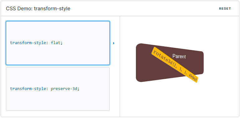
如果选择平面,元素的子元素将不会有 3D 的遮挡关系。
由于这个属性不会被继承,因此必须为元素的所有非叶子子元素设置它。
设置元素的子元素位于该元素的平面中。
指示元素的子元素应位于 3D 空间中。
transform-origin
transform-origin CSS 属性让你更改一个元素变形的原点。
示例

transform-origin属性可以使用一个,两个或三个值来指定,其中每个值都表示一个偏移量。没有明确定义的偏移将重置为其对应的初始值。
如果定义了两个或更多值并且没有值的关键字,或者唯一使用的关键字是center,则第一个值表示水平偏移量,第二个值表示垂直偏移量。
- 一个值:
- 必须是
<length>,<percentage>,或left,center,right,top,bottom关键字中的一个。
- 必须是
- 两个值:
- 其中一个必须是
<length>,<percentage>,或left,center,right关键字中的一个。 - 另一个必须是
<length>,<percentage>,或top,center,bottom关键字中的一个。
- 其中一个必须是
- 三个值:
- 前两个值和只有两个值时的用法相同。
- 第三个值必须是
<length>。它始终代表 Z 轴偏移量。
perspective
CSS 属性 perspective 指定了观察者与 z=0 平面的距离,使具有三维位置变换的元素产生透视效果。z>0 的三维元素比正常大,而 z<0 时则比正常小,大小程度由该属性的值决定。
示例
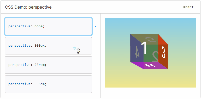
三维元素在观察者后面的部分不会绘制出来,即 z 轴坐标值大于 perspective 属性值的部分。
默认情况下,消失点位于元素的中心,但是可以通过设置 perspective-origin 属性来改变其位置。
当该属性值不为 0 和 none 时,会创建新的 层叠上下文。在这种情况下,容器内元素的层叠关系像是使用了 position: fixed 一样。
/* 关键字值 */
perspective: none; /* 不设置透视效果 */

/* <length> 值 */
perspective: 20px; /* 设置透视视景体距离为20像素 */
perspective: 3.5em; /* 设置透视视景体距离为当前字体大小的3.5倍 */

/* 全局值 */
perspective: inherit; /* 继承父元素的 perspective 属性 */
perspective: initial; /* 将 perspective 属性设置为其初始值 */
perspective: unset; /* 将 perspective 属性设置为其默认值,如果继承则取消继承 */
没有应用 perspective 样式时的默认值。
<length> 指定观察者距离 z=0 平面的距离,为元素及其内容应用透视变换。当值为 0 或负值时,无透视变换。
案例-1-立方体
示例

代码
<!DOCTYPE html>
<html>

<head>
	<meta charset="utf-8">
	<title></title>
	<style type="text/css">
		.bg {
			background-color: #e5e4fa;
		}

		.cube {
			width: 300px;
			height: 300px;
			margin: 200px auto;
			/* border: 2px solid lightgreen; */
			/* 相对定位 */
			position: relative;
			/* 使子元素保留3D的空间关系 */
			transform-style: preserve-3d;
			transform: rotateX(30deg) rotateY(60deg);
			/* 视距,正常值800px-1000px */
			/* perspective: 800px; */
		}

		div {
			width: 300px;
			height: 300px;
			position: relative;
			top: 0;
			left: 0;
			transition: all 4s;
		}

		.front {
			background-color: lightblue;
			transform: translateZ(150px);
			opacity: 0.85;
		}

		.back {
			background-color: lightgreen;
			transform: translateZ(-150px) translateY(-300px);
			opacity: 0.85;
		}

		.right {
			background-color: aquamarine;
			transform: rotateY(90deg) translateY(-600px) translateZ(150px);
			opacity: 0.85;
		}

		.left {
			background-color: mediumpurple;
			transform: rotateY(90deg) translateY(-900px) translateZ(-150px);
			opacity: 0.85;
		}

		.top {
			background-color: darkred;
			transform: translateY(-1350px) rotateX(90deg);
			opacity: 0.85;
		}

		.bottom {
			background-color: royalblue;
			/* 控制位移和旋转 */
			transform: translateY(-1350px) rotateX(90deg);
			/* 设置透明度 */
			opacity: 0.85;
		}

		.cube:hover {
			transform: rotateX(300deg) rotateY(600deg);
		}
	</style>
</head>

<body class="bg">
	<div class="cube">
		<div class="front">
			<img src="../static/avatar/0001.jpg" alt="" style="width: 300px; height: 300px;" />
		</div>
		<div class="back">
			<img src="../static/avatar/0002.jpg" alt="" style="width: 300px; height: 300px;" />
		</div>
		<div class="right">
			<img src="../static/avatar/0003.jpg" alt="" style="width: 300px; height: 300px;" />
		</div>
		<div class="left">
			<img src="../static/avatar/0004.jpg" alt="" style="width: 300px; height: 300px;" />
		</div>
		<div class="top">
			<img src="../static/avatar/0005.jpg" alt="" style="width: 300px; height: 300px;" />
		</div>
		<div class="bottom">
			<img src="../static/avatar/0006.jpg" alt="" style="width: 300px; height: 300px;" />
		</div>
	</div>
</body>

</html>
案例-2-风车
示例

代码
<!DOCTYPE html>
<html>
	<head>
		<meta charset="utf-8">
		<title>风车</title>
		<style type="text/css">
			.bg{
				background-color: #e5e4fa;
			}
			.max{
				width: 100px;
				height: 300px;
				/* border: 4px solid greenyellow; */
				margin: 200px auto;
				transform-style: preserve-3d;
				position: relative;
				transform: rotateX(10deg) rotateY(60deg);
			}
			div {
				width: 100px;
				height: 300px;
				transition: all 2s;
			}
			.windmill-1{
				background-color: skyblue;
				position: absolute;
				top: 0;
				left: 0;

			}
			.windmill-2{
				background-color: yellowgreen;
				position: absolute;
				top: 0;
				left: 0;
				transform: rotateX(60deg);
			}
			.windmill-3{
				background-color: darkorange;
				position: absolute;
				top: 0;
				left: 0;
				transform: rotateX(120deg);
			}
			.max:hover .windmill-1{
				transform: rotateX(180deg);
			}
			.max:hover .windmill-2{
				transform: rotateX(240deg);
			}
			.max:hover .windmill-3{
				transform: rotateX(300deg);
			}
		</style>
	</head>
	<body class="bg">
		<div class="max">
			<div class="windmill-1"></div>
			<div class="windmill-2"></div>
			<div class="windmill-3"></div>
		</div>
	</body>
</html>
案例-3-菜单导航栏
示例

代码
<!DOCTYPE html>
<html>

<head>
	<meta charset="utf-8">
	<title>菜单导航栏</title>
	<style type="text/css">
		.max {
			width: 100px;
			height: 40px;
			transform-style: preserve-3d;
			margin: 100px auto;
			transition: all 1s;
			float: left;
			/* transform: rotateX(30deg) rotateY(60deg); */
			/* border: 0.09px solid greenyellow; */
		}

		.top-1 {
			position: absolute;
			left: 0;
			top: 0;
			width: 100px;
			height: 40px;
			background-color: mediumpurple;
			transform: translateZ(-20px);
			/* transform: rotateZ(-25deg); */
		}

		.top-2 {
			position: absolute;
			left: 0;
			top: 0;
			width: 100px;
			height: 40px;
			background-color: royalblue;
			transform: translate3d(0, 20px, 0) rotateX(90deg);
		}

		.max:hover {
			transform: rotateX(-90deg);
		}
	</style>
</head>

<body>
	<div class="max">
		<div class="top-1"></div>
		<div class="top-2"></div>
	</div>
	<div class="max">
		<div class="top-1"></div>
		<div class="top-2"></div>
	</div>
	<div class="max">
		<div class="top-1"></div>
		<div class="top-2"></div>
	</div>
	<div class="max">
		<div class="top-1"></div>
		<div class="top-2"></div>
	</div>
	<div class="max">
		<div class="top-1"></div>
		<div class="top-2"></div>
	</div>
</body>

</html>
CSS动画基础
@keyframes
关键帧 @keyframes at-rule 规则通过在动画序列中定义关键帧(或 waypoints)的样式来控制 CSS 动画序列中的中间步骤。和 转换 transition 相比,关键帧 keyframes 可以控制动画序列的中间步骤。
@keyframes slidein {
  from {
    transform: translateX(0%);
  }

  to {
    transform: translateX(100%);
  }
}
JavaScript 可以通过 CSS 对象模型的 CSSKeyframesRule (en-US) 接口来访问 @keyframes。
要使用关键帧,先创建一个带名称的 @keyframes 规则,以便后续使用 animation-name 属性将动画同其关键帧声明匹配。每个 @keyframes 规则包含多个关键帧,也就是一段样式块语句,每个关键帧有一个百分比值作为名称,代表在动画进行中,在哪个阶段触发这个帧所包含的样式。
可以按任意顺序列出关键帧百分比;它们将按照其应该发生的顺序来处理。
帧列表的名称。名称必须符合 CSS 语法中对标识符的定义。
等价于 0%。
等价于 100%。
动画序列中触发关键帧的时间点,使用百分值来表示。
案例-4-初识动画
示例

代码
<!DOCTYPE html>
<html>

<head>
	<meta charset="utf-8">
	<title></title>
	<style type="text/css">
		.max {
			width: 200px;
			height: 200px;
			background-color: pink;
			animation: a1 5s;
		}

		/* 定义一个动画 */
		@keyframes a1 {
			/* 从哪个位置开始 */
			/* from{
					transform: translate(0px,0px);
				} */
			/* 到什么位置 */
			/* to{
					transform: translate(1000px,1000px);
				} */

			0% {}

			25% {
				transform: translate(1000px, 0px);
			}

			50% {
				transform: translate(1000px, 500px);
			}

			75% {
				transform: translate(0px, 500px);
			}

			100% {
				transform: translate(0px, 0px);
			}
		}
	</style>
</head>

<body>
	<div class="max">

	</div>
</body>

</html>
案例-5-动画的速度曲线
示例
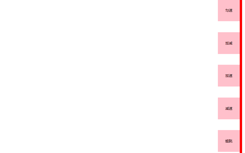
代码
<!DOCTYPE html>
<html>

<head>
	<meta charset="utf-8">
	<title></title>
	<style type="text/css">
		* {
			padding: 0px;
			margin: 0px;
			text-align: center;
			/* 设置行高为100 */
			line-height: 100px;
		}

		.qpx {
			width: 10px;
			height: 1200px;
			background-color: red;
			top: 0px;
			left: 100px;
			animation: a1 linear 5s forwards;
		}

		div {
			width: 100px;
			height: 100px;
			background-color: pink;
			position: absolute;
		}

		.a1 {
			animation: a1 linear 5s forwards;
		}

		.a2 {
			top: 150px;
			animation: a1 ease 5s forwards;
		}

		.a3 {
			top: 300px;
			animation: a1 ease-in 5s forwards;
		}

		.a4 {
			top: 450px;
			animation: a1 ease-out 5s forwards;
		}

		.a5 {
			top: 600px;
			animation: a1 steps(8) 5s forwards;
		}

		@keyframes a1 {
			100% {
				transform: translateX(1000px);
			}
		}
	</style>
</head>

<body>
	<!-- 动画的速度曲线 -->
	<div class="qpx"></div>
	<div class="a1">匀速</div>
	<div class="a2">加减</div>
	<div class="a3">加速</div>
	<div class="a4">减速</div>
	<div class="a5">蛙跳</div>
</body>

</html>
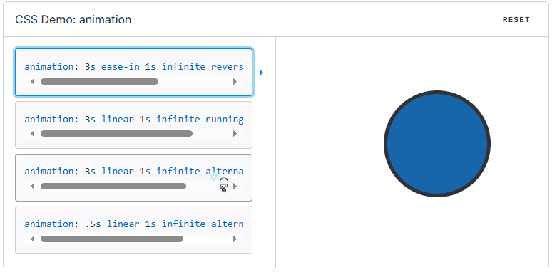
animation
CSS animation 属性是 animation-name,animation-duration, animation-timing-function,animation-delay,animation-iteration-count,animation-direction,animation-fill-mode 和 animation-play-state 属性的一个简写属性形式。
示例
/* 关键帧动画:持续时间 | 缓动函数 | 延迟 |
  迭代次数 | 方向 | 填充模式 | 播放状态 | 名称 */
animation: 3s ease-in 1s 2 reverse both paused slidein;

/* 关键帧动画:持续时间 | 缓动函数 | 延迟 | 名称 */
animation: 3s linear 1s slidein;

/* 两个动画 */
animation:
  3s linear slidein,
  3s ease-out 5s slideout;
animation 属性用来指定一组或多组动画,每组之间用逗号相隔。
案例-6-走马图
示例

代码
<!DOCTYPE html>
<html lang="en">

<head>
    <meta charset="UTF-8">
    <meta name="viewport" content="width=device-width, initial-scale=1.0">
    <title>Document</title>
    <style type="text/css">
        * {
            padding: 0;
            margin: 0;
            list-style: none;
        }

        .max {
            height: 200px;
            width: 600px;
            border: 2px solid skyblue;
            margin: 100px auto;
            overflow: hidden;
        }

        img {
            width: 200px;
            height: 200px;
        }

        .list {
            width: 2200px;
            height: 200px;
            display: flex;
            animation: lb 4s linear infinite;
        }

        @keyframes lb {
            0% {}

            100% {
                /* 沿着x轴移动 */
                transform: translateX(-1600px);
            }
        }
    </style>
</head>

<body>
    <div class="max">
        <ul class="list">
            <li><img src="../static/avatar/0001.jpg" alt=""></li>
            <li><img src="../static/avatar/0002.jpg" alt=""></li>
            <li><img src="../static/avatar/0003.jpg" alt=""></li>
            <li><img src="../static/avatar/0004.jpg" alt=""></li>
            <li><img src="../static/avatar/0005.jpg" alt=""></li>
            <li><img src="../static/avatar/0006.jpg" alt=""></li>
            <li><img src="../static/avatar/0007.jpg" alt=""></li>
            <li><img src="../static/avatar/0008.jpg" alt=""></li>
            <li><img src="../static/avatar/0001.jpg" alt=""></li>
            <li><img src="../static/avatar/0002.jpg" alt=""></li>
            <li><img src="../static/avatar/0003.jpg" alt=""></li>
            <li><img src="../static/avatar/0004.jpg" alt=""></li>
        </ul>
    </div>
</body>

</html>
注意:我设置的每个照片是200*200的8张重复图片,边框为600**200,为了消除间断效果需要按照顺序在<li>中至少补3张图,<ul>中的宽度属性要设置为图片的总数量宽度之和。
案例-7-奔跑的熊
示例

代码
<!DOCTYPE html>
<html lang="en">

<head>
    <meta charset="UTF-8">
    <meta name="viewport" content="width=device-width, initial-scale=1.0">
    <title>Document</title>
    <style>
        body {
            background-color: lightgreen;
        }

        .max {
            width: 200px;
            height: 100px;
            background-image: url(../static/bear.png);
            animation: dh1 0.7s steps(7) infinite, dh2 3s linear infinite;
        }

        @keyframes dh1 {
            0% {}

            100% {
                background-position: 1400px 0;
            }
        }

        @keyframes dh2 {
            0% {}

            100% {
                transform: translateX(1600px);
            }
        }
    </style>
</head>

<body>
    <div class="max"></div>
</body>

</html>
注:这里使用的是一张熊的奔跑图片,该图片有熊奔跑时的8张动作图,是一组长图,并且是一张png格式的图片

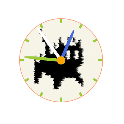
案例-8-时钟
示例(视图已做加速处理)
代码
<!DOCTYPE html>
<html lang="en">

<head>
    <meta charset="UTF-8">
    <meta name="viewport" content="width=device-width, initial-scale=1.0">
    <title>Document</title>
    <style>
        .max {
            width: 400px;
            height: 400px;
            border: 4px solid lightsalmon;
            margin: 200px auto;
            background-image: url(../static/avatar/0002.jpg);
            border-radius: 50%;
            background-size: 100% 100%;
            position: relative;
            transform-style: preserve-3d;
        }

        .a1 {
            width: 10px;
            height: 20px;
            background-color: yellowgreen;
            position: absolute;
            left: 50%;
            top: 0%;
            transform: translateX(-50%);
            transform-origin: 5px 200px;
        }

        .a2 {
            width: 10px;
            height: 20px;
            background-color: yellowgreen;
            position: absolute;
            left: 50%;
            top: 0%;
            transform: translateX(-50%) rotateZ(30deg);
            transform-origin: 5px 200px;
        }

        .a3 {
            width: 10px;
            height: 20px;
            background-color: yellowgreen;
            position: absolute;
            left: 50%;
            top: 0%;
            transform: translateX(-50%) rotateZ(60deg);
            transform-origin: 5px 200px;
        }

        .a4 {
            width: 10px;
            height: 20px;
            background-color: yellowgreen;
            position: absolute;
            left: 50%;
            top: 0%;
            transform: translateX(-50%) rotateZ(90deg);
            transform-origin: 5px 200px;
        }

        .a5 {
            width: 10px;
            height: 20px;
            background-color: yellowgreen;
            position: absolute;
            left: 50%;
            top: 0%;
            transform: translateX(-50%) rotateZ(120deg);
            transform-origin: 5px 200px;
        }

        .a6 {
            width: 10px;
            height: 20px;
            background-color: yellowgreen;
            position: absolute;
            left: 50%;
            top: 0%;
            transform: translateX(-50%) rotateZ(150deg);
            transform-origin: 5px 200px;
        }

        .a7 {
            width: 10px;
            height: 20px;
            background-color: yellowgreen;
            position: absolute;
            left: 50%;
            top: 0%;
            transform: translateX(-50%) rotateZ(180deg);
            transform-origin: 5px 200px;
        }


        .a8 {
            width: 10px;
            height: 20px;
            background-color: yellowgreen;
            position: absolute;
            left: 50%;
            top: 0%;
            transform: translateX(-50%) rotateZ(210deg);
            transform-origin: 5px 200px;
        }


        .a9 {
            width: 10px;
            height: 20px;
            background-color: yellowgreen;
            position: absolute;
            left: 50%;
            top: 0%;
            transform: translateX(-50%) rotateZ(240deg);
            transform-origin: 5px 200px;
        }

        .a10 {
            width: 10px;
            height: 20px;
            background-color: yellowgreen;
            position: absolute;
            left: 50%;
            top: 0%;
            transform: translateX(-50%) rotateZ(270deg);
            transform-origin: 5px 200px;
        }

        .a11 {
            width: 10px;
            height: 20px;
            background-color: yellowgreen;
            position: absolute;
            left: 50%;
            top: 0%;
            transform: translateX(-50%) rotateZ(300deg);
            transform-origin: 5px 200px;
        }

        .a12 {
            width: 10px;
            height: 20px;
            background-color: yellowgreen;
            position: absolute;
            left: 50%;
            top: 0%;
            transform: translateX(-50%) rotateZ(330deg);
            transform-origin: 5px 200px;
        }


        .center {
            width: 40px;
            height: 40px;
            background-color: orange;
            position: absolute;
            border-radius: 50%;
            z-index: 99;
            top: 50%;
            left: 50%;
            transform: translate(-50%, -50%);
        }

        .miao {
            width: 15px;
            height: 200px;
            background-color: #fff;
            position: absolute;
            top: 0px;
            left: 50%;
            transform: translateX(-50%);
            border-top-left-radius: 50%;
            border-top-right-radius: 50%;
            /* 设置旋转中心 */
            transform-origin: 7.5px bottom;
            animation: miao 60s steps(60) infinite;

        }

        .fen {
            width: 15px;
            height: 180px;
            background-color: yellowgreen;
            position: absolute;
            top: 20px;
            left: 50%;
            transform: translateX(-50%);
            border-top-left-radius: 50%;
            border-top-right-radius: 50%;
            /* 设置旋转中心 */
            transform-origin: 7.5px bottom;
            animation: miao 3600s linear infinite;
        }

        .shi {
            width: 15px;
            height: 160px;
            background-color: royalblue;
            position: absolute;
            top: 40px;
            left: 50%;
            transform: translateX(-50%);
            border-top-left-radius: 50%;
            border-top-right-radius: 50%;
            /* 设置旋转中心 */
            transform-origin: 7.5px bottom;
            animation: miao 43200s linear infinite;
        }

        @keyframes miao {
            0% {
                transform: translateX(-50%) rotate(0deg);
            }

            100% {
                transform: translateX(-50%) rotate(360deg);
            }
        }
    </style>
</head>

<body>
    <div class="max">
        <div class="a1"></div>
        <div class="a2"></div>
        <div class="a3"></div>
        <div class="a4"></div>
        <div class="a5"></div>
        <div class="a6"></div>
        <div class="a7"></div>
        <div class="a8"></div>
        <div class="a9"></div>
        <div class="a10"></div>
        <div class="a11"></div>
        <div class="a12"></div>
        <div class="center"></div>
        <div class="miao"></div>
        <div class="fen"></div>
        <div class="shi"></div>
    </div>
</body>

</html>
注意:分钟与小时的单位换算。
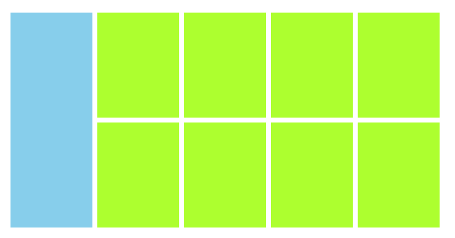
案例-9-列表悬浮动画
示例
代码
<!DOCTYPE html>
<html>

<head>
	<meta charset="utf-8">
	<title></title>
	<style type="text/css">
		* {
			margin: 0;
			padding: 0;
		}

		.max {
			width: 1226px;
			height: 614px;
			/* background-color: coral; */
			margin: 100px auto;
			display: flex;
		}

		.left {
			width: 234px;
			height: 614px;
			background-color: skyblue;
		}

		.right {
			width: 992px;
			height: 614px;
			/* background-color: aquamarine; */
		}

		.biaoge {
			width: 234px;
			height: 260px;
			padding: 20px 0;
			margin-left: 14px;
			justify-content: space-between;
			background-color: greenyellow;
			float: left;
			display: inline;

		}

		.biaoge:hover {
			animation-name: donghua;
			animation-duration: 2s;
			animation-direction: alternate;
			animation-fill-mode: forwards;
			box-shadow: rgba(0, 0, 0, .3) 0px 0px 15px;
		}

		.left:hover {
			animation-name: donghua;
			animation-duration: 2s;
			animation-direction: alternate;
			animation-fill-mode: forwards;
			box-shadow: rgba(0, 0, 0, .3) 0px 0px 15px;
		}

		@keyframes donghua {
			0% {}

			25% {
				transform: translateY(-10px);
			}

			75% {
				transform: translateY(-10px);
			}

			100% {
				transform: translateY(-10px);
			}
		}
	</style>
</head>

<body>
	<div class="max">
		<div class="left"></div>
		<div class="right">
			<div class="biaoge">

			</div>
			<div class="biaoge">

			</div>
			<div class="biaoge">

			</div>
			<div class="biaoge">

			</div>
			<div class="biaoge" style="margin-top: 14px;">

			</div>
			<div class="biaoge" style="margin-top: 14px;">

			</div>
			<div class="biaoge" style="margin-top: 14px;">

			</div>
			<div class="biaoge" style="margin-top: 14px;">

			</div>
		</div>
	</div>
</body>

</html>
本文来自互联网用户投稿,该文观点仅代表作者本人,不代表本站立场。本站仅提供信息存储空间服务,不拥有所有权,不承担相关法律责任。 如若内容造成侵权/违法违规/事实不符,请联系我的编程经验分享网邮箱:chenni525@qq.com进行投诉反馈,一经查实,立即删除!
- Python教程
- 深入理解 MySQL 中的 HAVING 关键字和聚合函数
- Qt之QChar编码(1)
- MyBatis入门基础篇
- 用Python脚本实现FFmpeg批量转换
- Spring MVC学习——解决请求参数中文乱码
- RabbitMQ进阶
- 基于SpringBoot+Vue前后分离的微博数据分析可视化管理平台(Java毕业设计)
- 【考研数学】11早鸟课 初识(不定)积分
- 汽车标定工具--INCA使用方法
- 2023年成都市中等职业学校学生技能大赛“网络搭建及应用”赛项竞赛样卷
- PyTorch优化算法:torch.optim.SGD的参数详解和应用
- ifc 到底如何渲染,真复杂!
- Liunx:线程控制
- 《吐血整理》进阶系列教程-拿捏Fiddler抓包教程(17)-Fiddler如何充当第三者,再识AutoResponder标签-下篇