【QML-布局】
QML编程指南 VX:hao541022348
■ 布局
■ Manual Positioning 手动定位
其实就是通过设置元素 Item 的x,y属性,可以将它们放置在屏幕上特定的x,y坐标处。
  import QtQuick 2.3
  Item {
      width: 100; height: 100

      Rectangle {
          // Manually positioned at 20,20
          x: 20
          y: 20
          width: 80
          height: 80
          color: "red"
      }
  }
■ Anchors 锚定位
基本上每个 可视化 Item 类型都提供了锚定到其他 Item 类型的能力。
每个元素有7条锚线:左、右、垂直居中、上、下、基线和水平居中。
这三条垂直锚线可以锚定到另一个项目的三条垂直锚线中的任何一条上,这四条水平锚线可以锚定到另一个项目的水平锚线上。Anchors 也是用的相对锚定的方式来实现的。
| 锚属性 | 描述 |
|---|---|
| anchors.left: | 元素左边缘相对于父元素或其他元素的左边缘的位置。 |
| anchors.right: | 元素右边缘相对于父元素或其他元素的右边缘的位置。 |
| anchors.top: | 元素顶部边缘相对于父元素或其他元素的顶部边缘的位置。 |
| anchors.bottom: | 元素底部边缘相对于父元素或其他元素的底部边缘的位置。 |
| anchors.horizontalCenter: | 元素水平中心相对于父元素或其他元素的水平中心的位置。 |
| anchors.verticalCenter: | 元素垂直中心相对于父元素或其他元素的垂直中心的位置。 |
| anchors.fill: | 元素完全填充父元素或其他元素的大小。 |
| anchors.centerIn: | 元素完全居中于父元素或其他元素。 |
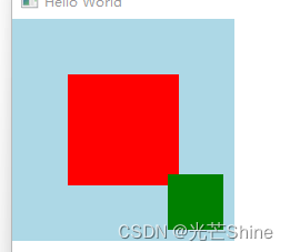
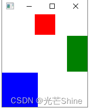
    Rectangle {
        width: 200
        height: 200
        color: "lightblue"
        Rectangle {
            width: 100
            height: 100
            color: "red"
            anchors.centerIn: parent
        }
        Rectangle {
            width: 50
            height: 50
            color: "green"
            anchors.right: parent.right
            anchors.bottom: parent.bottom
            anchors.margins: 10
        }
    }
  import QtQuick 2.3

  Item {
      width: 200; height: 200

      Rectangle {
          // Anchored to 20px off the top right corner of the parent
          anchors.right: parent.right
          anchors.top: parent.top
          anchors.margins: 20 // Sets all margins at once

          width: 80
          height: 80
          color: "orange"
      }

      Rectangle {
          // Anchored to 20px off the top center corner of the parent.
          // Notice the different group property syntax for 'anchors' compared to
          // the previous Rectangle. Both are valid.
          anchors { horizontalCenter: parent.horizontalCenter; top: parent.top; topMargin: 20 }

          width: 80
          height: 80
          color: "green"
      }
  }
■ Positioners 定位器
放置在定位器中的物品会以某种方式自动定位;
■ Row(行定位器)
Row 沿着一行安置它的孩子们,在你需要水平放置一系列的 Item 时,它比锚布局更加方便。
一旦你把一个 Item 交给 Row 来管理,那就不要再使用 Item 的 x 、 y 、 anchors 等属性了, Row 会安排得妥妥的。
在一个 Row 内的 item ,可以使用 Positioner 附加属性来获知自己在 Row 中的更多位置信息。 Positioner 有 index 、 isFirstItem 、 isLastItem 三个属性。
** 示例一 **
  import QtQuick 2.3

  Item {
      width: 300; height: 100

      Row { // The "Row" type lays out its child items in a horizontal line
          spacing: 20 // Places 20px of space between items

          Rectangle { width: 80; height: 80; color: "red" }
          Rectangle { width: 80; height: 80; color: "green" }
          Rectangle { width: 80; height: 80; color: "blue" }
      }
  }
** 示例二 **
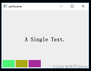
Row 本身是一个 Item ,所以你可以使用锚布局来定位一个 Row
import QtQuick 2.0
import QtQuick.Controls 1.1

Rectangle {
    width: 360;
    height: 240;
    color: "#EEEEEE";
    id: rootItem;

    Text {
        id: centerText;
        text: "A Single Text.";
        anchors.centerIn: parent;
        font.pixelSize: 24;
        font.bold: true;
    }

    function setTextColor(clr){
        centerText.color = clr;
    }

    Row {
        anchors.left: parent.left;
        anchors.leftMargin: 4;
        anchors.bottom: parent.bottom;
        anchors.bottomMargin: 4;
        spacing: 4;

        Rectangle {
            width: 50;
            height: 30;
            color: Qt.rgba(Math.random(), Math.random(), Math.random(), 1.0);
        }

        Rectangle {
            width: 50;
            height: 30;
            color: Qt.rgba(Math.random(), Math.random(), Math.random(), 1.0);
        }

        Rectangle {
            width: 50;
            height: 30;
            color: Qt.rgba(Math.random(), Math.random(), Math.random(), 1.0);
        }
    }
}
■ Column (列定位器)
Column你可以将任何其他 QML元素作为Column的子元素,如按钮、图像、自定义组件等。
| 属性 | 描述 |
|---|---|
| spacing: | 子元素之间的间距。可以设置为像素值或其他长度单位。 |
| Layout.alignment: | 用于控制子元素在垂直方向上的对齐方式,如AlignHCenter、AlignTop等。 |
| Layout.fillHeight: | 是否填充剩余空间。如果设置为true,子元素将占用剩余的垂直空间。 |
** 示例一 **
Column {
    spacing: 10 // 子元素之间的间距
    Text {
        text: "First Item"
    }
    Rectangle {
        width: 100
        height: 100
        color: "red"
    }
    Item {
        width: 200
        height: 50
    }
    Text {
        text: "First Item"
    }
}
** 示例二 **
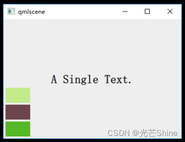
import QtQuick 2.0
import QtQuick.Controls 1.1

Rectangle {
    width: 360;
    height: 240;
    color: "#EEEEEE";
    id: rootItem;

    Text {
        id: centerText;
        text: "A Single Text.";
        anchors.centerIn: parent;
        font.pixelSize: 24;
        font.bold: true;
    }

    function setTextColor(clr){
        centerText.color = clr;
    }

    Column {
        anchors.left: parent.left;
        anchors.leftMargin: 4;
        anchors.bottom: parent.bottom;
        anchors.bottomMargin: 4;
        spacing: 4;

        Rectangle {
            width: 50;
            height: 30;
            color: Qt.rgba(Math.random(), Math.random(), Math.random(), 1.0);
        }

        Rectangle {
            width: 50;
            height: 30;
            color: Qt.rgba(Math.random(), Math.random(), Math.random(), 1.0);
        }

        Rectangle {
            width: 50;
            height: 30;
            color: Qt.rgba(Math.random(), Math.random(), Math.random(), 1.0);
        }
    }
}
■ Grid(表格定位器)
Grid 在一个网格上安置它的子 Items ,它会创建一个拥有很多单元格的网格,足够容纳它所有的子 Items 。
Grid 会从左到右、从上到下把它的子 items 一个一个塞到单元格里。
item 默认会被放在一个单元格左上角 (0, 0) 的位置。
你可以通过 rows 和 columns 属性设定表格的行、列数。如果你不设置,默认只有四列,而行数则会根据实际的 item 数量自动计算。rowSpacing 和 columnSpacing 指定行、列间距,单位是像素。
Grid 的 flow 属性描述表格的流模式,可以取值 Grid.LeftToRight ,这是默认模式,从左到右一个挨一个放置 item,一行放满再放下一行;取值为 Grid.TopToBottom 时,从上到下一个挨一个放置 item,一列放满再放下一列。
horizontalItemAlignment 和 verticalItemAlignment 指定单元格对齐方式。默认的单元格对齐方式和 layoutDirection 以及 flow 有关。
** 示例一 **
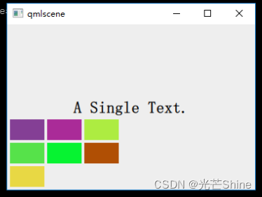
import QtQuick 2.0
import QtQuick.Controls 1.1

Rectangle {
    width: 360;
    height: 240;
    color: "#EEEEEE";
    id: rootItem;

    Text {
        id: centerText;
        text: "A Single Text.";
        anchors.centerIn: parent;
        font.pixelSize: 24;
        font.bold: true;
    }

    function setTextColor(clr){
        centerText.color = clr;
    }

    Grid {
        anchors.left: parent.left;
        anchors.leftMargin: 4;
        anchors.bottom: parent.bottom;
        anchors.bottomMargin: 4;
        rows: 3;
        columns: 3;
        rowSpacing: 4;
        columnSpacing: 4;

        Rectangle {
            width: 50;
            height: 30;
            color: Qt.rgba(Math.random(), Math.random(), Math.random(), 1.0);
        }

        Rectangle {
            width: 50;
            height: 30;
            color: Qt.rgba(Math.random(), Math.random(), Math.random(), 1.0);
        }

        Rectangle {
            width: 50;
            height: 30;
            color: Qt.rgba(Math.random(), Math.random(), Math.random(), 1.0);
        }

        Rectangle {
            width: 50;
            height: 30;
            color: Qt.rgba(Math.random(), Math.random(), Math.random(), 1.0);
        }

        Rectangle {
            width: 50;
            height: 30;
            color: Qt.rgba(Math.random(), Math.random(), Math.random(), 1.0);
        }

        Rectangle {
            width: 50;
            height: 30;
            color: Qt.rgba(Math.random(), Math.random(), Math.random(), 1.0);
        }

        Rectangle {
            width: 50;
            height: 30;
            color: Qt.rgba(Math.random(), Math.random(), Math.random(), 1.0);
        }
    }
}
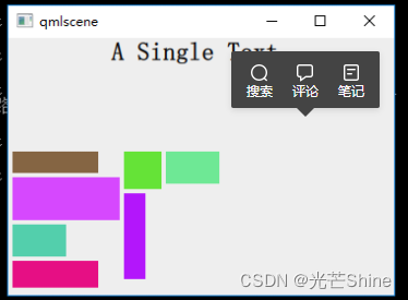
■ Flow(流式定位器)
Flow元素会根据其宽度自动调整子元素的位置和换行方式。
无论子元素的宽度如何,Flow都会根据可用的空间进行动态排列。
| 属性 | 描述 |
|---|---|
| spacing: | 子元素之间的间距。可以设置为像素值或其他长度单位。 |
| flow: | 子元素的流动方向,可选值为Flow.LeftToRight、Flow.RightToLeft、Flow.TopToBottom和Flow.BottomToTop。Layout.alignment: |
** 示例一 **
    Flow {
        width: 300 // Flow布局的宽度
        spacing: 100

        Rectangle {
            width: 100
            height: 100
            color: "red"
        }

        Rectangle {
            width: 100
            height: 50
            color: "blue"
        }

        Rectangle {
            width: 100
            height: 120
            color: "green"
        }

        Text {
            text: "Flow Item"
        }
    }
** 示例二 **
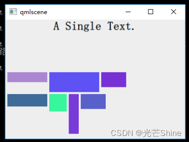
在 Flow 对象生命内添加 “flow: Flow.TopToBottom;” 这行代码,再次执行 qmlscene flow_layout.qml ,效果如下图所示:
import QtQuick 2.0
import QtQuick.Controls 1.1

Rectangle {
    width: 360;
    height: 240;
    color: "#EEEEEE";
    id: rootItem;

    Text {
        id: centerText;
        text: "A Single Text.";
        anchors.horizontalCenter: parent.horizontalCenter;
        anchors.top: parent.top;
        font.pixelSize: 24;
        font.bold: true;
    }

    function setTextColor(clr){
        centerText.color = clr;
    }

    Flow {
        anchors.left: parent.left;
        anchors.leftMargin: 4;
        anchors.bottom: parent.bottom;
        anchors.bottomMargin: 4;
        width: 280;
        height: 130;
        spacing: 4;

        Rectangle {
            width: 80;
            height: 20;
            color: Qt.rgba(Math.random(), Math.random(), Math.random(), 1.0);
        }

        Rectangle {
            width: 100;
            height: 40;
            color: Qt.rgba(Math.random(), Math.random(), Math.random(), 1.0);
        }

        Rectangle {
            width: 50;
            height: 30;
            color: Qt.rgba(Math.random(), Math.random(), Math.random(), 1.0);
        }

        Rectangle {
            width: 80;
            height: 25;
            color: Qt.rgba(Math.random(), Math.random(), Math.random(), 1.0);
        }

        Rectangle {
            width: 35;
            height: 35;
            color: Qt.rgba(Math.random(), Math.random(), Math.random(), 1.0);
        }

        Rectangle {
            width: 20;
            height: 80;
            color: Qt.rgba(Math.random(), Math.random(), Math.random(), 1.0);
        }

        Rectangle {
            width: 50;
            height: 30;
            color: Qt.rgba(Math.random(), Math.random(), Math.random(), 1.0);
        }
    }
}
■ Layout Types 布局类型
Layout Types 的功能更加强大,更允许进一步细化或限制布局。
一般我都是使用的 Layout 这样更能适应屏幕大小.
- 设置文本和其他项目的对齐方式
- 自动调整并填充分配的应用程序区域
- 设置尺寸约束,例如最小或最大尺寸
- 设置布局中元素之间的间距
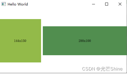
■ Layout 作用
Layout 本身其实不是参与到布局里面,主要是给GridLayout、RowLayout或ColumnLayout上的项提供附加属性。一个Layout类型的对象被附加到布局的子元素上,以提供关于 Item 的特定于布局的信息。
附加对象的属性会影响布局如何安排 Item 。
注意:不要在布局中绑定 Item 的x、y、width或height属性
import QtQuick 2.14
import QtQuick.Window 2.3
import QtQuick.Layouts 1.3

RowLayout {
    id: layout
    anchors.fill: parent
    spacing: 6
    Rectangle {
        color: "#93ba49"
        Layout.fillWidth: true
        Layout.minimumWidth: 50
        Layout.preferredWidth: 100
        Layout.maximumWidth: 300
        Layout.minimumHeight: 150
        Text {
            anchors.centerIn: parent
            text: parent.width + 'x' + parent.height
        }
    }
    Rectangle {
        color: "#518e4f"
        Layout.fillWidth: true
        Layout.minimumWidth: 100
        Layout.preferredWidth: 200
        Layout.preferredHeight: 100
        Text {
            anchors.centerIn: parent
            text: parent.width + 'x' + parent.height
        }
    }
}
■ RowLayout 行布局 💾
例子一:
import QtQuick 2.0
import QtQuick.Layouts 1.3
import QtQuick.Window 2.3
import QtQuick.Controls 2.5

Window{
    RowLayout{
        spacing: 2
        anchors.fill: parent
        Button{
            text: "添加"
            Layout.alignment: Qt.AlignHCenter
        }
        Button{
            text: "删除"
            Layout.alignment: Qt.AlignHCenter
        }
        Button{
            text: "修改"
            Layout.alignment: Qt.AlignHCenter
        }
        Button{
            text: "保存"
            Layout.alignment: Qt.AlignHCenter
        }
    }
}

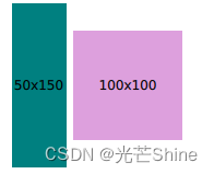
例子二:官方排列
import QtQuick 2.0
import QtQuick.Layouts 1.3
import QtQuick.Window 2.3

Window{
  RowLayout {
      id: layout
      anchors.fill: parent
      spacing: 6
      Rectangle {
          color: 'teal'
          Layout.fillWidth: true
          Layout.minimumWidth: 50
          Layout.preferredWidth: 100
          Layout.maximumWidth: 300
          Layout.minimumHeight: 150
          Text {
              anchors.centerIn: parent
              text: parent.width + 'x' + parent.height
          }
      }
      Rectangle {
          color: 'plum'
          Layout.fillWidth: true
          Layout.minimumWidth: 100
          Layout.preferredWidth: 200
          Layout.preferredHeight: 100
          Text {
              anchors.centerIn: parent
              text: parent.width + 'x' + parent.height
          }
      }
  }
}
■ ColumnLayout 列布局
例子一
import QtQuick 2.0
import QtQuick.Layouts 1.3
import QtQuick.Window 2.3
import QtQuick.Controls 2.5

Window{
    ColumnLayout{
        spacing: 2
        anchors.fill: parent
        Button{
            text: "添加"

            Layout.alignment: Qt.AlignHCenter
        }
        Button{
            text: "删除"

            Layout.alignment: Qt.AlignHCenter
        }
        Button{
            text: "修改"
            Layout.alignment: Qt.AlignHCenter
        }
        Button{
            text: "保存"
            Layout.alignment: Qt.AlignHCenter
        }
    }
}

例子一 官方排列
import QtQuick 2.0
import QtQuick.Layouts 1.3
import QtQuick.Window 2.3

Window{
    ColumnLayout{
        spacing: 2
        anchors.fill: parent
        Rectangle {
            Layout.alignment: Qt.AlignCenter
            color: "red"
            Layout.preferredWidth: 40
            Layout.preferredHeight: 40
        }

        Rectangle {
            Layout.alignment: Qt.AlignRight
            color: "green"
            Layout.preferredWidth: 40
            Layout.preferredHeight: 70
        }

        Rectangle {
            Layout.alignment: Qt.AlignBottom
            Layout.fillHeight: true
            color: "blue"
            Layout.preferredWidth: 70
            Layout.preferredHeight: 40
        }
    }
}
■ GridLayout 网格布局
网格布局,并根据需要自动调整子元素的大小和位置。
| 属性 | 描述 |
|---|---|
| spacing: | 行和列之间的间距。可以设置为像素值或其他长度单位。 |
| flow | 子元素的流动方式,用于控制子元素在网格中的排列顺序,可选值为Grid.LeftToRight、Grid.RightToLeft、Grid.TopToBottom 和 Grid.BottomToTop。 |
| Layout.alignment | 用于控制子元素在网格单元格内的对齐方式,如AlignHCenter、AlignTop等。 |
例子一
    Grid {
        columns: 4 // 列数
        spacing: 10 // 行和列之间的间距

        Rectangle {
            width: 100
            height: 100
            color: "red"
//            Grid.column: 0 // 子元素所在的列索引
//            Grid.row: 0    // 子元素所在的行索引
        }

        Text {
            text: "Item 2"
//            Grid.column: 1
//            Grid.row: 0
        }

//        Item {
//            width: 20
//            height: 50
            color: "blue"
            Grid.column: 0
            Grid.row: 1
            Grid.columnSpan: 3 // 横跨多列
//        }
        Text {
            text: "Item 2"
//            Grid.column: 1
//            Grid.row: 0
        }

        Rectangle {
            width: 50
            height: 50
            color: "green"
//            Grid.column: 2
//            Grid.row: 2
        }
    }
例子二
Grid {
    columns: 3
    spacing: 10
    flow: Grid.LeftToRight // 从左到右流动

    Rectangle {
        width: 100
        height: 100
        color: "red"
    }

    Text {
        text: "Item 2"
    }

    Rectangle {
        width: 150
        height: 150
        color: "green"
    }

    Text {
        text: "Item 4"
    }

    Rectangle {
        width: 200
        height: 50
        color: "blue"
    }

    Text {
        text: "Item 6"
    }
}
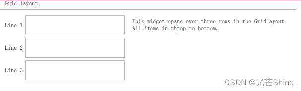
例子三
  GroupBox {
      id: gridBox
      title: "Grid layout"
      Layout.fillWidth: true

      GridLayout {
          id: gridLayout
          rows: 3
          flow: GridLayout.TopToBottom
          anchors.fill: parent
          Label { text: "Line 1" }
          Label { text: "Line 2" }
          Label { text: "Line 3" }

          TextField { }
          TextField { }
          TextField { }

          TextArea {
              text: "This widget spans over three rows in the GridLayout.\n"
                    + "All items in the GridLayout are implicitly positioned from top to bottom."
              Layout.rowSpan: 3
              Layout.fillHeight: true
              Layout.fillWidth: true
          }
      }
  }
■ StackLayout 堆布局
StackLayout 其实就是说,在同一个时刻里面,只有一个页面是展示出来的,类似QStackWidget 的功能,主要就是切换界面的功能。
这个类型我们可以通过设置currentIndex属性来修改当前可见的项。
索引对应于StackLayout子元素的顺序。
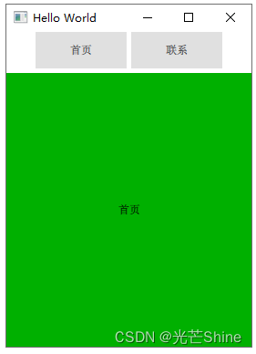
例子一:
import QtQuick 2.0
import QtQuick.Layouts 1.3
import QtQuick.Window 2.3
import QtQuick.Controls 2.5

Window {
    id: root
    visible: true
    width: 319
    height: 570
    title: qsTr("Hello World")
    ColumnLayout
    {
        anchors.fill: parent
        RowLayout
        {
            Layout.alignment: Qt.AlignHCenter
            Button{
                text: "首页"
                Layout.alignment: Qt.AlignHCenter
                onClicked:
                {
                    stackWig.currentIndex = 0;
                }
            }
            Button{
                text: "联系"
                Layout.alignment: Qt.AlignHCenter
                onClicked:
                {
                    stackWig.currentIndex = 1;
                }
            }
        }

        StackLayout
        {
            id:stackWig
            currentIndex: 0
            Rectangle
            {
                color: "#00B000"
                Text {
                    id: homePage
                    text: qsTr("首页")
                    anchors.verticalCenter: parent.verticalCenter
                    anchors.horizontalCenter: parent.horizontalCenter
                    verticalAlignment: Text.AlignVCenter
                    horizontalAlignment: Qt.AlignHCenter
                }
            }

            Rectangle
            {
                id: rectangle
                color: "steelblue"
                Text {
                    id: contactPage
                    text: qsTr("联系")
                    anchors.verticalCenter: parent.verticalCenter
                    anchors.horizontalCenter: parent.horizontalCenter
                    verticalAlignment: Text.AlignVCenter
                    horizontalAlignment: Qt.AlignHCenter
                }
            }
        }
    }
}
本文来自互联网用户投稿,该文观点仅代表作者本人,不代表本站立场。本站仅提供信息存储空间服务,不拥有所有权,不承担相关法律责任。 如若内容造成侵权/违法违规/事实不符,请联系我的编程经验分享网邮箱:chenni525@qq.com进行投诉反馈,一经查实,立即删除!