CSS 纵向底部往上动画
发布时间:2024年01月01日
<template>
<div class="container" @mouseenter="startAnimation" @mouseleave="stopAnimation">
<!-- 旋方块 -->
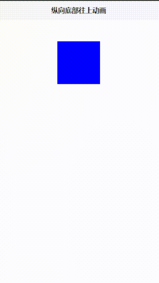
<div class="box" :class="{ 'scale-up-ver-bottom': isAnimating }">
<!-- 元素内容 -->
</div>
</div>
</template>
<script setup>
import {
ref
} from 'vue';
const isAnimating = ref(false); // 控制是否应用动画的响应式状态
function startAnimation() {
// 鼠标进入容器时,启动动画
isAnimating.value = true;
}
function stopAnimation() {
// 鼠标离开容器时,停止动画
isAnimating.value = false;
}
</script>
<style>
.container {
/* 定义容器宽度和高度 */
width: 100px;
height: 100px;
margin-top: 50px;
margin-left: 40%;
}
.box {
/* 定义方块宽度和高度 */
width: 100px;
height: 100px;
background-color: blue;
}
.scale-up-ver-bottom {
-webkit-animation: scale-up-ver-bottom 0.4s cubic-bezier(0.390, 0.575, 0.565, 1.000) both;
animation: scale-up-ver-bottom 0.4s cubic-bezier(0.390, 0.575, 0.565, 1.000) both;
}
@-webkit-keyframes scale-up-ver-bottom {
0% {
-webkit-transform: scaleY(0.4);
transform: scaleY(0.4);
-webkit-transform-origin: 0% 100%;
transform-origin: 0% 100%;
}
100% {
-webkit-transform: scaleY(1);
transform: scaleY(1);
-webkit-transform-origin: 0% 100%;
transform-origin: 0% 100%;
}
}
@keyframes scale-up-ver-bottom {
0% {
-webkit-transform: scaleY(0.4);
transform: scaleY(0.4);
-webkit-transform-origin: 0% 100%;
transform-origin: 0% 100%;
}
100% {
-webkit-transform: scaleY(1);
transform: scaleY(1);
-webkit-transform-origin: 0% 100%;
transform-origin: 0% 100%;
}
}
</style>
教学视频地址
文章来源:https://blog.csdn.net/weixin_54226053/article/details/135325578
本文来自互联网用户投稿,该文观点仅代表作者本人,不代表本站立场。本站仅提供信息存储空间服务,不拥有所有权,不承担相关法律责任。 如若内容造成侵权/违法违规/事实不符,请联系我的编程经验分享网邮箱:chenni525@qq.com进行投诉反馈,一经查实,立即删除!
本文来自互联网用户投稿,该文观点仅代表作者本人,不代表本站立场。本站仅提供信息存储空间服务,不拥有所有权,不承担相关法律责任。 如若内容造成侵权/违法违规/事实不符,请联系我的编程经验分享网邮箱:chenni525@qq.com进行投诉反馈,一经查实,立即删除!
最新文章
- Python教程
- 深入理解 MySQL 中的 HAVING 关键字和聚合函数
- Qt之QChar编码(1)
- MyBatis入门基础篇
- 用Python脚本实现FFmpeg批量转换
- 中国1981-2023年逐年每15天8km植被指数数据集
- Spring5注解驱动(六)
- PPT模板(100套IT科技互联网风)
- postman后端测试时invalid token报错+token失效报错解决方案
- 【Amazon MFA删除】如何开启和关闭根用户的MFA删除
- 一.初识Linux 1-3操作系统概述&Linux初识&虚拟机介绍
- 前端性能优化二十五:花裤衩模板vue打包优化
- 诊断试剂市场调研:预计2029年将达到859亿美元
- 多位数码管
- 30天精通Nodejs--第二十七天:Docker容器部署