uniapp纯CSS实现圆形进度条组件
发布时间:2023年12月22日
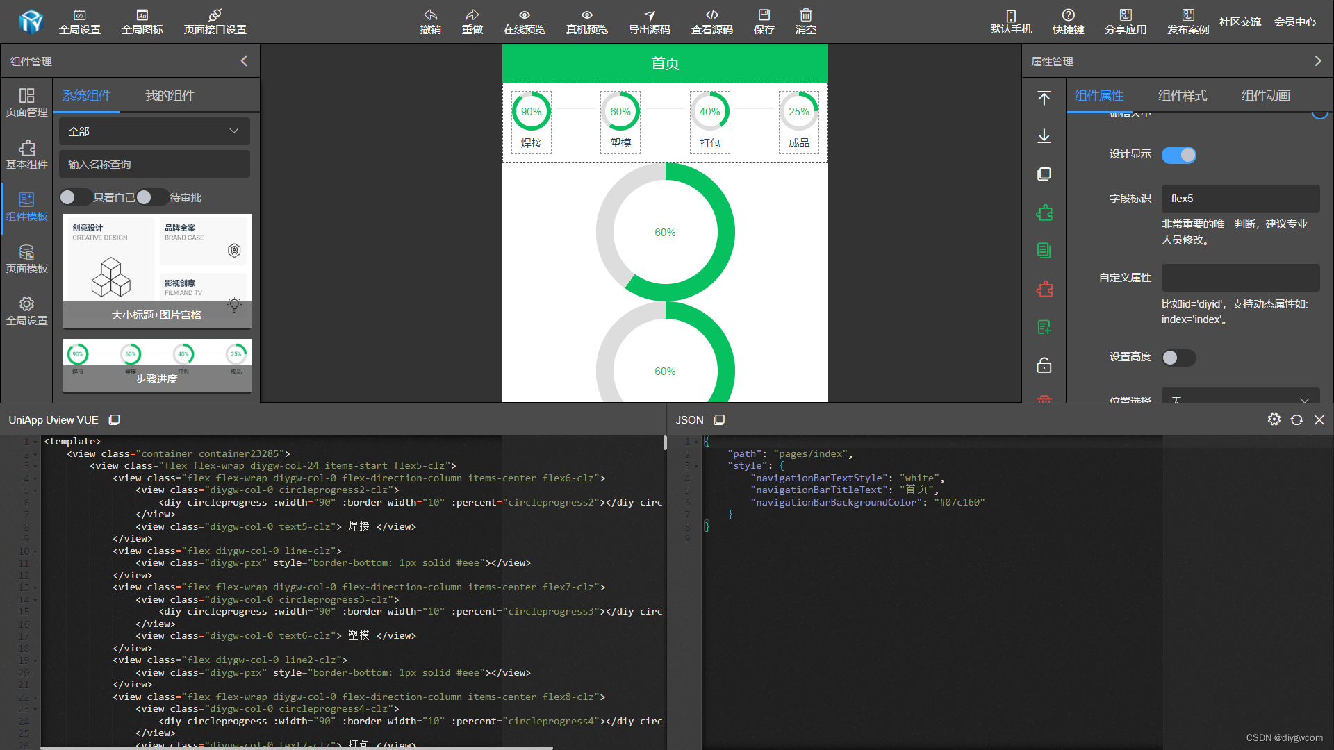
uniapp纯CSS实现圆形进度条组件。圆形进度条组件组合做一个步骤进度组件是非常常见。

纯 CSS 实现圆形进度条组件有以下几个好处:
轻量级:由于纯 CSS 实现,无需额外的 JavaScript 或图像资源,所以组件的文件大小相对较小,加载速度快,对页面性能的影响较小。
兼容性好:CSS 是 Web 标准的一部分,几乎所有现代浏览器都支持 CSS。因此,纯 CSS 实现的圆形进度条组件在各种设备和浏览器上都能正常显示和运行。
可定制性强:CSS 提供了丰富的样式属性和选择器,可以灵活地自定义圆形进度条的样式、颜色、大小、动画效果等,以满足不同项目和设计需求。
简单易用:纯 CSS 实现的圆形进度条组件通常使用简单,只需要在 HTML 中添加相应的 CSS 类或样式即可,无需复杂的配置或调用 JavaScript 函数。
性能优化:由于纯 CSS 实现的圆形进度条不涉及 JavaScript 的计算和操作,可以减轻客户端的计算负担,提高页面的响应速度和性能。
<template>
	<view class="flex align-center diygw-col-24 justify-center">
		<view class="progress-circle " :class="'progress-'+innerPercent" :style="{
			'--not-progress-color':notProgressColor,
			'--bg-color':bgColor,
			'--color':color,
			'--progress-color':progressColor,
			'--width':$u.addUnit(width),
			'--font-size':$u.addUnit(fontSize),
			'--border-width':$u.addUnit(borderWidth)
		}">
			<view class="inner">
				 <view class="progress-number">{{innerPercent}}%</view>
			</view>
		</view>
	</view>
</template>

<script>
	export default {
		props: {
			width: {
				type: Number,
				default: 100
			},
			borderWidth: {
				type: Number,
				default: 20
			},
			bgColor: {
				type: String,
				default: '#fff'
			},
			notProgressColor: {
				type: String,
				default: '#ddd'
			},
			progressColor: {
				type: String,
				default: '#07c160'
			},
			color:{
				type: String,
				default: '#07c160'
			},
			fontSize:{
				type: Number,
				default: 24
			},
			/**
			 * 进度(0-100)
			 */
			percent: {
				type: Number,
				default: 0
			},
			/**
			 * 是否动画
			 */
			animate: {
				type: Boolean,
				default: true
			},
			/**
			 * 动画速率
			 */
			rate: {
				type: Number,
				default: 5
			}
		},
		computed: {
			/**
			 * @private
			 */
			complete() {
				return this.innerPercent == 100
			}
		},
		watch: {
			percent(percent) {
				this.setPercent()
			}
		},
		data() {
			return {
				innerPercent: 0,
				timeout: null
			}
		},
		mounted() {
			this.setPercent()
		},
		methods: {
			setPercent() {
				if (this.animate) {
					this.stepTo(true)
				} else {
					this.innerPercent = this.percent
				}
			},
			clearTimeout() {
				clearTimeout(this.timeout)
				Object.assign(this, {
					timeout: null
				})
			},
			stepTo(topFrame = false) {
				if (topFrame) {
					this.clearTimeout()
				}
				if (this.percent > this.innerPercent && !this.complete) {
					this.innerPercent=this.innerPercent+1
				}
				if (this.percent < this.innerPercent && this.innerPercent > 0) {
					this.innerPercent--
				}
				if (this.innerPercent !== this.percent) {
					this.timeout = setTimeout(() => {
						this.stepTo()
					}, this.rate)
				}
			}
		}
	}
</script>

<style lang="scss" scoped>
	.progress-circle {
		--progress-color:#63B8FF;
		--not-progress-color:#ddd;
		--bg-color:#fff;
		--width: 240rpx;
		--border-width: 10rpx;
		--color:#777;
		--font-size:1.5rem;

		$diythemeColor:var(--progress-color) ;
		$diybackColor: var(--not-progress-color) ;
		position: relative;
		display: flex;
		align-items: center;
		justify-content: center;
		width: var(--width);
		height: var(--width);
		border-radius: 50%;
		transition: transform 1s;
		background-color: $diybackColor;
		padding:var(--border-width);

		.inner{
			width:100%;
			height: 100%;
			display: flex;
			align-items: center;
			justify-content: center;
			border-radius: 50%;
			z-index:1;
			background-color: var(--bg-color);
		}

		&:before {
			content: '';
			left:0;
			top:0;
			position: absolute;
			width: 100%;
			height: 100%;
			border-radius: 50%;
			background-color: $diythemeColor;
		}

		$step: 1;
		$loops: 99;
		$increment: 3.6;
		$half: 50;

		@for $i from 0 through $loops {
			&.progress-#{$i * $step}:before {
				@if $i < $half {
					$nextDeg: 90deg+($increment * $i);
					background-image: linear-gradient(90deg, $diybackColor 50%, transparent 50%, transparent), linear-gradient($nextDeg, $diythemeColor 50%, $diybackColor 50%, $diybackColor);
				}
				@else {
					$nextDeg: -90deg+($increment * ($i - $half));
					background-image: linear-gradient($nextDeg, $diythemeColor 50%, transparent 50%, transparent), linear-gradient(270deg, $diythemeColor 50%, $diybackColor 50%, $diybackColor);
				}
			}
		}

		.progress-number {
			width: 100%;
			line-height: 1;
			text-align: center;
			font-size: var(--font-size);
			color: var(--color);
		}
	}

</style>
文章来源:https://blog.csdn.net/luck332/article/details/135156496
本文来自互联网用户投稿,该文观点仅代表作者本人,不代表本站立场。本站仅提供信息存储空间服务,不拥有所有权,不承担相关法律责任。 如若内容造成侵权/违法违规/事实不符,请联系我的编程经验分享网邮箱:chenni525@qq.com进行投诉反馈,一经查实,立即删除!
本文来自互联网用户投稿,该文观点仅代表作者本人,不代表本站立场。本站仅提供信息存储空间服务,不拥有所有权,不承担相关法律责任。 如若内容造成侵权/违法违规/事实不符,请联系我的编程经验分享网邮箱:chenni525@qq.com进行投诉反馈,一经查实,立即删除!